Gamifying AT&T Internet’s mobile flow
A showcase of animation, usability testing, and client collaboration through playful design.
overview
AT&T is one of our clients for whom we operate authorized reseller sites that drive a significant share of their residential internet sales. However, a 60% drop-off at the end of the plan-recommendation quiz was limiting performance.
As the product designer on the project, I created a mobile-game-inspired flow for our gamer segment to increase engagement and form completion. The new experience delivered a 15% lift in sales per visitor, 3% higher engagement, and a 17% increase in net revenue within four weeks.
+15%
+17%
+3%
project timeline
7 Months
team
Myself (Designer)
James K. (Product Manager)
Alex K. (Developer)
my design skills in focus
Animation
Usability Testing
Adapting to Client Constraints
the problem
A disconnected flow was costing us half our internet sales
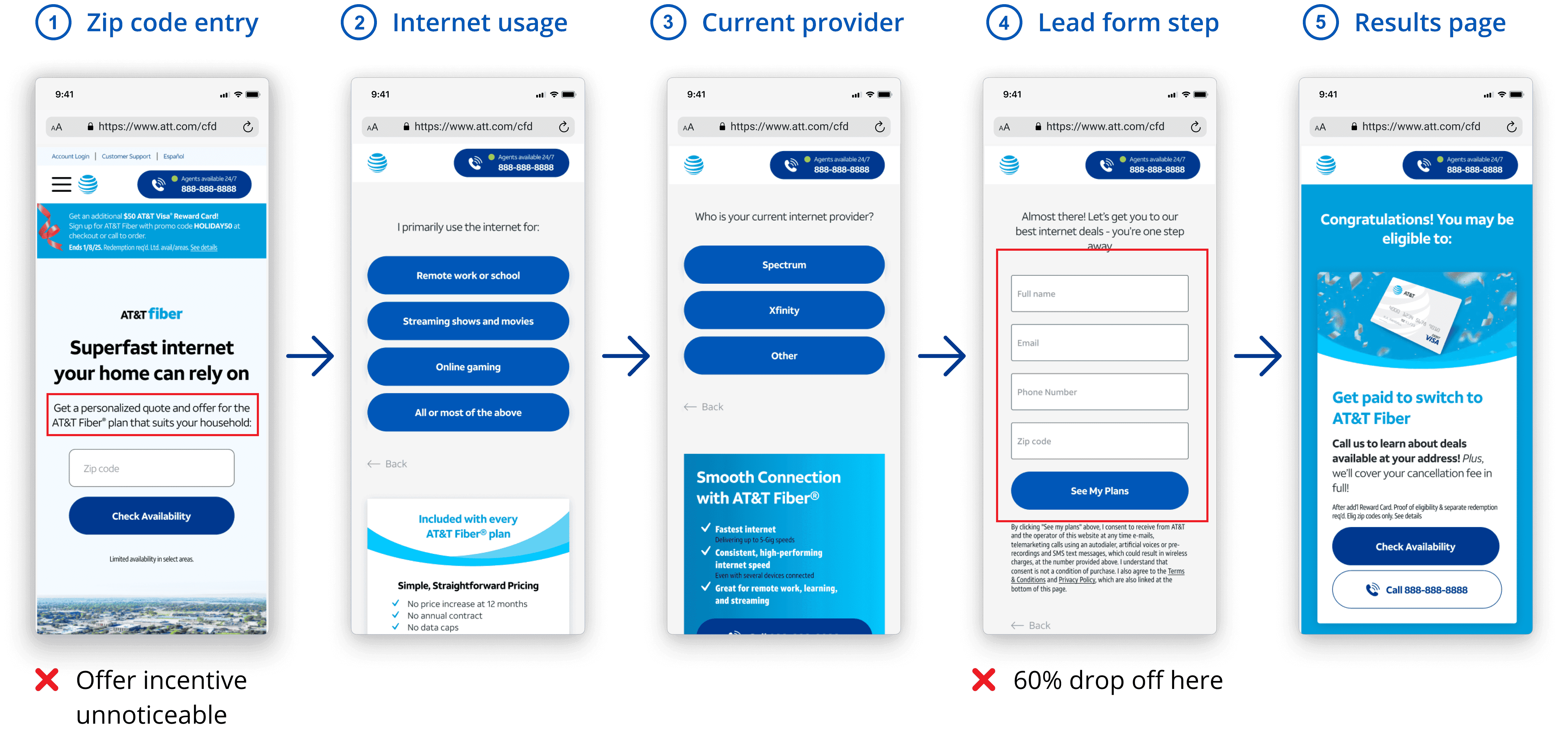
The original flow had a 60% drop-off at the lead form step—a key conversion point that drives half of all internet sales. The offer incentive was easy to miss, buried in small text before the flow even began, which made the results page feel disconnected and irrelevant. Overall, the experience felt generic, and past tests showed that more personalized flows increased engagement and conversions.
For context, engagement in my team is defined through:
Call CTA Interactions – Users clicking call buttons throughout the site
Lead Form Submissions – Users completing the lead form step (our agents call them afterwards to close a sale)
the solution
Turning user insights into a personalized, mobile game-inspired flow
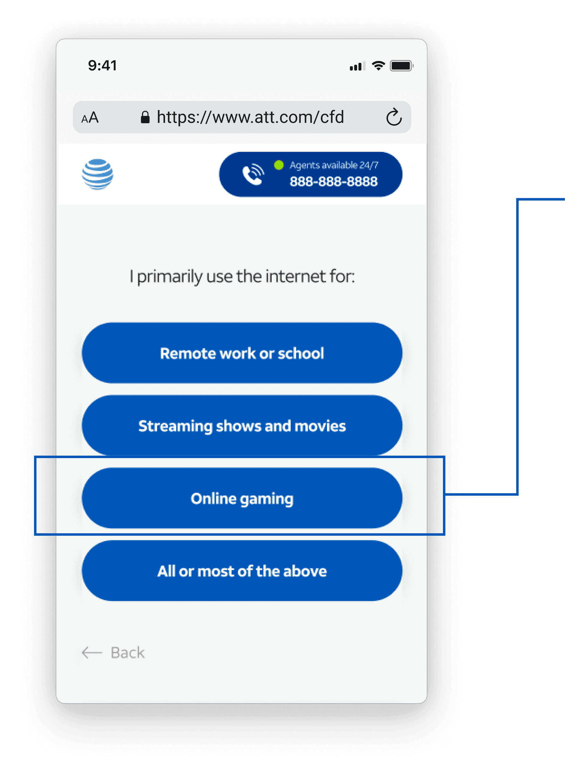
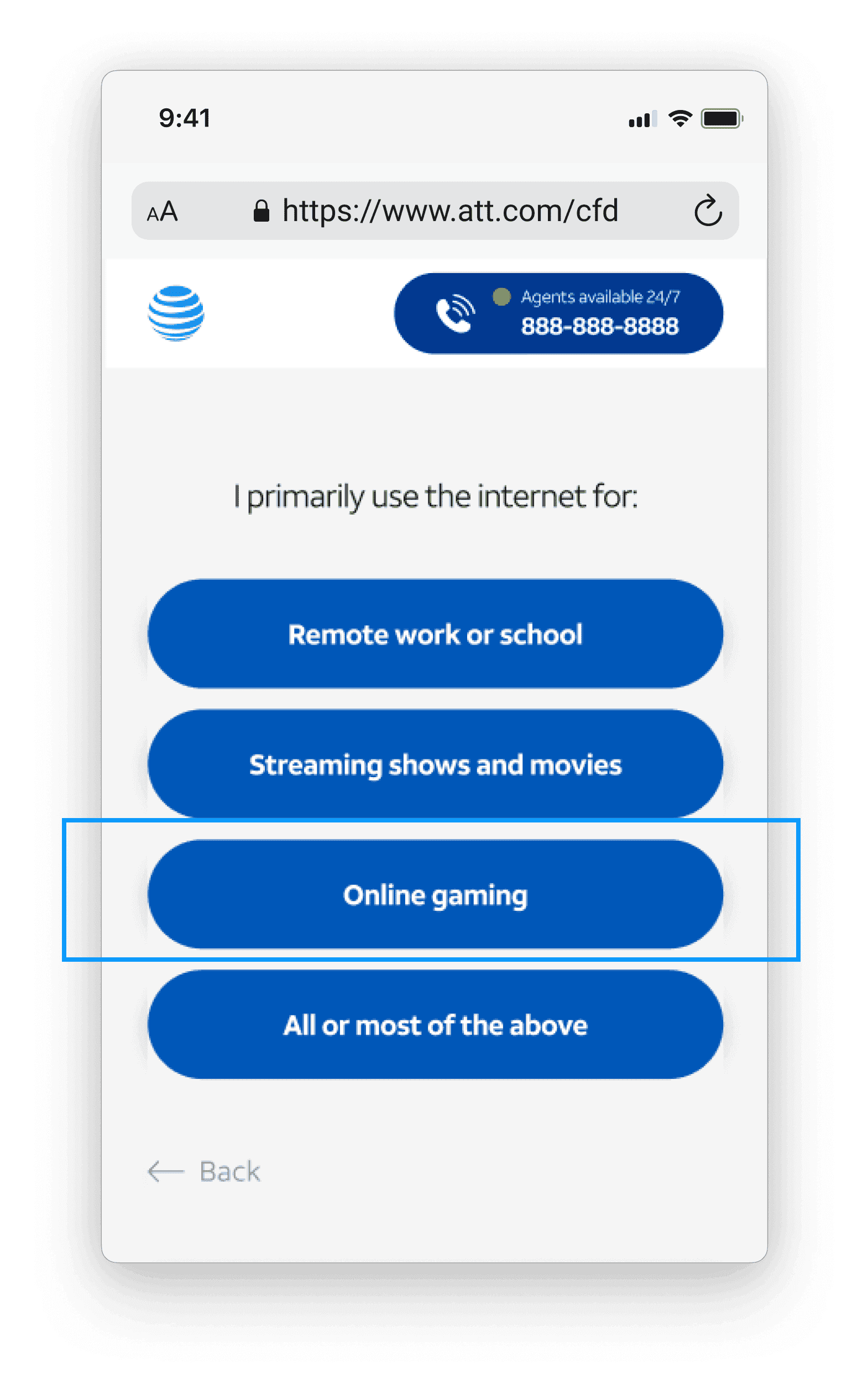
60% of users selected "Online gaming" for primary internet use (second most selected after “All or most of the above”). I saw an opportunity to create a tailored, mobile game-inspired flow for gamers and make the journey feel more engaging and personalized.
Conversion Goals
Reduce drop-offs on the lead form by 10%
Improve sales per visitor (SPV) by 10%
Experience Goals
Build a personalized flow for gamers
Emphasize incentive to increase completion
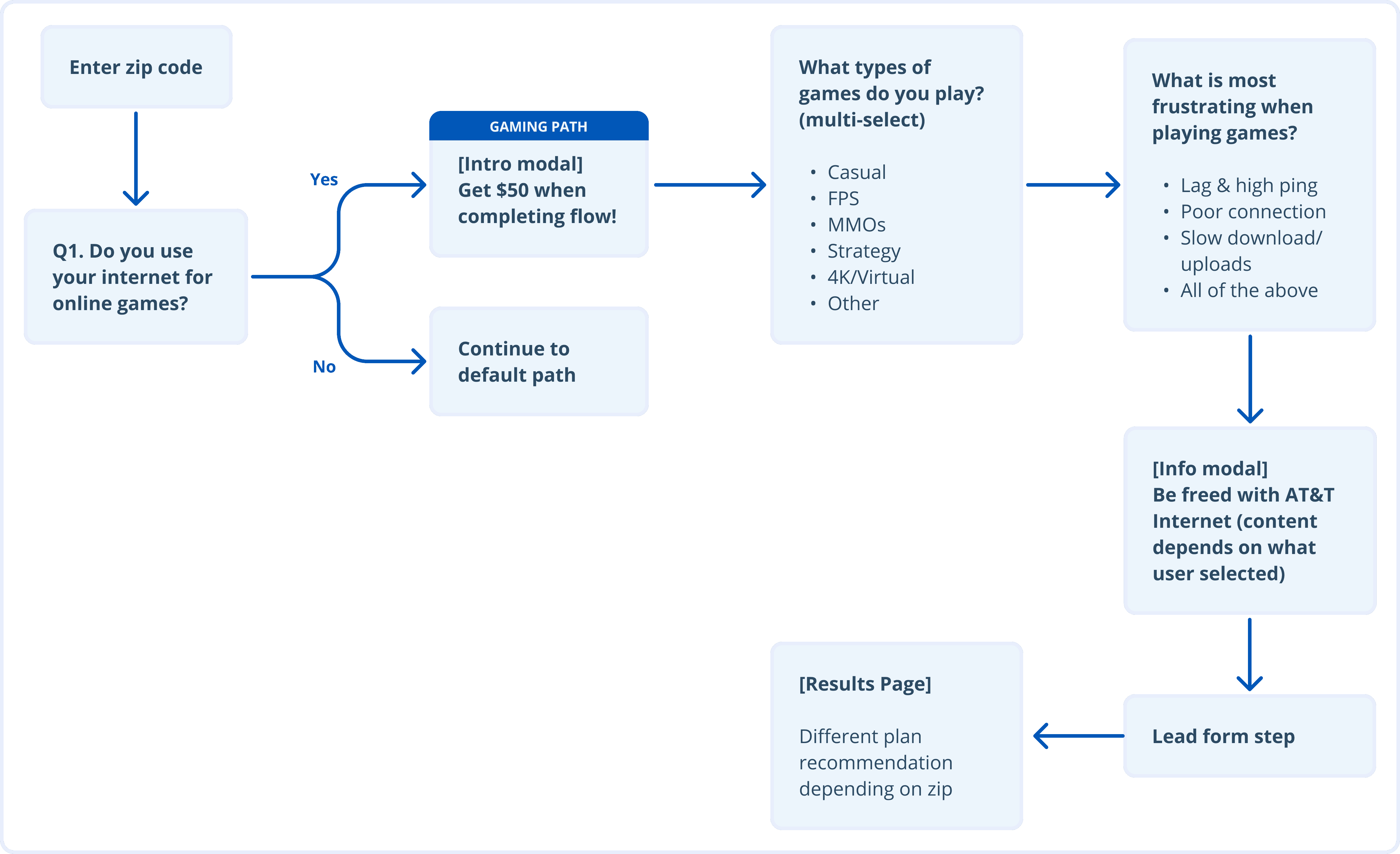
flow mapping
Laying out the groundwork first
I built a user flow to outline the content for the path of users who identify as gamers. I gamified the flow by gaming-focused content and putting the offer upfront, making it the main user incentive for completion.
Note: This personalized, gamified flow is only triggered if the user selects that they’re a gamer.
Finding inspiration
For better visual direction, I explored gaming-inspired UI patterns that would make the flow feel more like a mobile game. I focused on design details like loading/progress bars and earned rewards that help create a playful, goal-driven experience.

designs before usability testing
Exploring a more playful take on lead flows
Although lead flows are traditionally designed to collect customer information, the experience doesn't need to feel generic. I saw an opportunity to design a concept that had never been tested at my company—a gamified flow where users collect stars as they answer each question, creating a more engaging journey towards an AT&T offer.
Entry into gaming flow
Since the entry point in the original design wasn’t as clear, I incorporated game visuals and used animations to clearly explain what users can expect in the flow.
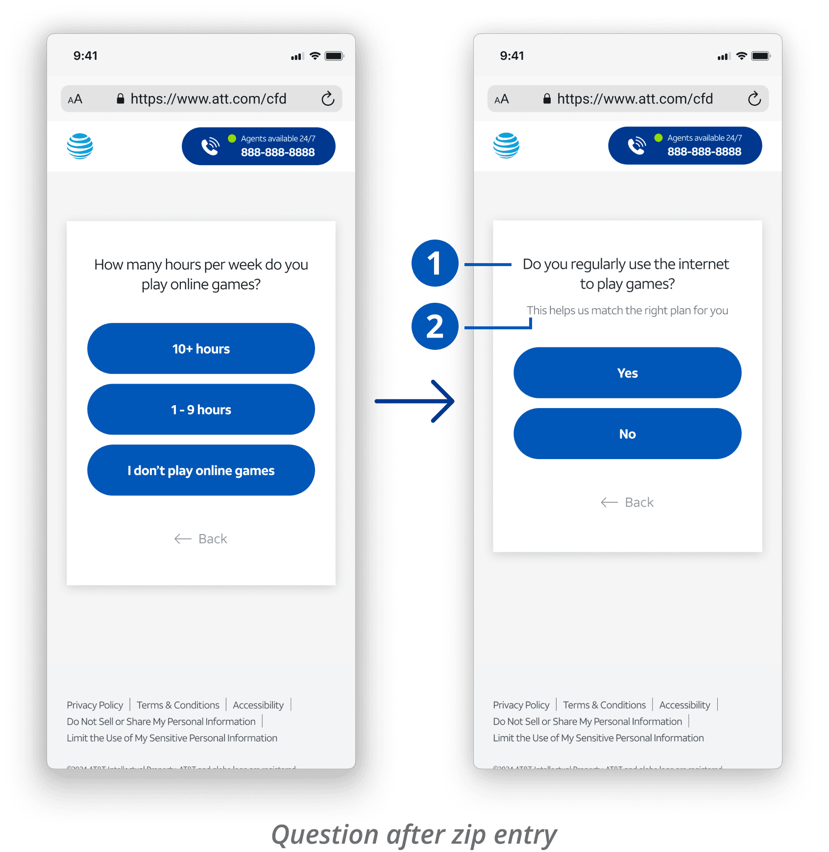
Question after zip entry
User will go into gaming flow unless they don’t play games
Game flow loader animation
Animated loading screen to capture game aesthetic
Intro modal with offer
Intro modal explaining flow’s purpose and expectations
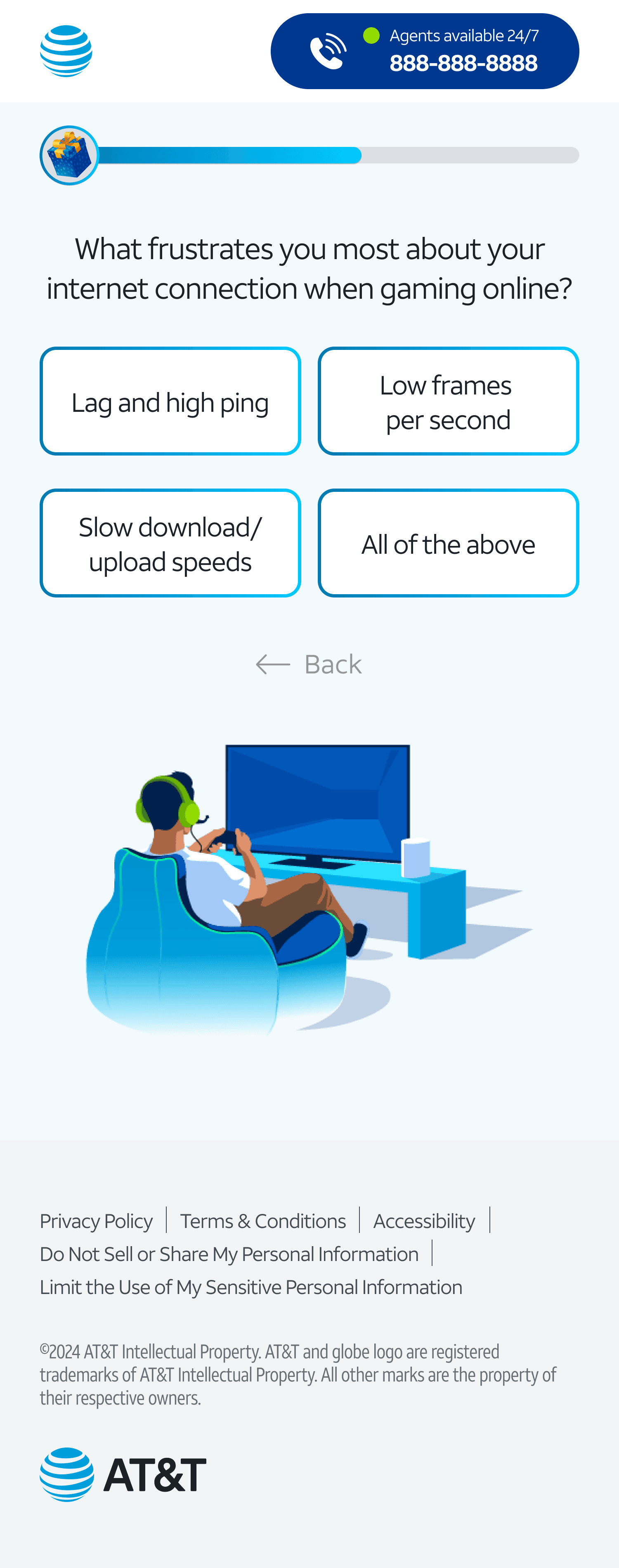
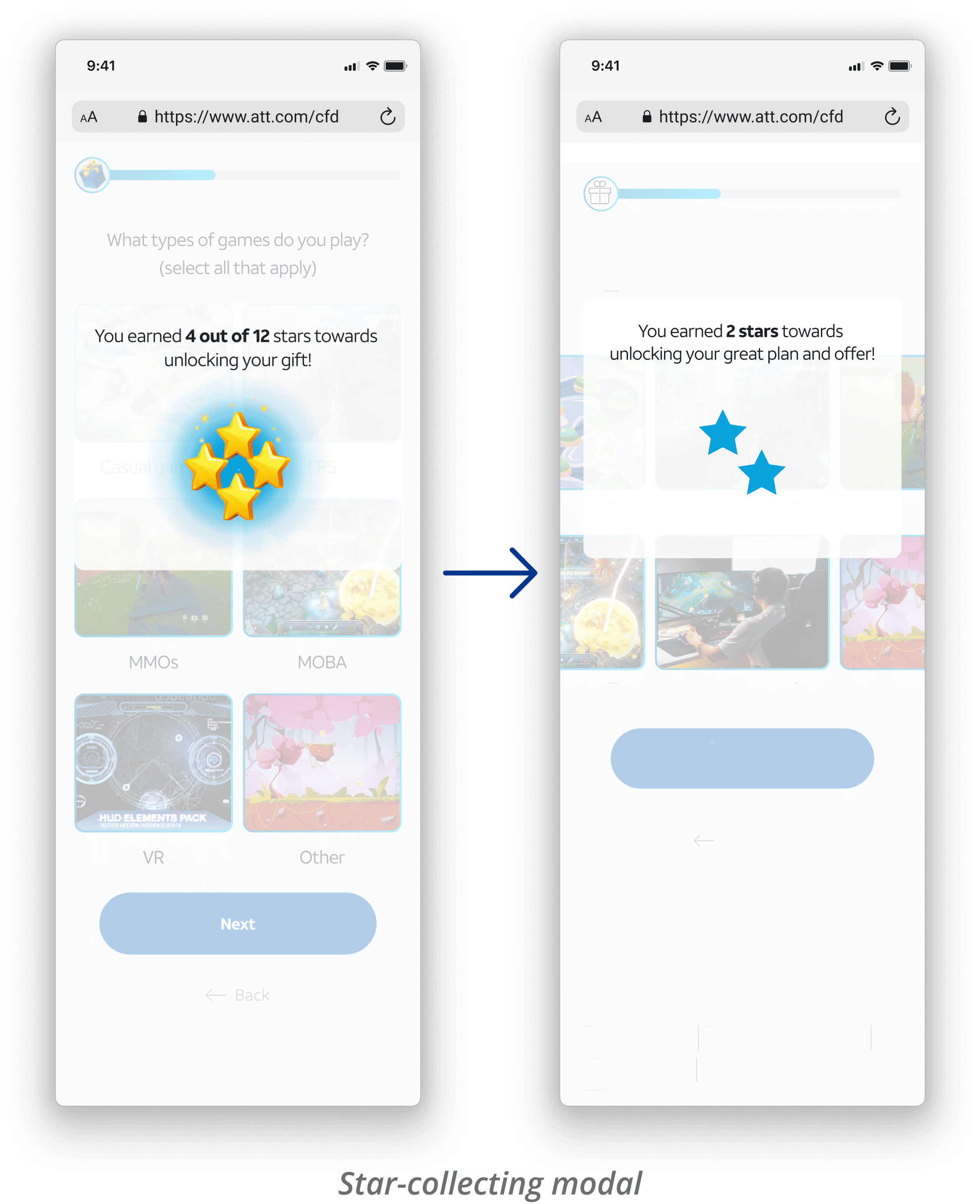
Collecting stars to gamify the flow
Added gamification to make the flow more fun and relevant to gamers. Users collect stars as they progress, and added gaming visuals to the multi-select question for further relatability.
**Animations all made by me using Figma
Improving flow completion
For the latter half of the flow, I implemented playful, purposeful changes to boost engagement, focusing on reducing form drop-off. I kept most of the results page unchanged, as we were primarily testing just the lead flow in an A/B test.
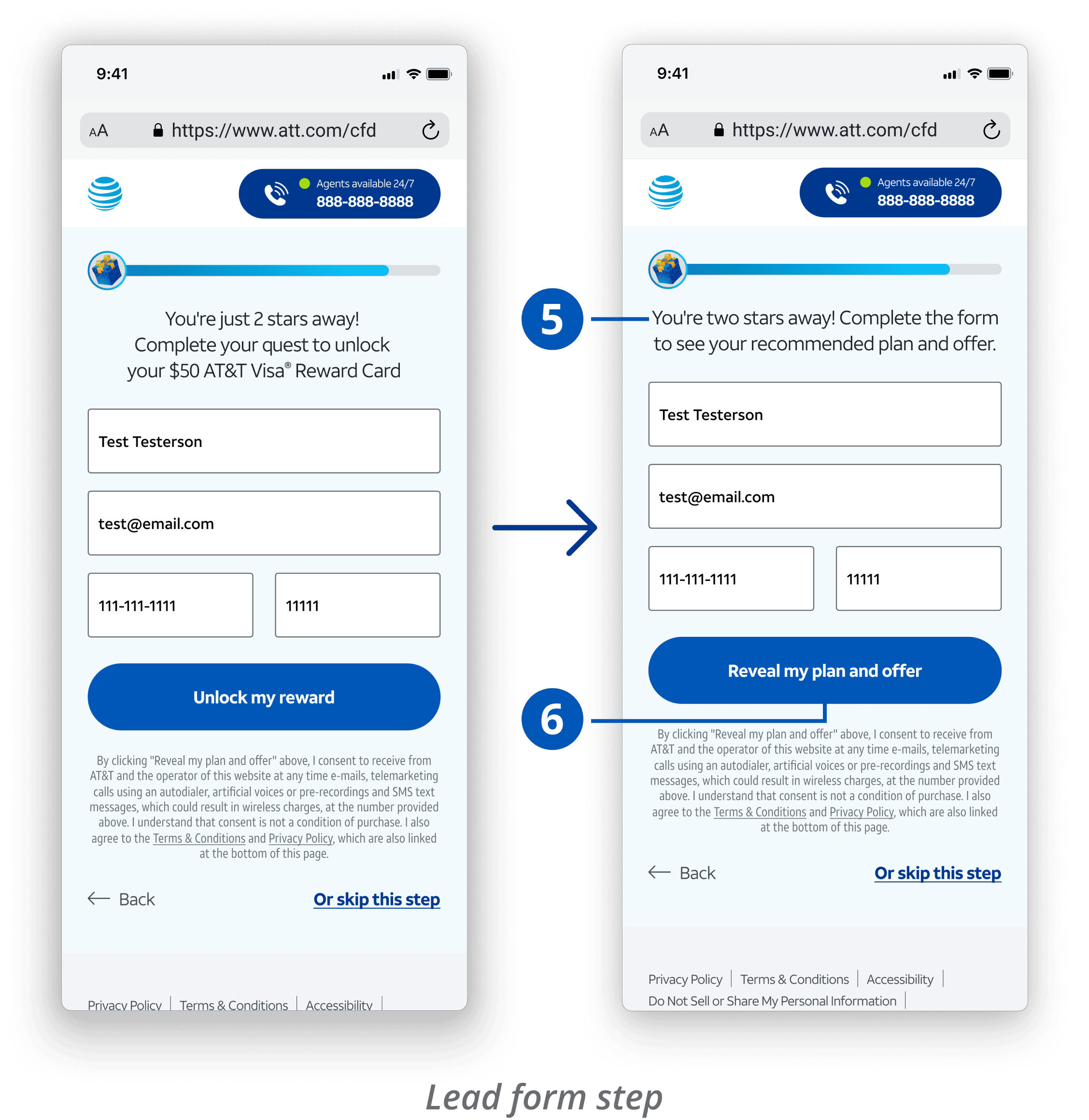
New lead form step
Built gift box + stars animation to reinforce gamified flow
Final flow loader animation
Mostly unchanged; Updated header for contextual relevance
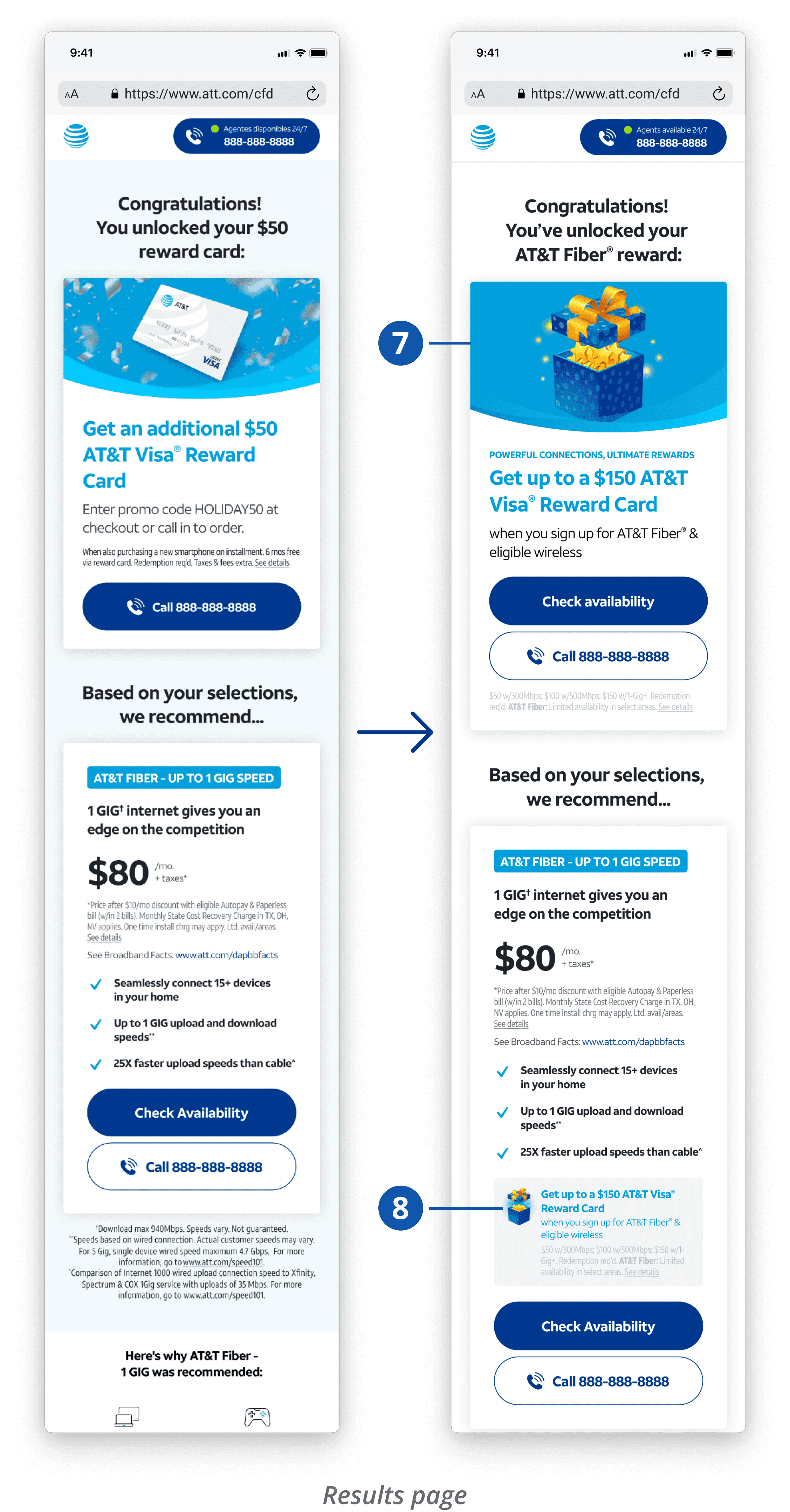
New results page
Condensed form; added gaming/reward copy to reduce drop-off
working with product manager & dev
I collaborated closely with James and Alex to ensure the gaming concept and complex animations were enjoyable—and possible.
Since this design included multiple animations, I wanted to ensure they were feasible within the project timeline. I worked closely with Alex (the developer) to plan how we would integrate the animations into the site—we ended up working with gifs to keep file sizes lightweight. I also frequently met up with James (product manager) to share my design progress and align on direction. He was supportive of most concepts, and emphasized the importance of including a deal/reward at the end, since past tests have performed well when users have an incentive to work towards.
Usability Testing & Iterations
Feedback from gamers helped level up the design
Five participants
I ran moderated individual usability tests on my new design with five colleagues in the company’s gaming club. All have not worked on AT&T before, but all were familiar with the brand.

Aaron

Steven

Matt

Caroline

Andrew
Topics focused on each session were:
Walking through and completing the full flow
Gathering feedback on each lead flow step, including whether the questions felt relevant and valuable for gamers
Evaluating the animations in terms of clarity, delight, and relevance to the gamified theme
100% of participants
successfully completed the flow and explicitly stated the gamified experience felt valuable for gamers.
Feedback & revisions
Synthesizing all the feedback I got from the 1:1 sessions, I evaluated which feedback was relevant and high priority and turned them into revisions.
Feedback
4/5 participants felt this question was jarring
Oh, I thought I missed a question because a large portion of people could be non-gamers. This feels like a question you'd ask after answering if you game or not.
Matt
Revisions
Simplified the question to be more entry-friendly
Included helper text to explain question purpose and to build trust
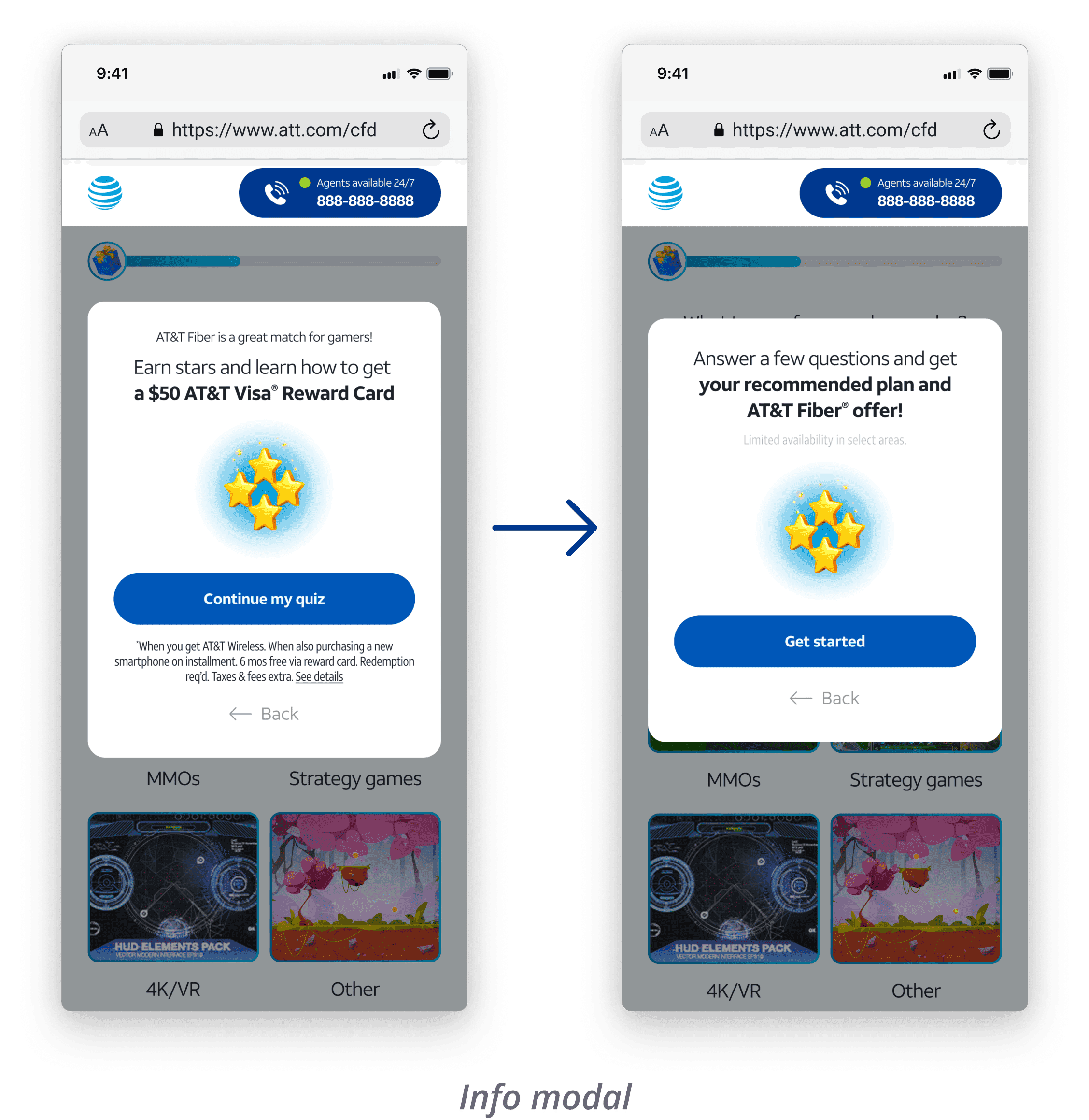
Feedback
100% of participants felt the intro modal set the tone well
However, 2 were unclear on what “earning stars” leads to and found the word “quiz” misleading when this is set up as a game
This feels like a mobile game and matches the modals I see in games that I play.
Steven
Revisions
Clarified what users can expect next and teased the reward to spark curiosity
Changed CTA to “Get started” to prevent any confusion
Feedback
3/5 were turned off by the verbiage, “unlock” and "quest", as it comes off condescending and “try-hard” to gamers
Revisions
Simplified the copy, avoided gamer terms, and held the offer reveal until after this step
Removed “unlock” verbiage

stand-out feedback
4/5 participants explicitly stated they enjoyed the loader animation, as it helped enhanced the theme.
Feedback
100% were satisfied with seeing a customized plan based on their answers. 3/5 wanted stronger visual continuity with the gaming theme
Revisions
Changed the reward to a gift box to maintain relevancy
Added reward offer in the plan card to re-emphasize it
client feedback
Balancing the original vision with client needs
Client wanted us to follow brand more
Although the new gaming visuals I created (gift box, stars, etc) majorly contributed to creating a game-like environment, we did receive feedback about the illustrations not being design system compliant.
Feedback
Client emphasized that the stars and gift box illustrations are unfortunately not a part of their branding and must be swapped with available icons.
working with product manager & dev
I problem-solved with James and Alex to make the visuals brand-compliant without increasing complexity.
I filled James in on the feedback and after searching around for brand-compliant vectors and images, realized that the solution was actually simple—deconstruct the brand-compliant icons and transform them into the same animation that I had before. Since we were coding in the animations as gifs, it didn't change the Level of Effort (LOE) for Alex and our project ETA stayed the same.
final design
Balancing user insights with conversion goals
A/b test results
The data took the story even further
Summarizing the data
+15.36% SPV & +17% net revenue
+6.74% outbound SPV (agent-led sales)
+19.21% in user-initiated calls
+22.45% inbound SPV (user-led sales)
+2.93% total engagement
Reduced form drop-off by 70%
Gamer completion: 78% (drop-off 18%)
Default completion: 36% (drop-off 60%)
Higher quality leads & revenue
New flow exceeded original goal of 10% form drop-off reduction and 10% SPV improvement.
Flow completion was significantly higher on the new gamer path and form drop-off reduced by 70%. Since the new design splits users into gamer vs. non-gamer paths (while the default has only one), this comparison reflects gamer-path users vs. the original default flow. SPV and revenue metrics are aggregated across both paths, so path-level conclusions beyond flow completion cannot be drawn. However, overall SPV, engagement, and revenue increased with the new design, indicating that the new flow contributed to improved performance.
reflection & next steps
Success that opened new opportunities
Impact 🚀
This was the first time my team and I explored a themed flow concept like this, and the results spoke for itself. The success and revenue impact this project had encouraged our design team to explore more playfully themed flows across other client sites—shaping a new direction for how we approach lead-generation experiences.
Challenges 🌱
Working within strict client guidelines and building animations from scratch was challenging. While the final design didn’t exactly match my initial vision, I enjoyed the creative problem-solving required to still capture a gaming feel in the flow. Collaborating on the animations with my developer was also fun and engaging.
Overall, the new design increased net revenue by 17%, which was a huge win. I do wish we could have measured sales separately for the gamer and non-gamer paths to more clearly assess the impact of the gamified flow and reduce the ambiguity that remains.
Next steps 🐾
We saw a 30% drop-off at this question in the new flow, suggesting it may not add enough value to justify keeping. Removing or rethinking it could improve completion rates.