Who is Eternal Return?
Eternal Return is a handmade clothing brand selling unique pieces in limited stocks.
The Problem
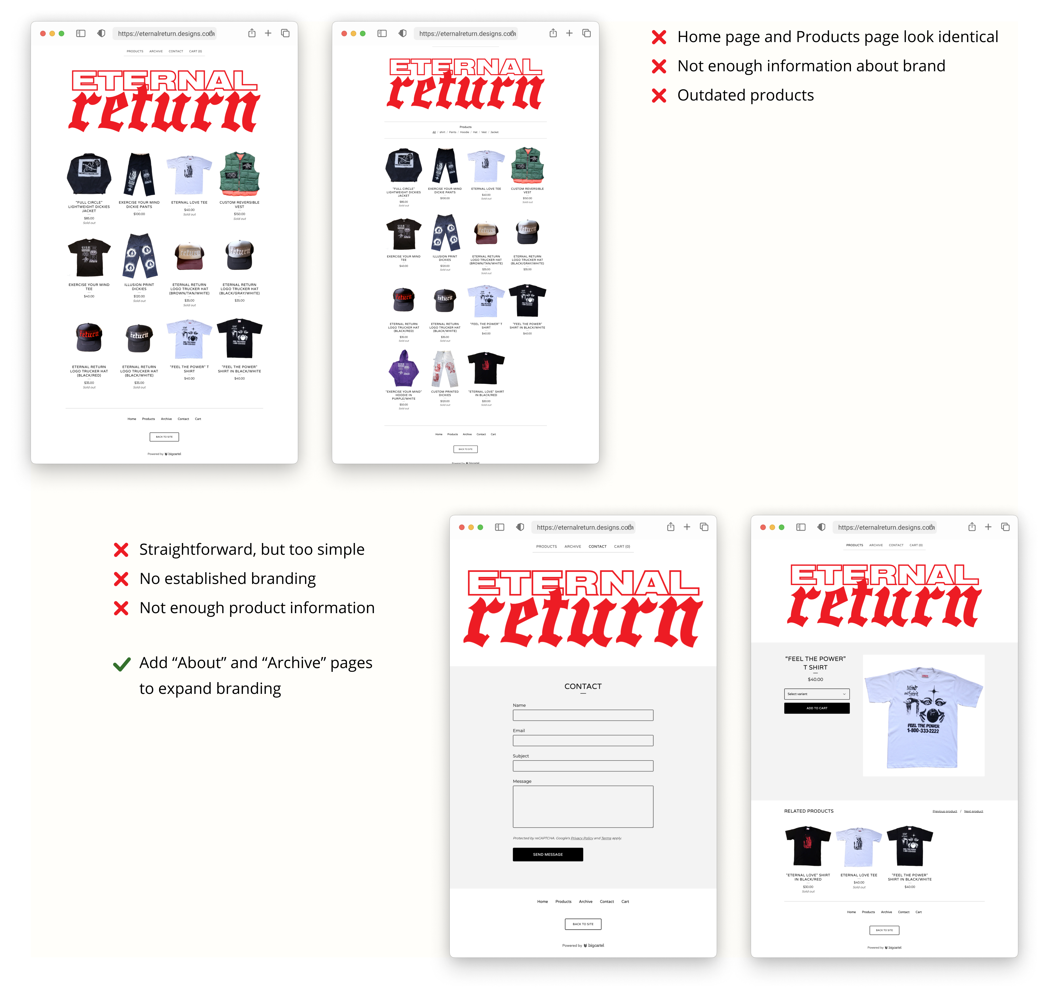
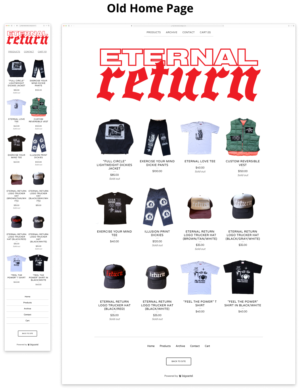
Their original website lacked a compelling brand presence, hindering the efficient sale of products. Most sales were from Instagram and flea markets, but the client was seeking a more effective online solution.
The Solution
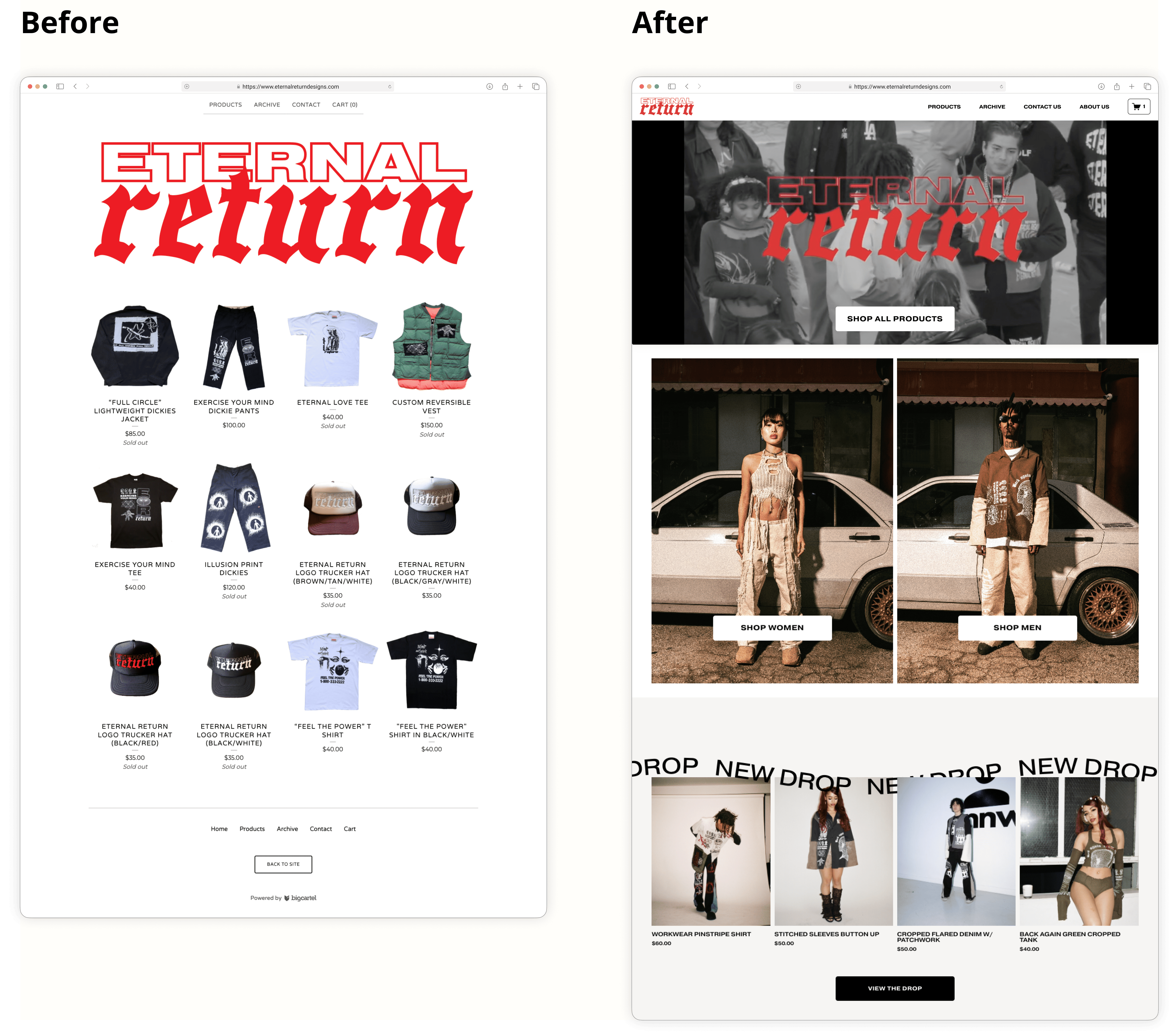
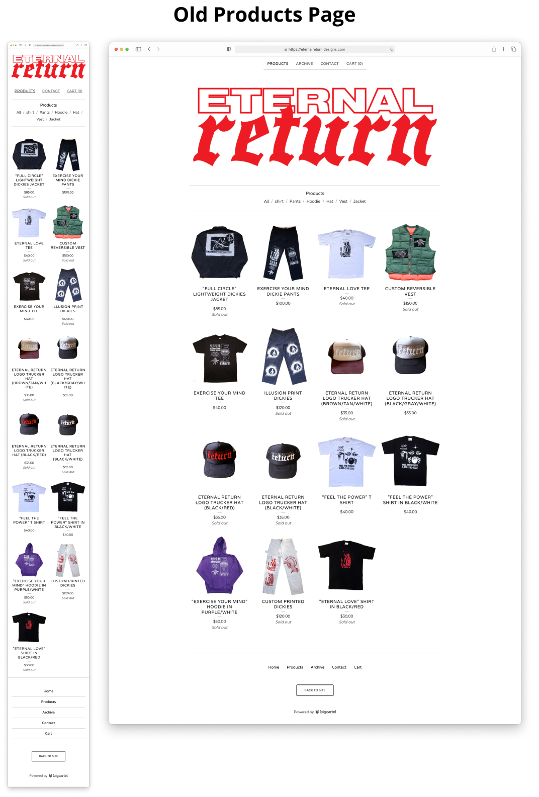
We redesigned the website to showcase the handmade and unique essence of Eternal Return's clothing, while adding pages and improving user navigation.
The Results
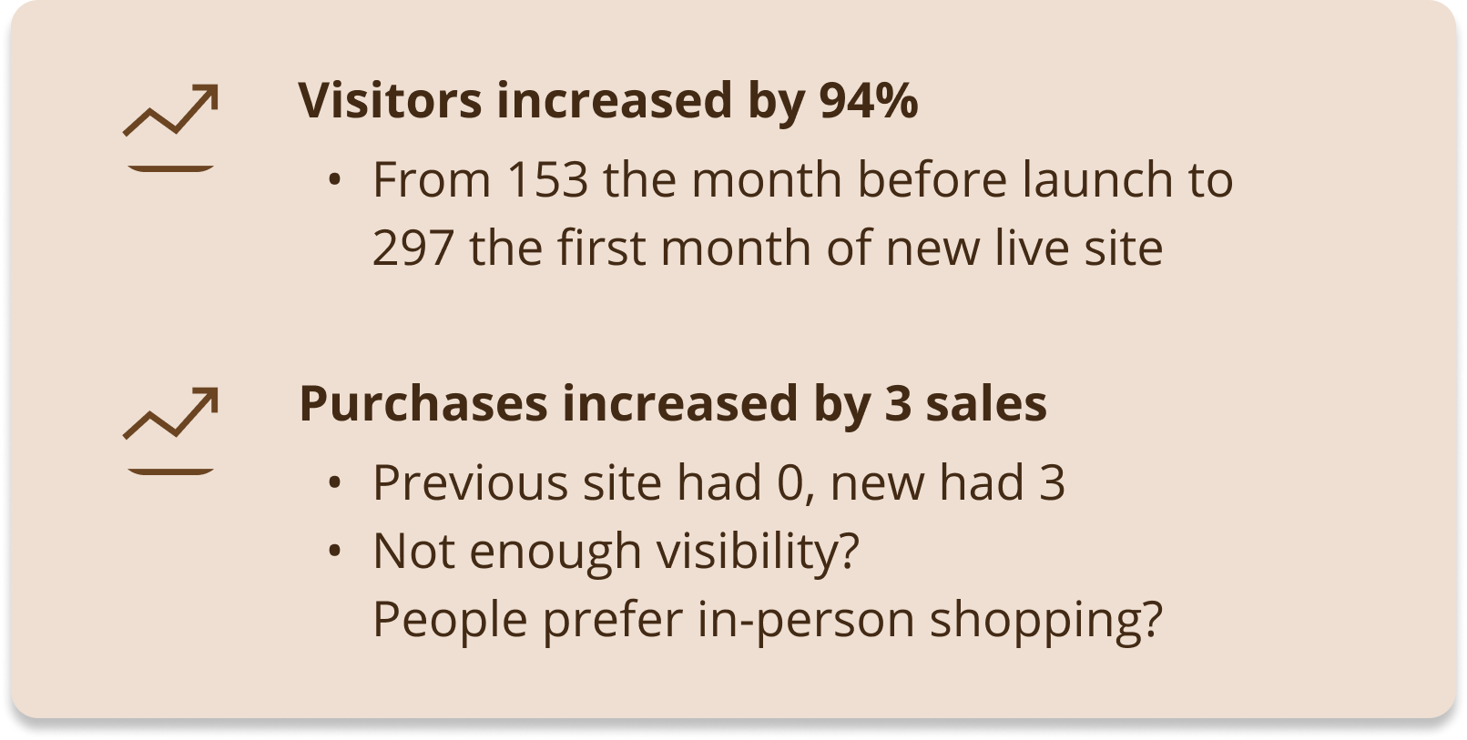
The redesign boosted visitors by 94% and increased engagement, with purchases rising from 0 to 3 and potential for further growth.
PROJECT TIMELINE
Dec 2023 - Mar 2024
TOOLS
Figma, Photoshop, Squarespace, CSS
TARGET AUDIENCE
20-30 year olds interested in handmade fashion
TEAM
Myself (Designer)
2 Founders (Stakeholders)
Stakeholders' Pain Points & Goals
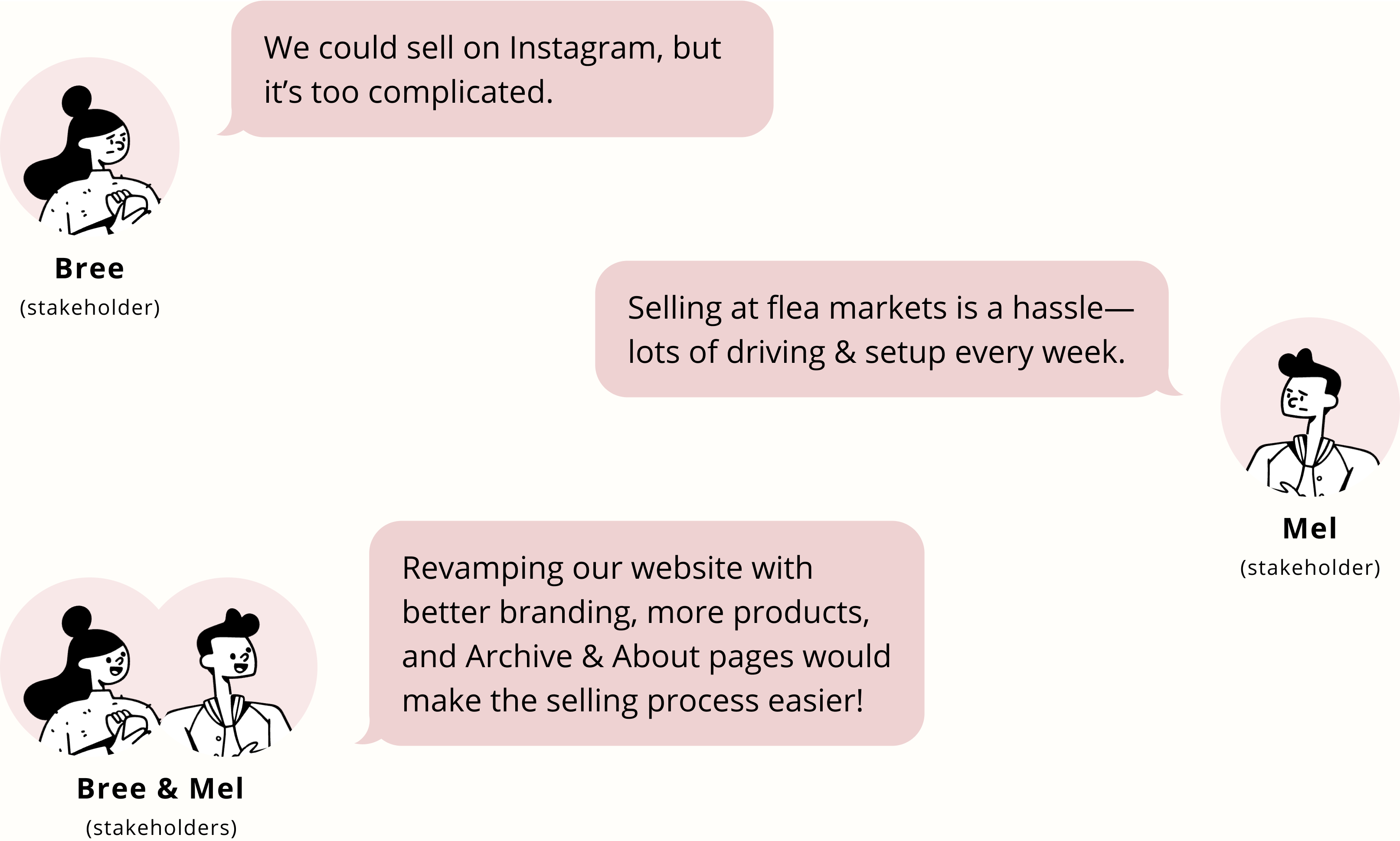
I discussed with the founders issues with the original website and their current method of selling, along with their goals. They wanted a more efficient way to sell their products beyond flea markets and felt their website was outdated. They also wanted a better-organized, aesthetically pleasing site that would attract more collaboration requests from clients.
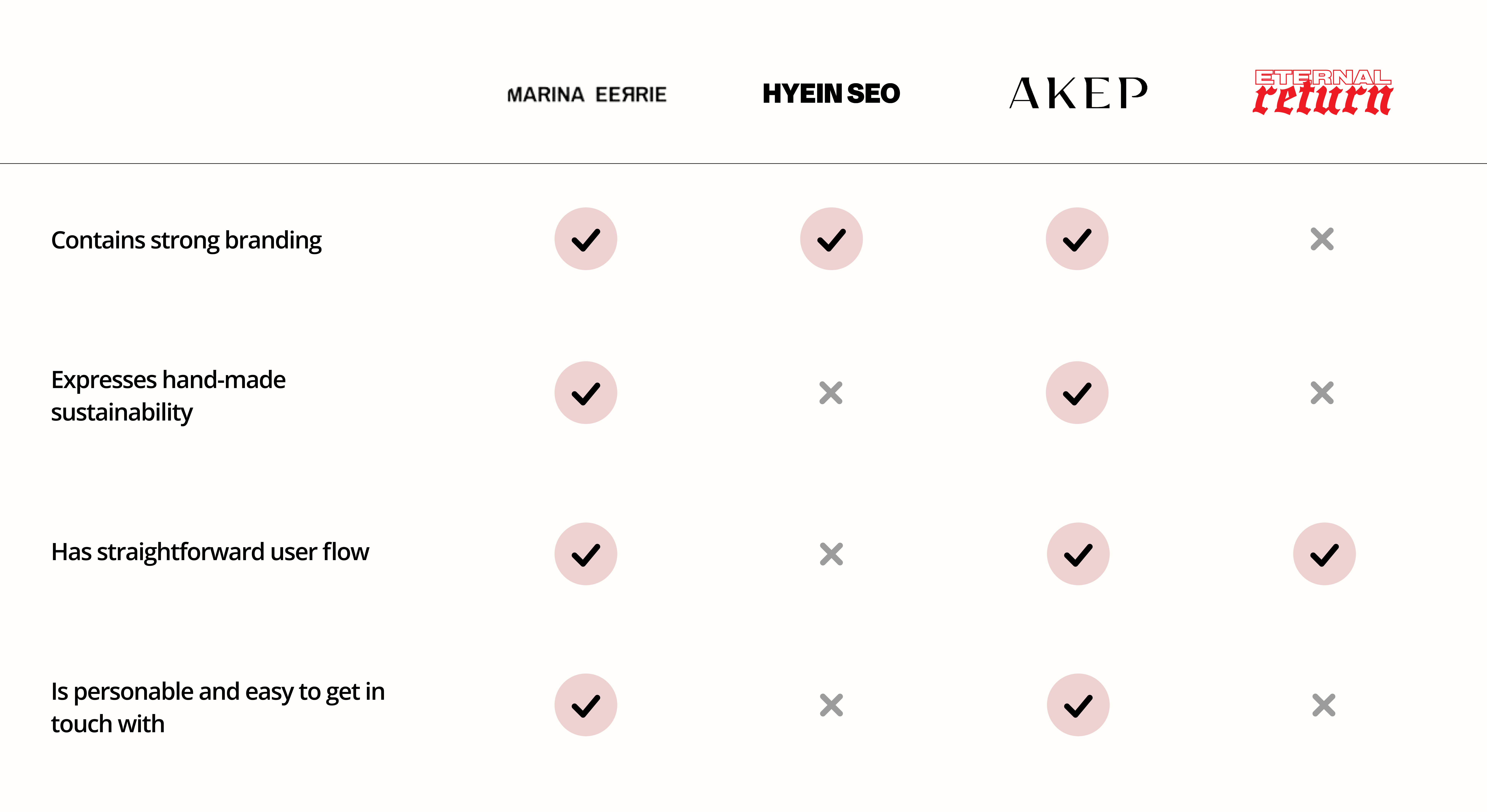
Consistent to the stakeholders' pain points, it was clear that Eternal Return was facing a branding challenge, struggling to distinguish itself in the unique, handmade clothing market compared to its competitors. While the website was user-friendly, this was due to the lack of much content to navigate through, making it difficult to convey the brand's identity compared to its vibrant Instagram presence.
Open Card Sort
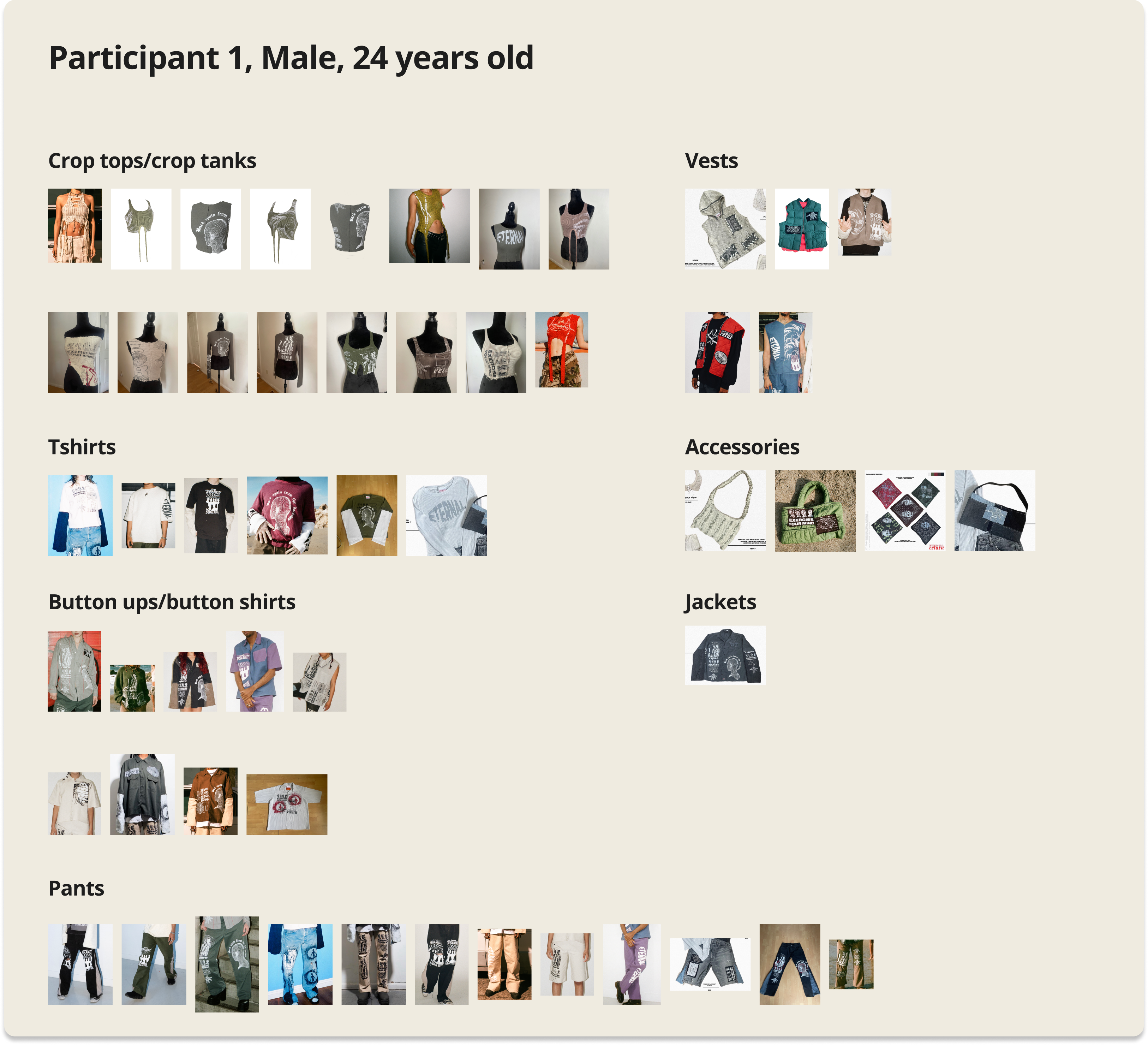
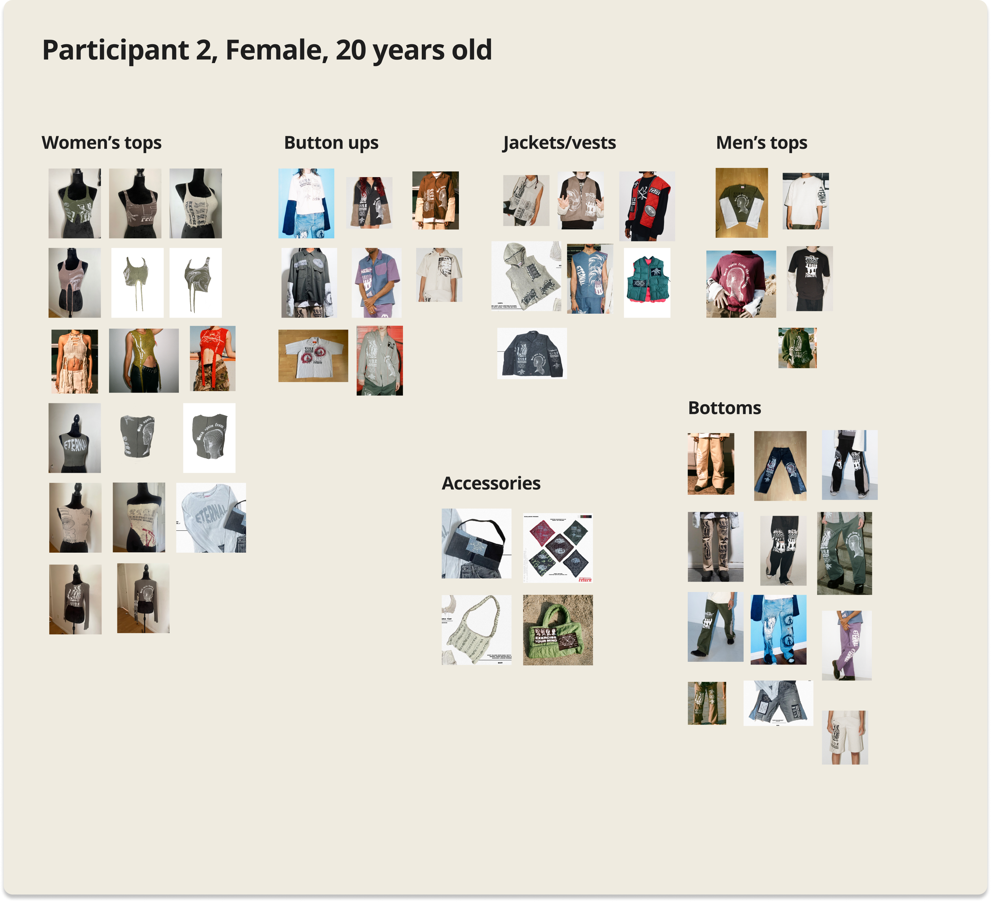
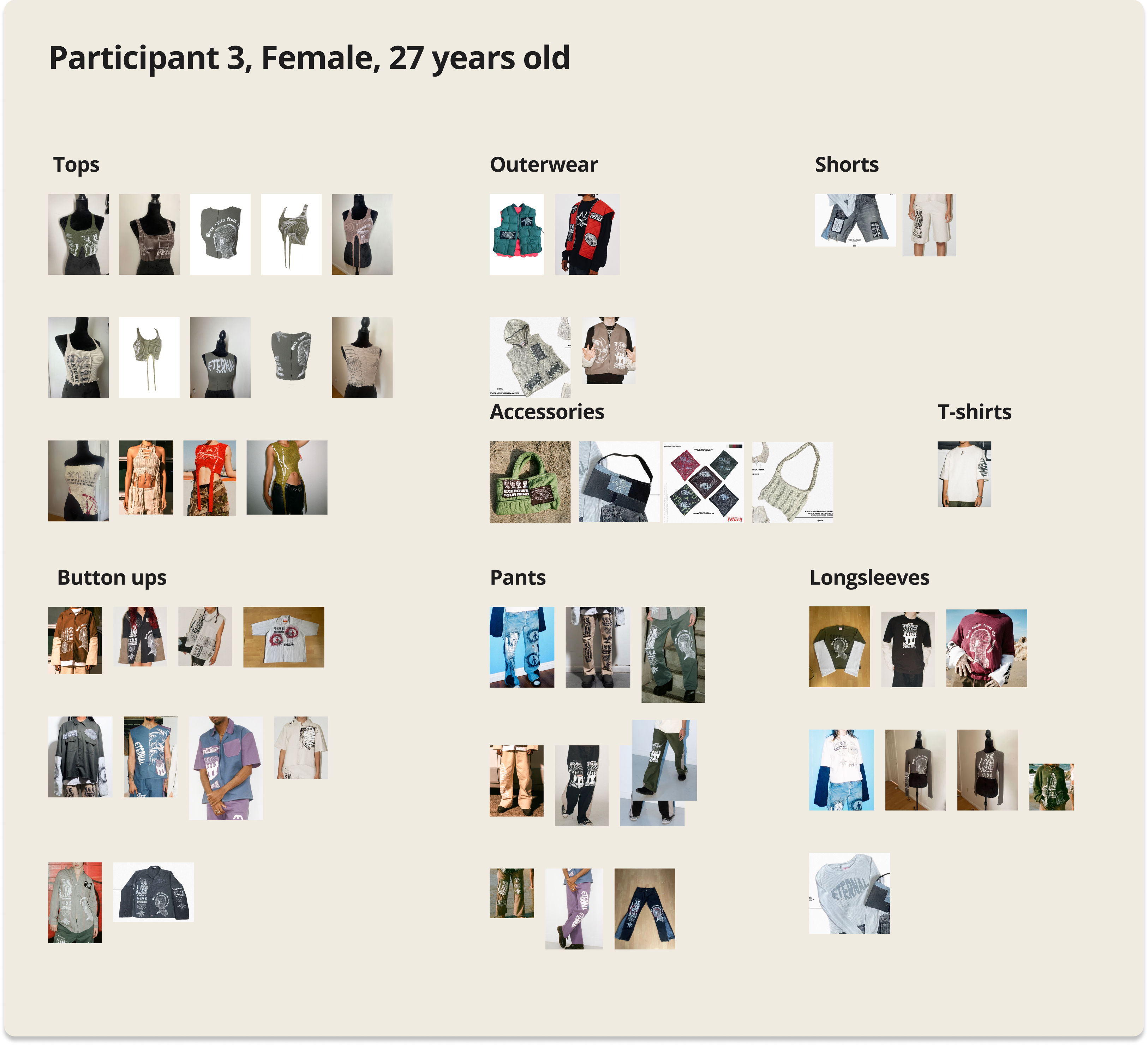
I asked 3 participants individually to sort images of past Eternal Return products to understand how to optimally categorize and display the navigation menu.
Findings
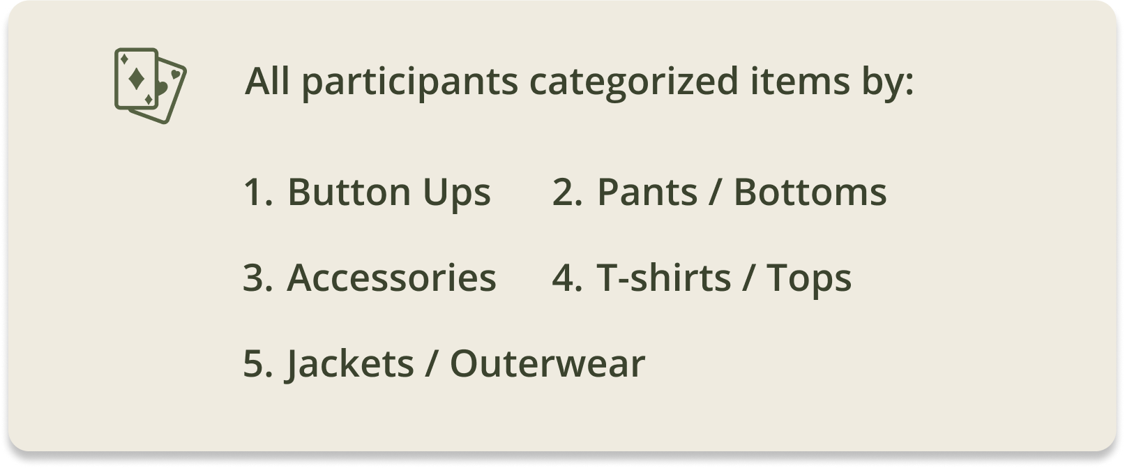
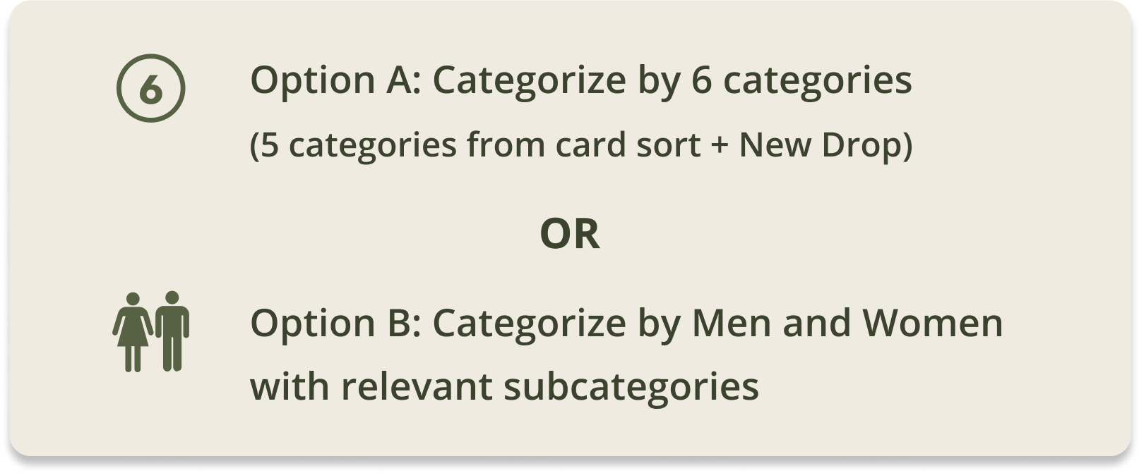
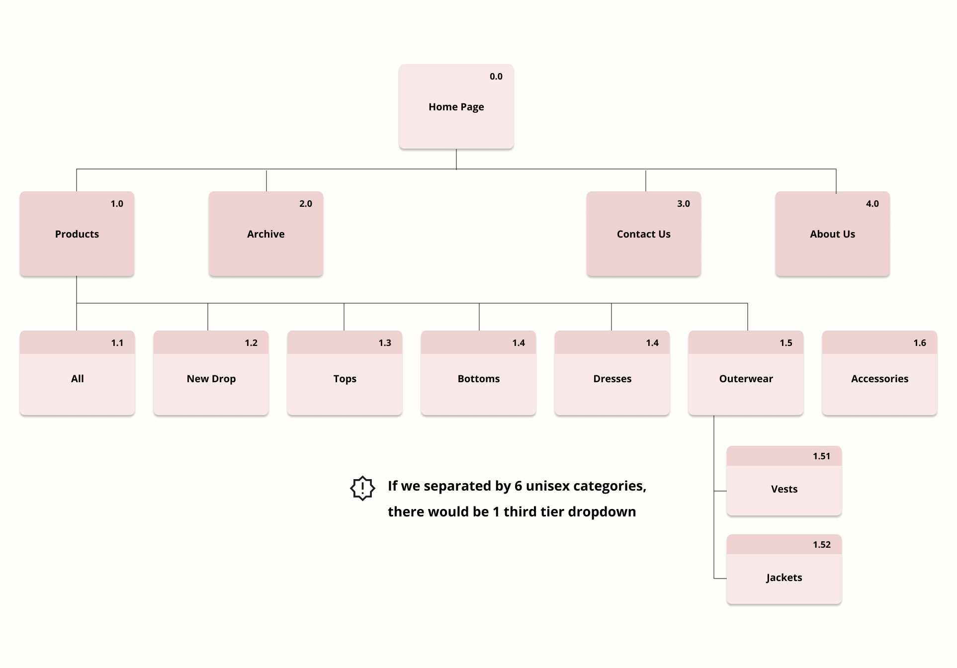
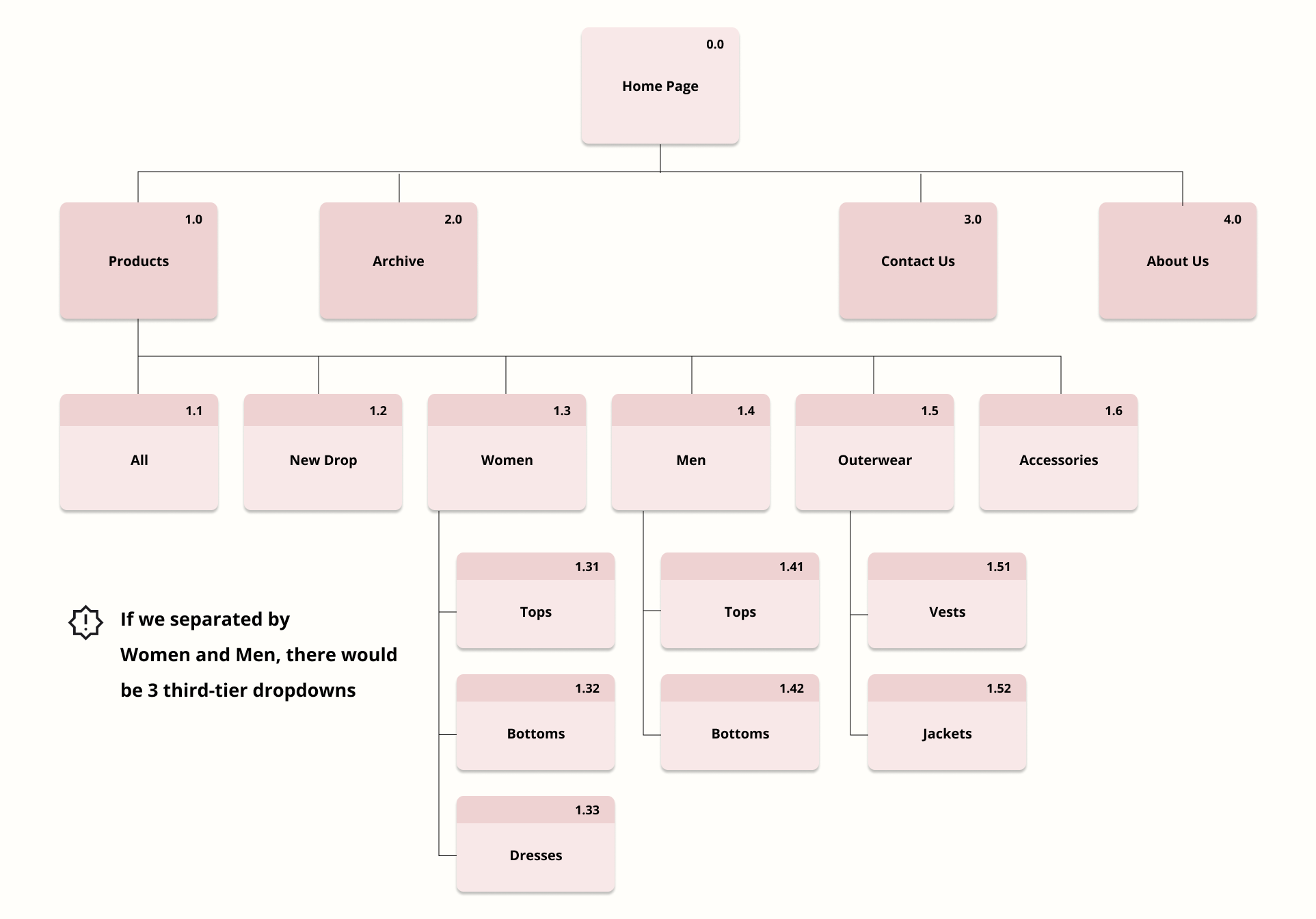
While 2/3 participants favored categorizing products as unisex, I recognized the viability of organizing by Women and Men, especially to place inside the side-by-side image on the home page, leading to the development of Option B. For Option A, I grouped items into five categories based on participants' preferences, with plans to include New Drop as a category for the dedicated New Drop page.
Site Map
I organized the categories from the card sort into two site map versions to plan the page layout before wireframing.
Branding
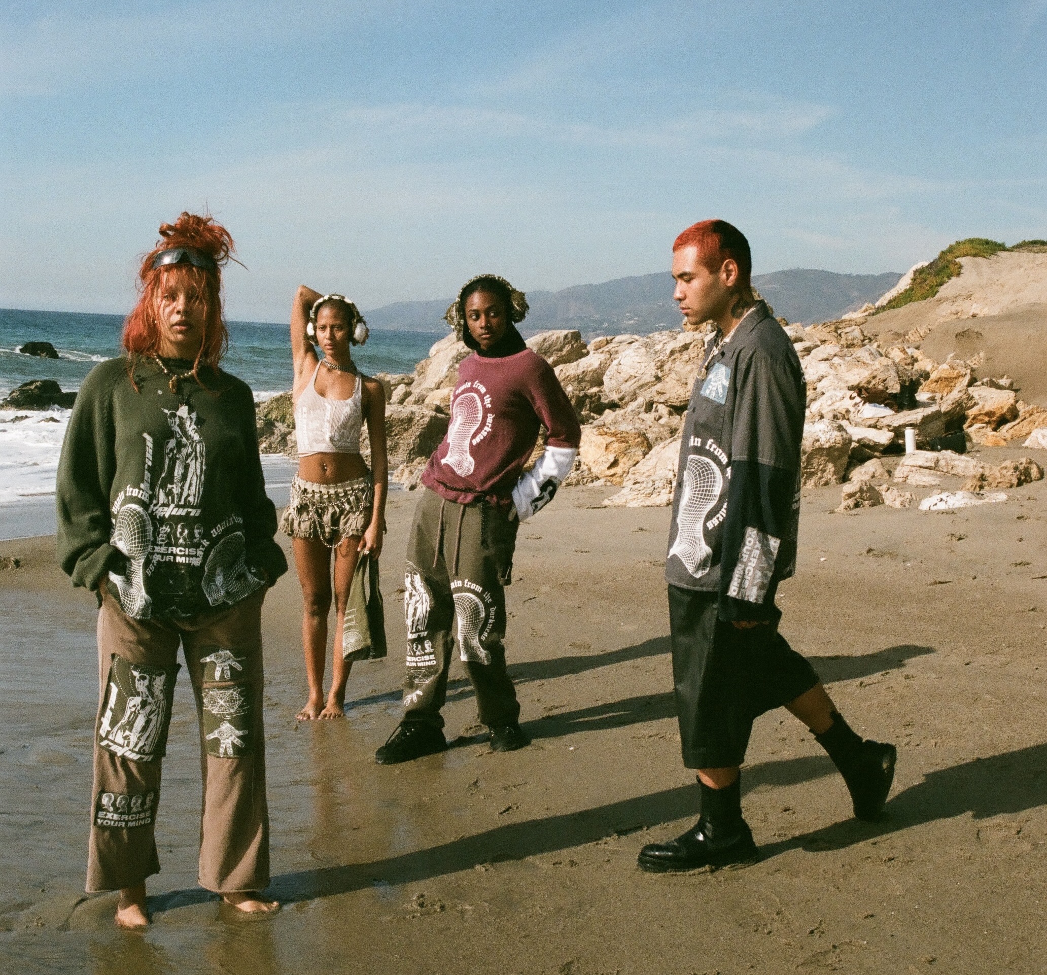
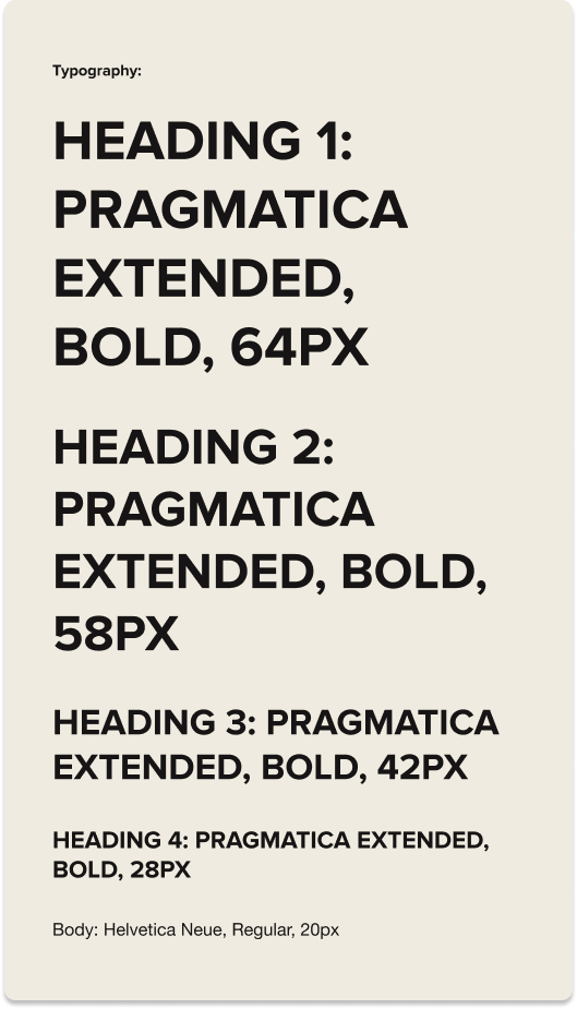
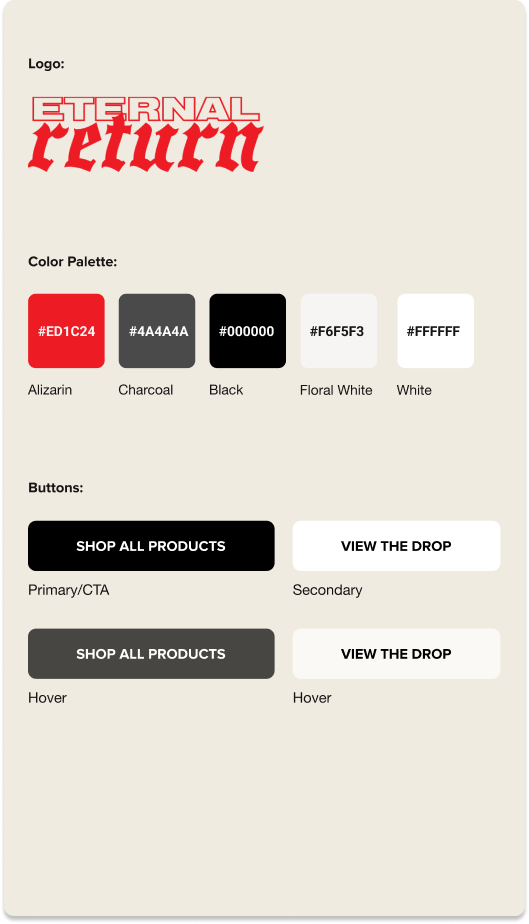
Utilizing the client's existing logo and color branding, I optimized the website with the Sans Serif fonts above to represent the bold and chic personality of Eternal Return. I kept the CTA's simple and we opted not to customize Squarespace's built-in UI kit for now due to time constraints.
Lo-Fi Wireframes
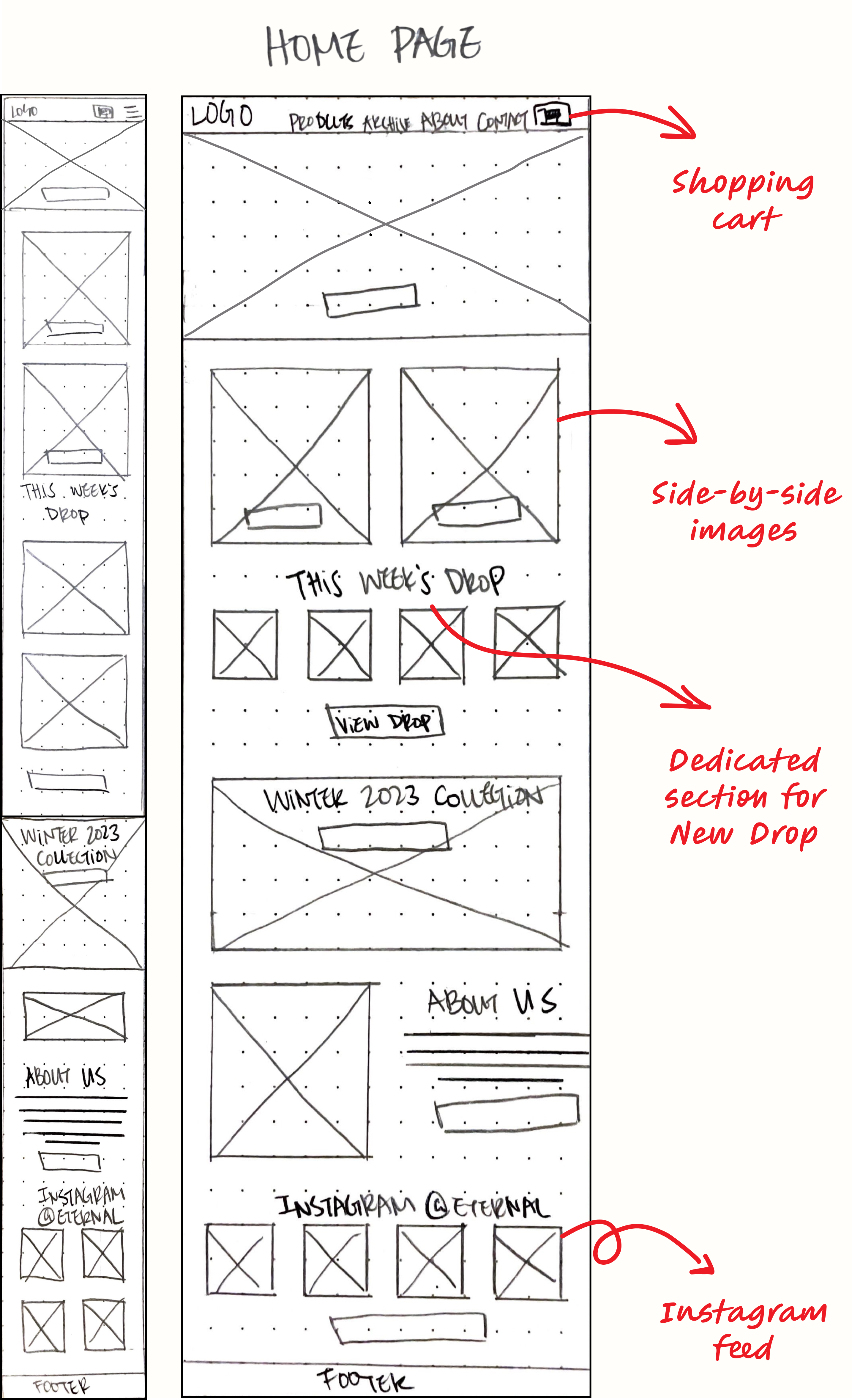
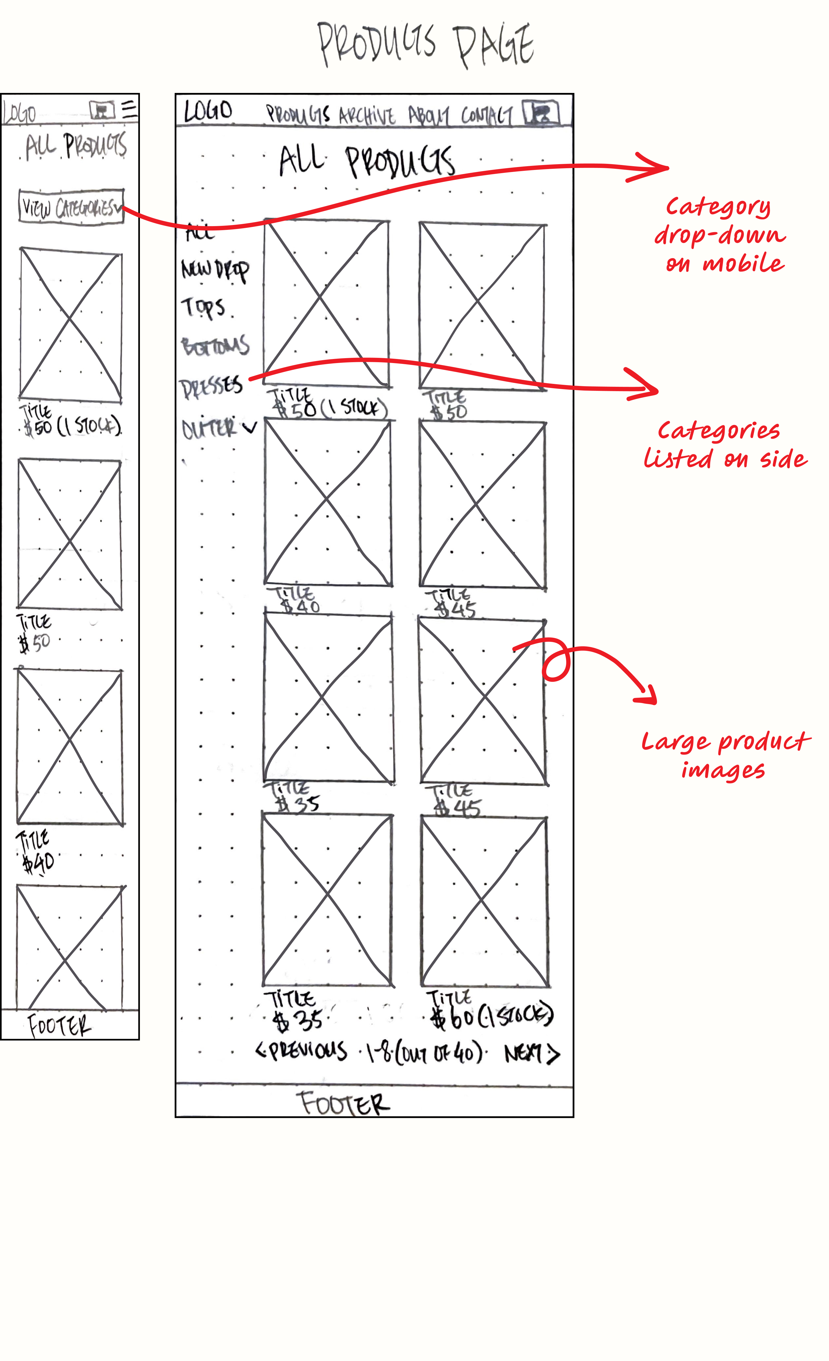
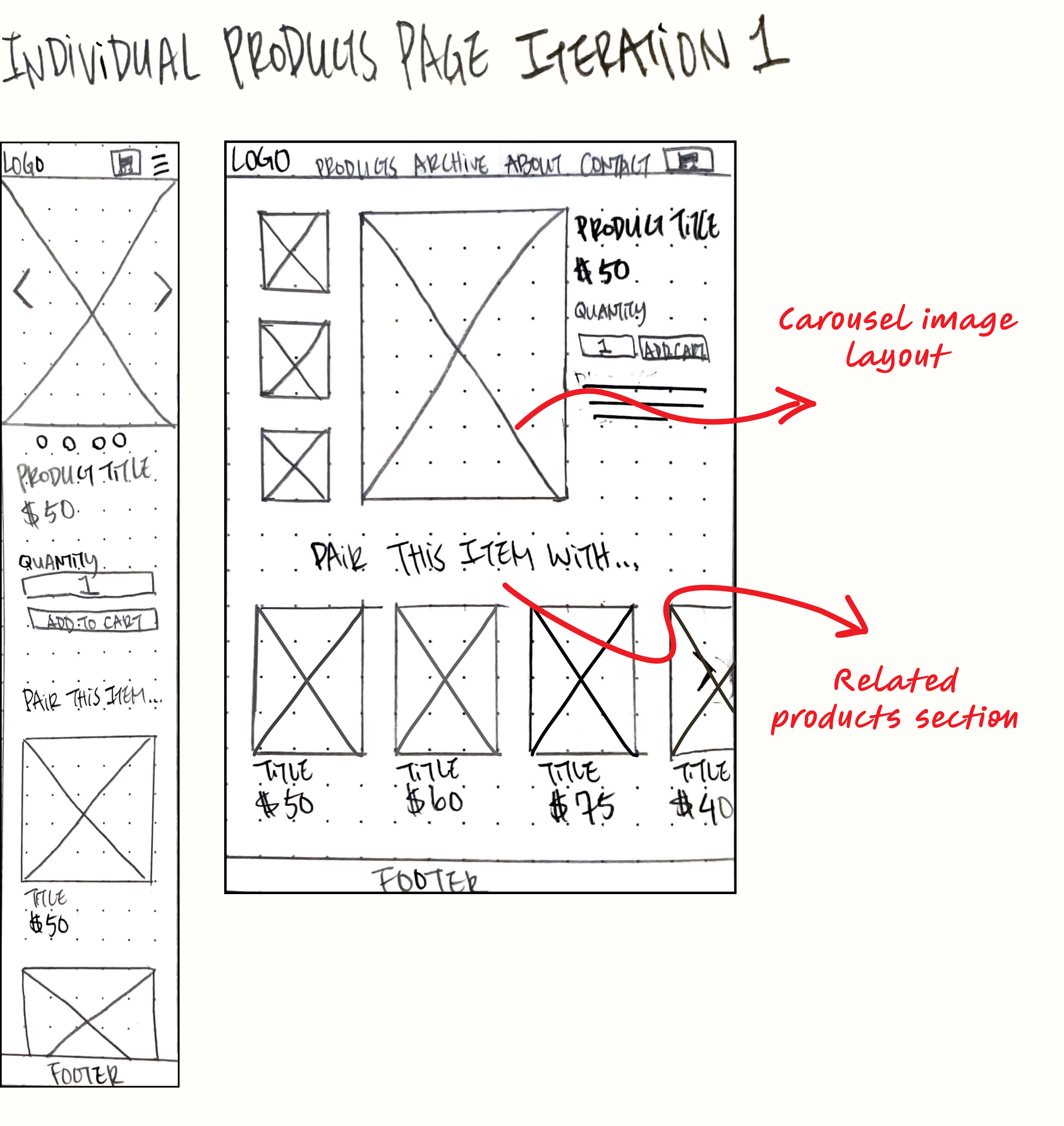
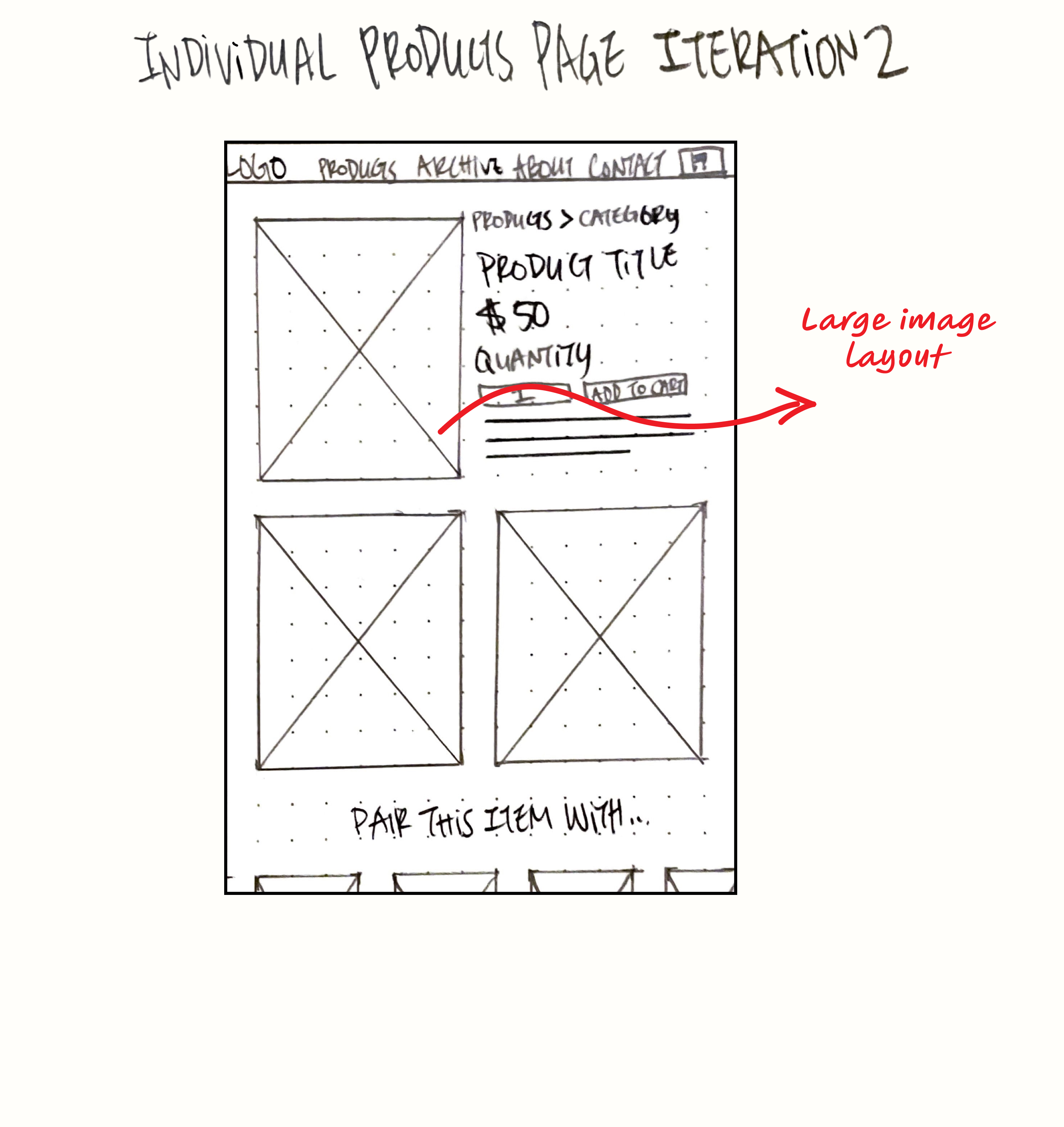
Combining the insights I got from competitor analysis, sitemap, and user flow, I sketched lo-fi wireframes to map out the layout for each section and page.
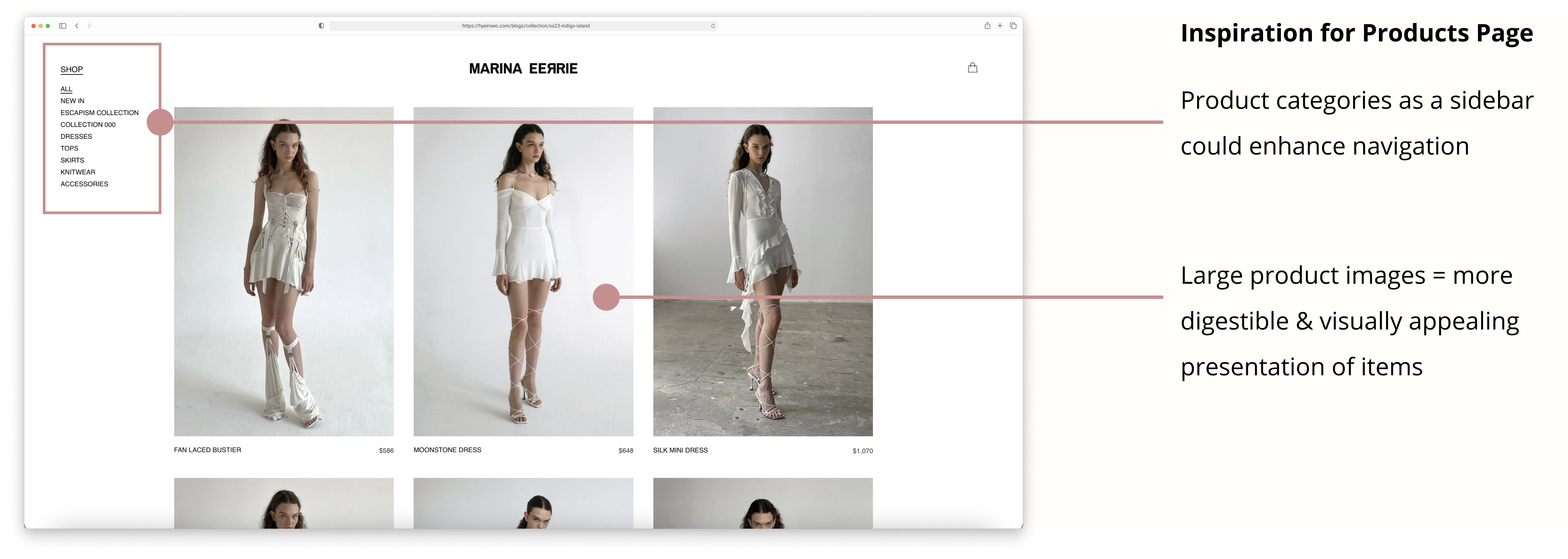
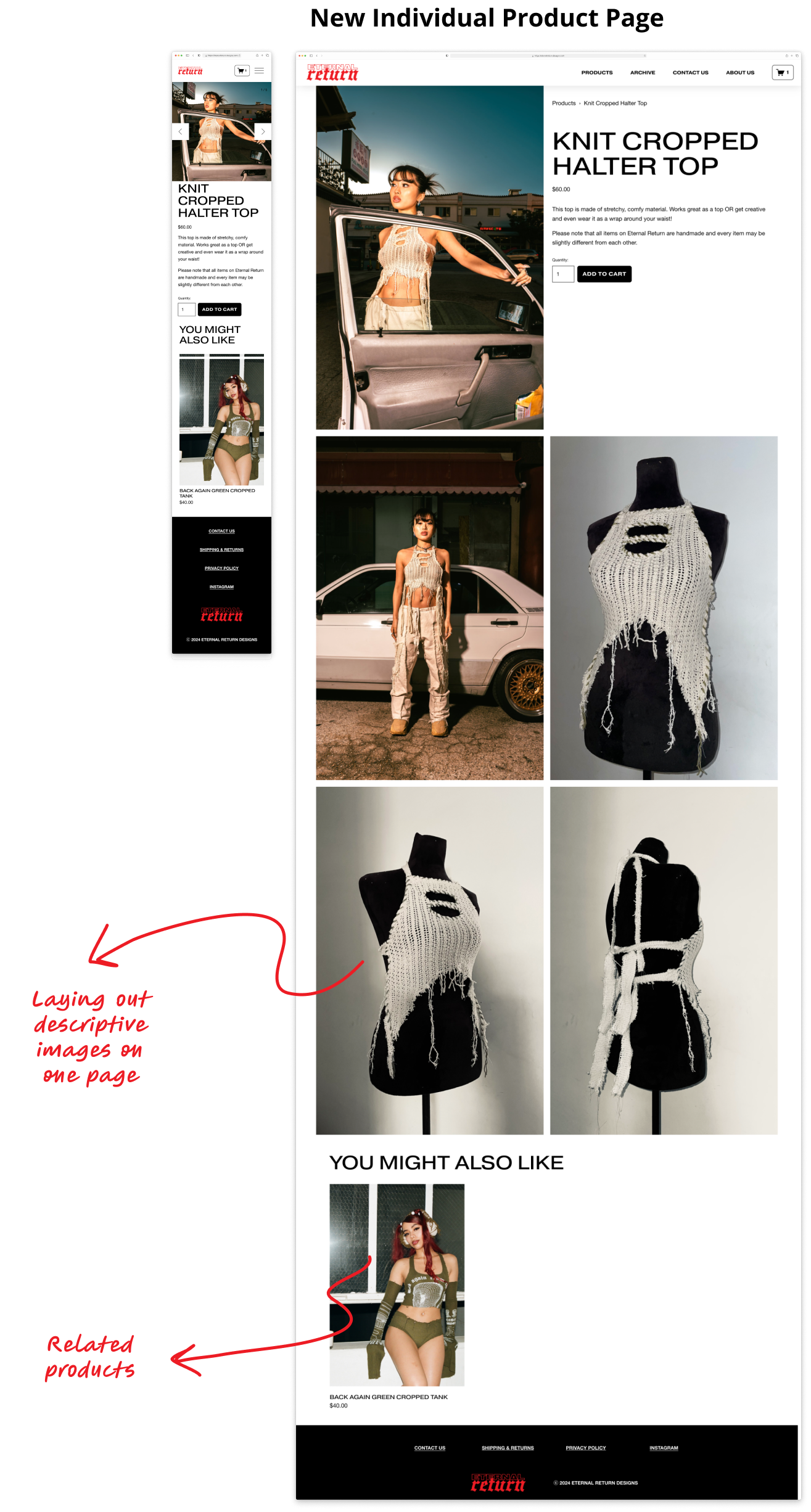
I first had a carousel layout for the product images on desktop view, but after checking its feasibility on Squarespace, I concluded that showcasing larger product images in a laid-out format better aligns with the goal of emphasizing product details and the overall branding strategy.
Challenges
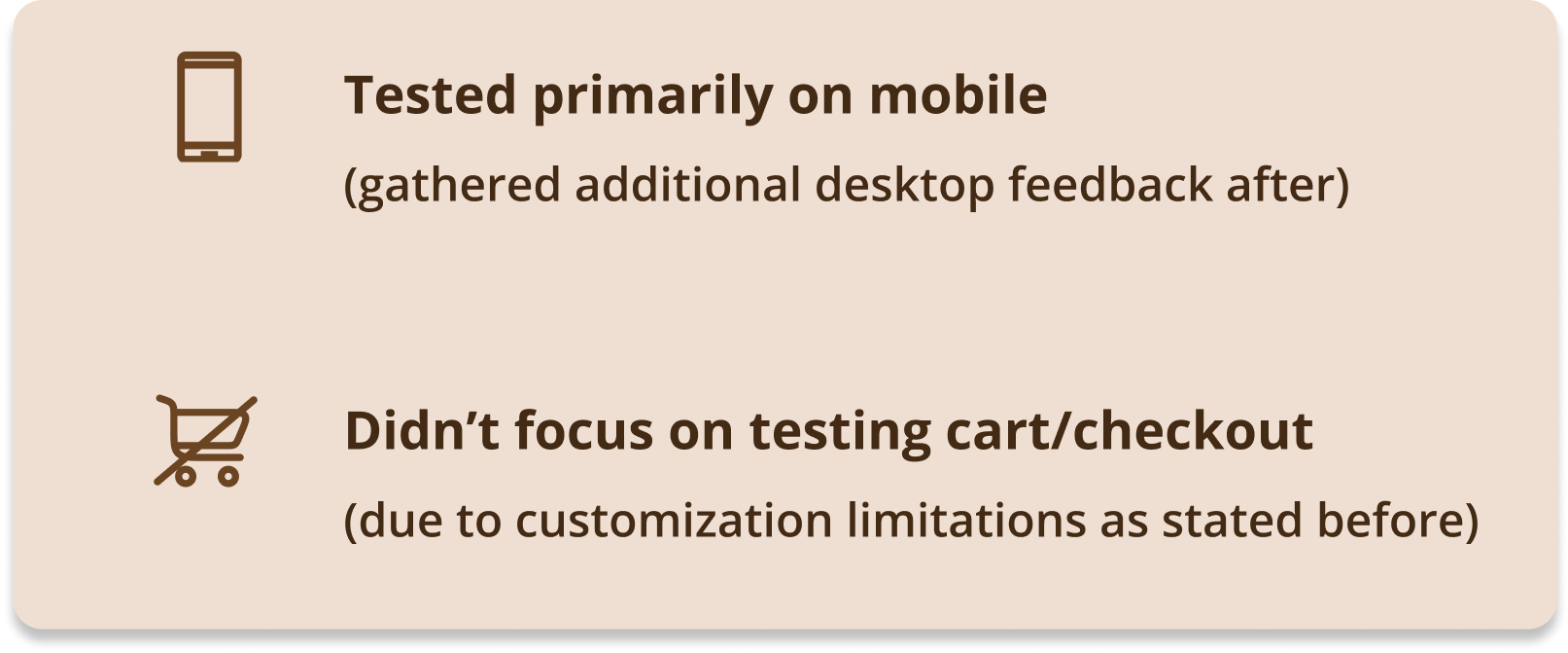
Knowing Squarespace's limitations in customization without coding, I had to build the wireframes while simultaneously checking the feasibility of my designs on the platform for efficiency. Most designs were customizable, except for certain elements like form layouts.
I deliberately skipped wireframing the checkout process for now, based on resource constraints and limitations on customization. Given its satisfactory functionality on Squarespace, we planned to make potential enhancements in the future.
I dove directly into building the hi-fi wireframes/prototype for About Us and Archive due to both being image-driven pages, which I will show in the next section.
Prototype
Next, I integrated UI elements to build the prototype. This process was efficient because I verified the feasibility of the designs on Squarespace during wireframing.
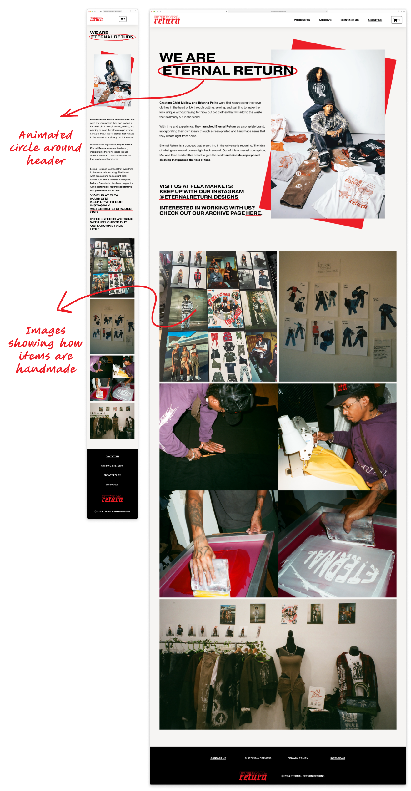
About Us Page
I included subtle interactive elements, like an animated circle around the header, to play into the fun nature of this page. I included images showcasing the founders' creative process to highlight the brand's handmade essence and to compliment the description of the brand's values.
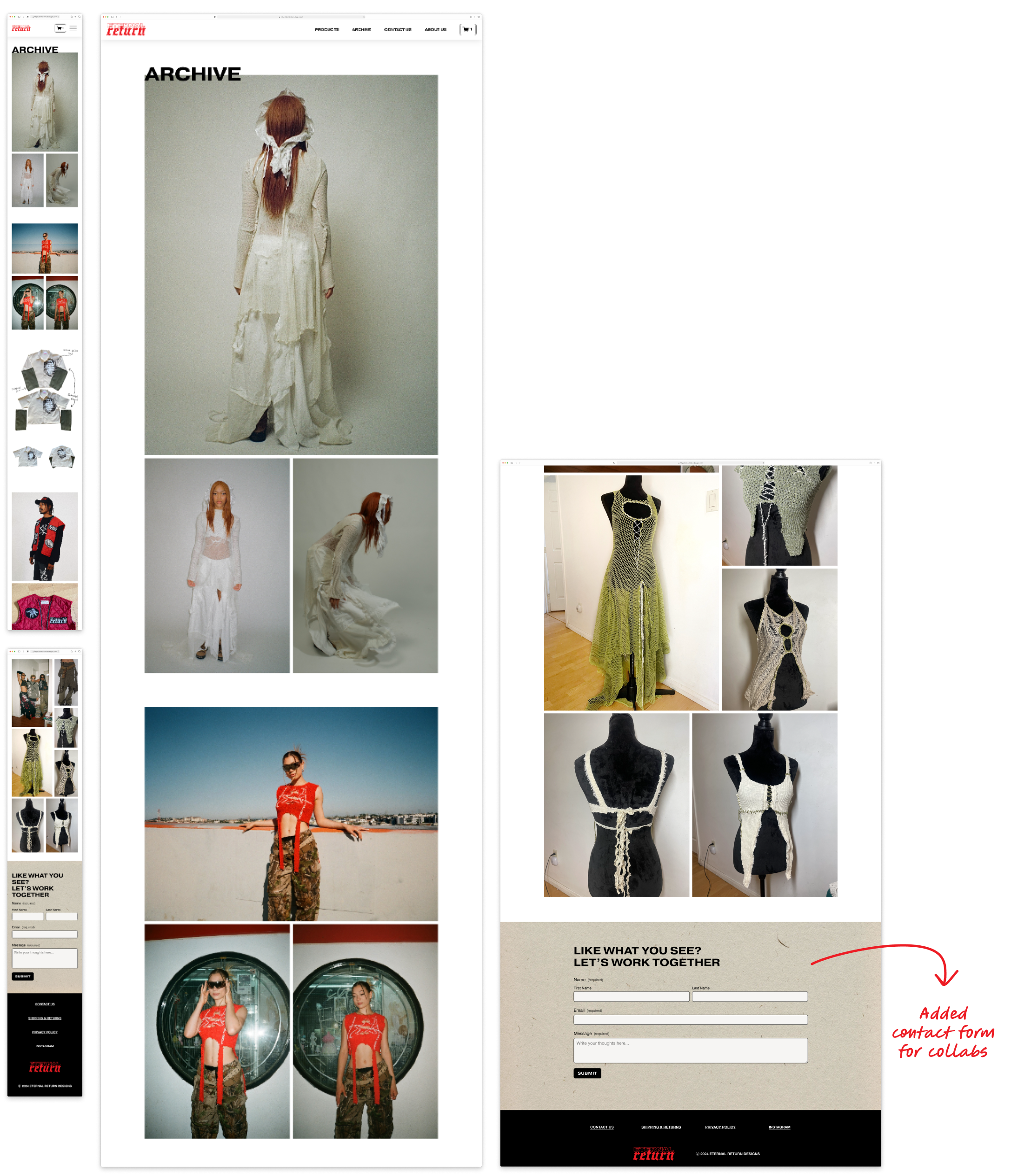
Archive Page
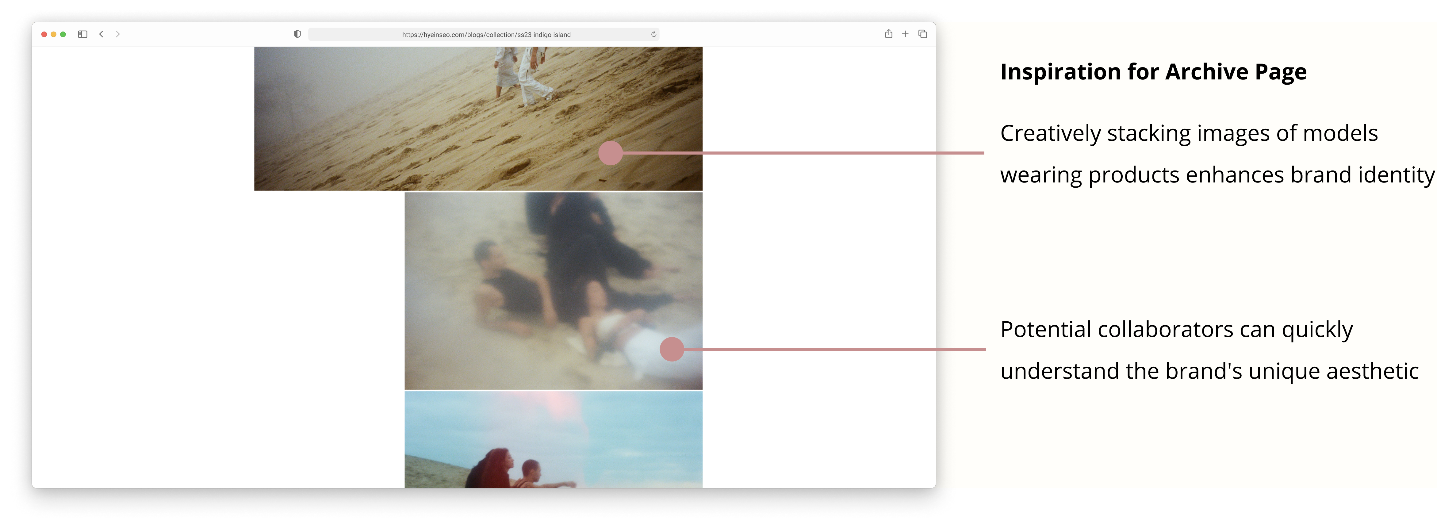
To provide a quick understanding of Eternal Return's fashion style and creations for potential collaborators, I creatively stacked various pieces made by the brand. I also strategically placed a contact form at the end, so that interested collaborators could reach out easily.
Challenges
Designing the Archive page was the most challenging, given the amount of images I had to sort through. I had to carefully curate images that embodied Eternal Return's style while creating an aesthetically pleasing layout.
Home Page
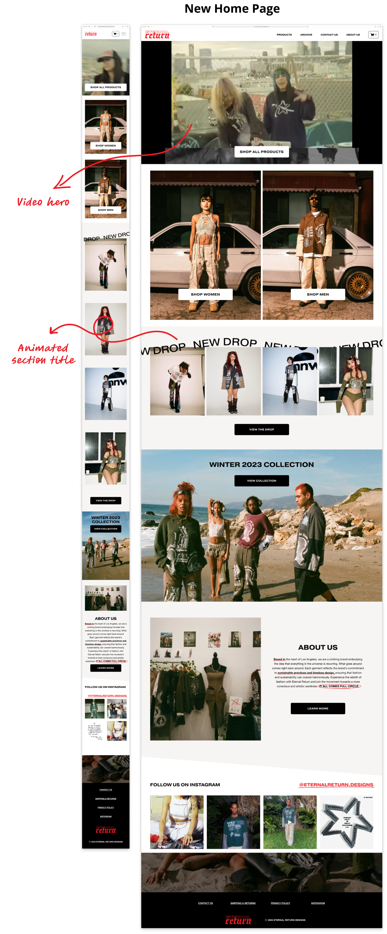
I elevated my lo-fi wireframes by introducing a video hero section and animating the title for the New Drops section. I included red accents and consistent image filters to vividly convey the brand's ambiance and values, enhance the page's context compared to the original design.
Navigation Bar
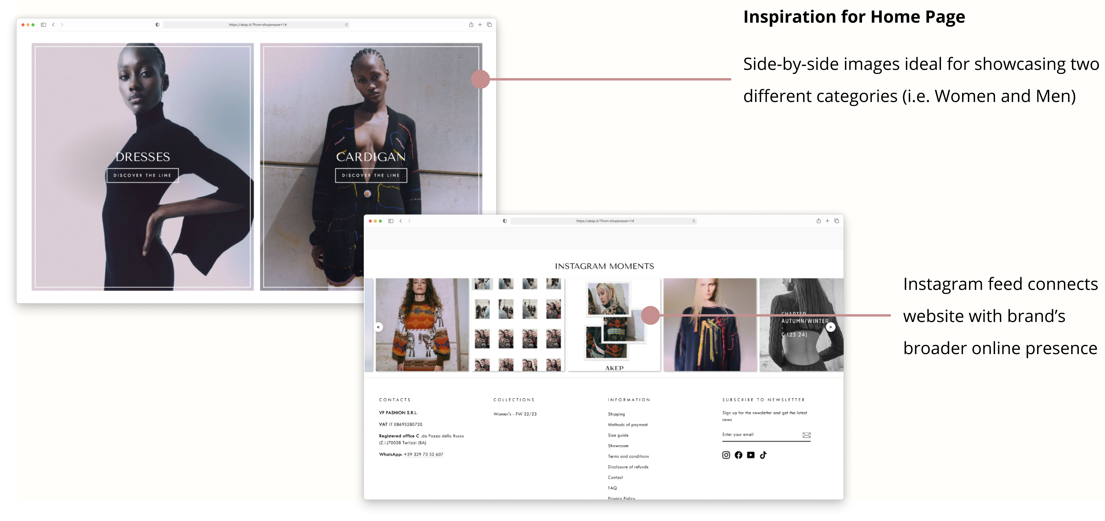
The side-by-side images (just below the hero in the home page) were optimal for introducing the "Shop Women" and "Shop Men" sections. After discussion with the founders, we decided to proceed with categorizing products based on gender.
The categories were refined to be:
- Women: Crop Tops, Bottoms, and Dresses
- Men: Button-Ups, Bottoms
- Outerwear
- Accessories
Products Page
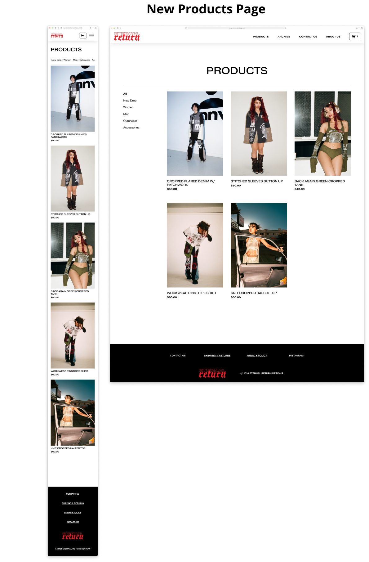
I integrated images of people wearing each product to accurately express the styling and fashion sense of Eternal Return.
Individual Product Page
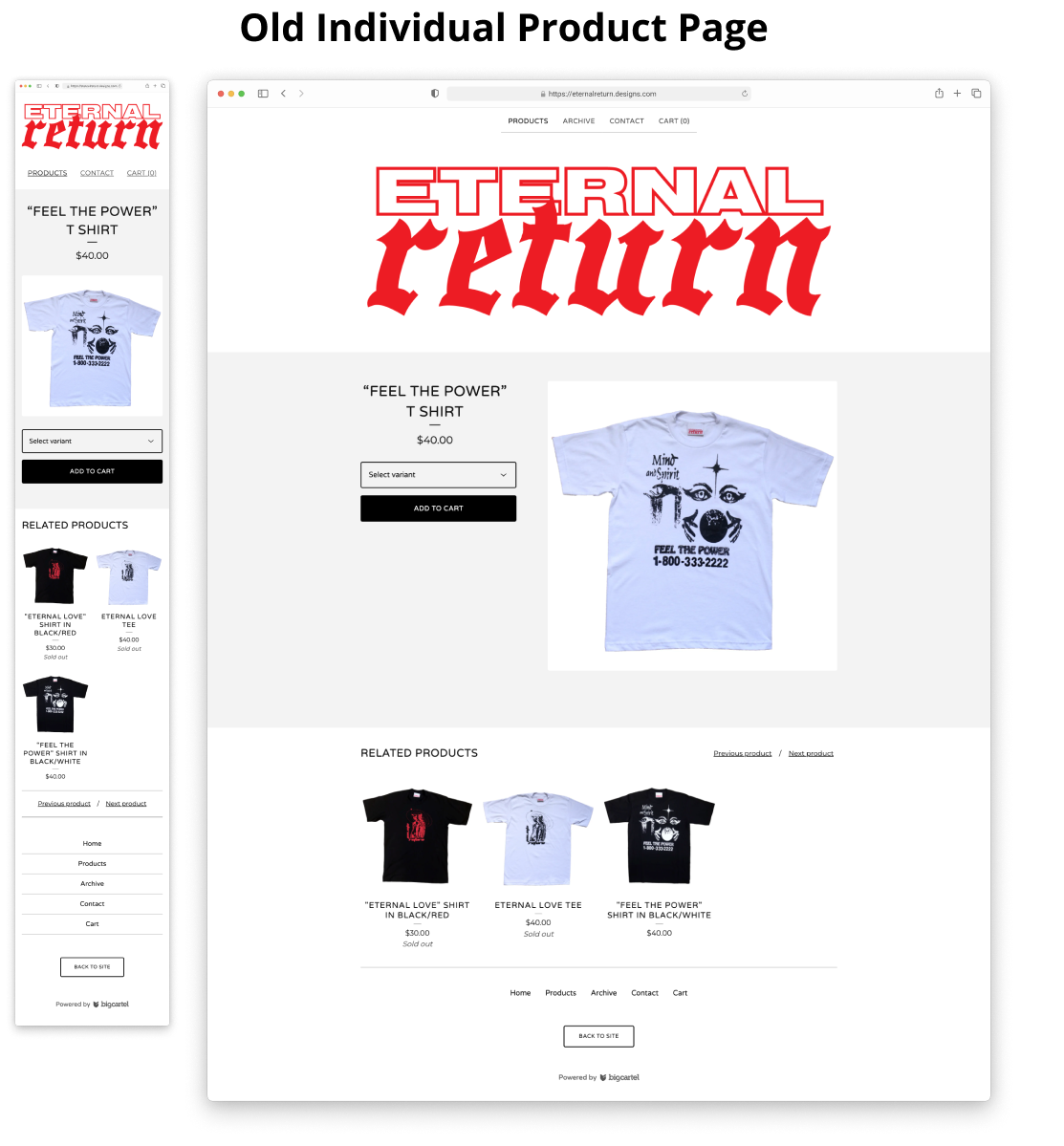
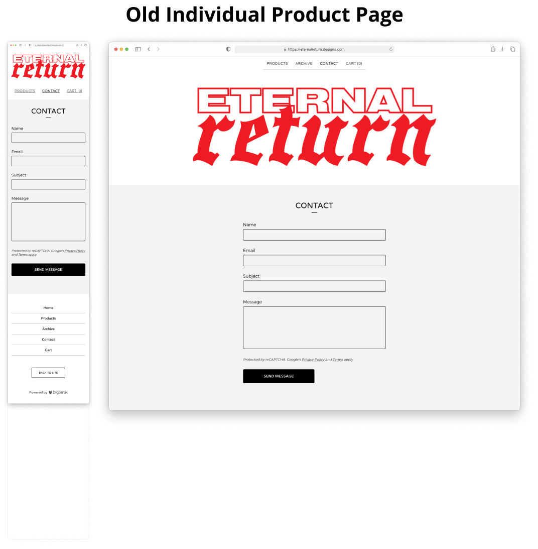
I improved product presentation by including more descriptive images with different angles, a notable improvement from the original page.
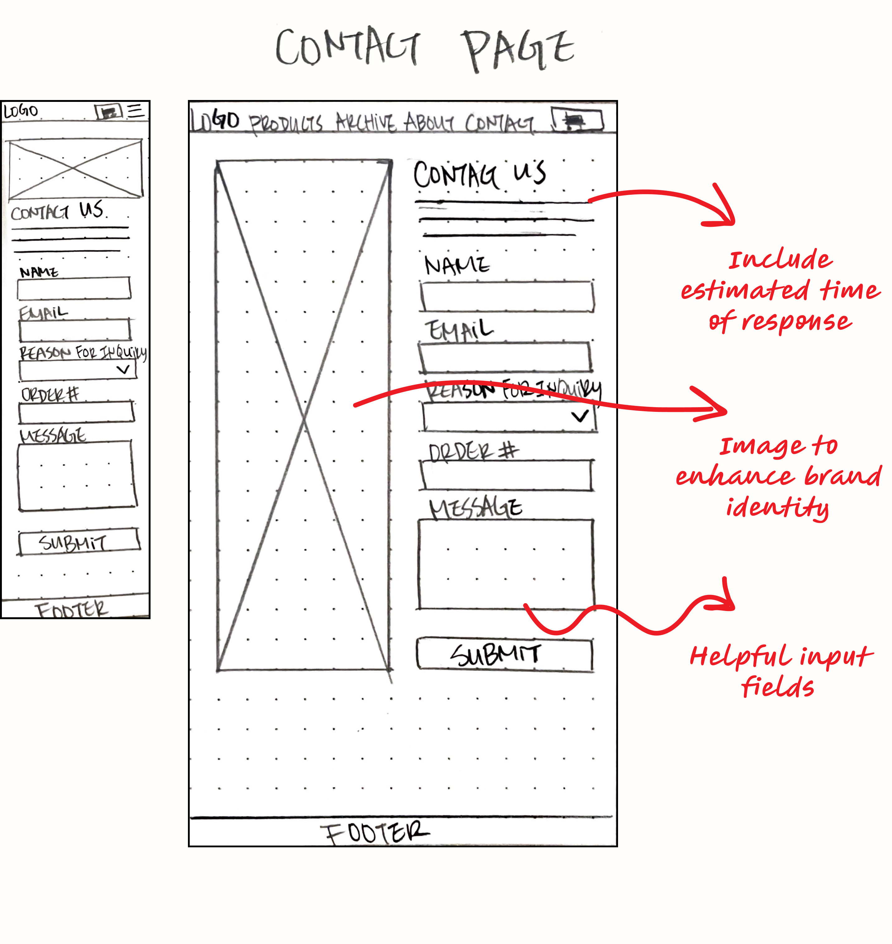
Contact Us Page
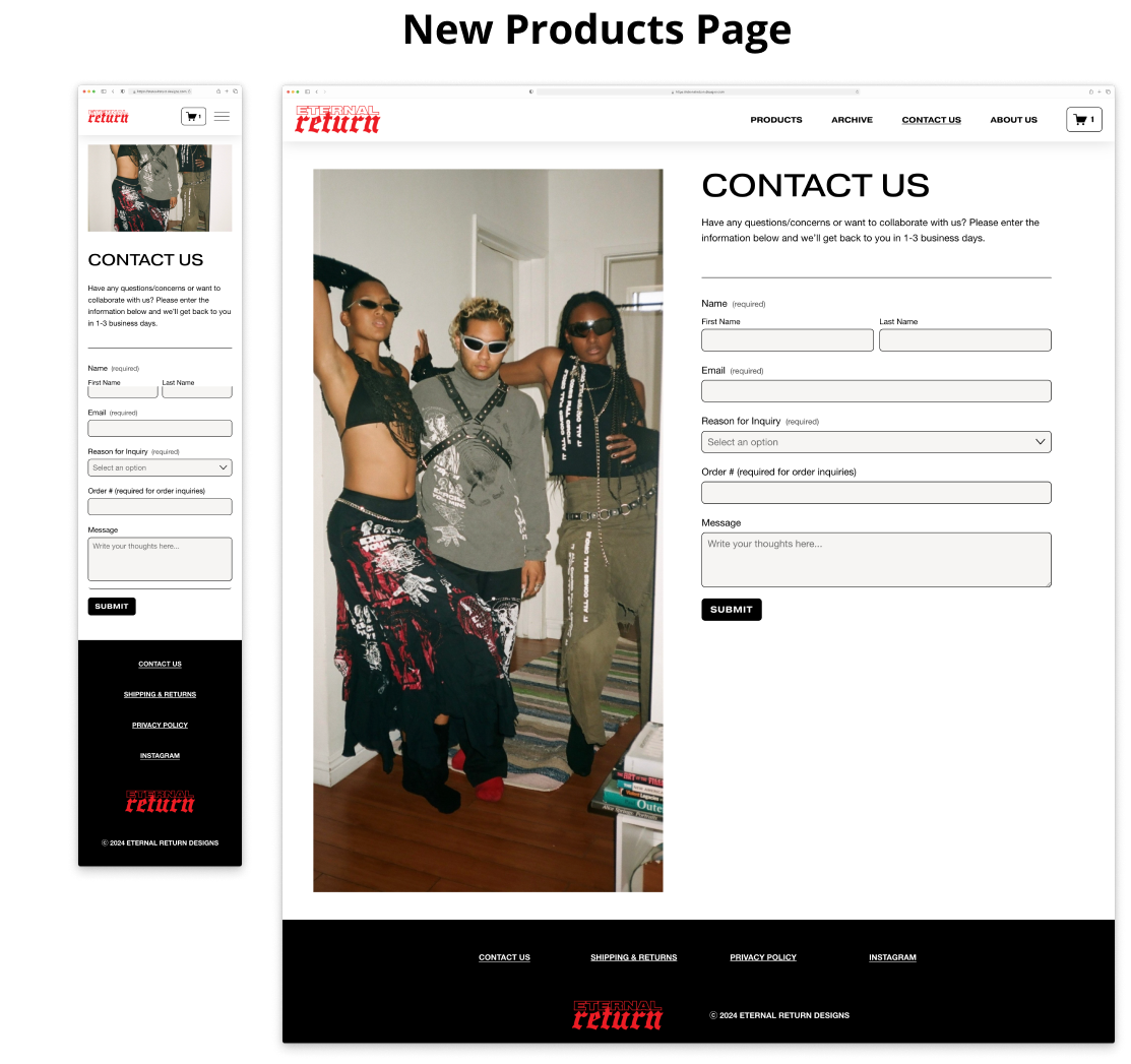
I continued the lo-fi wireframe strategy. Additionally, I included an image to maintain strong branding.
Priority Matrix
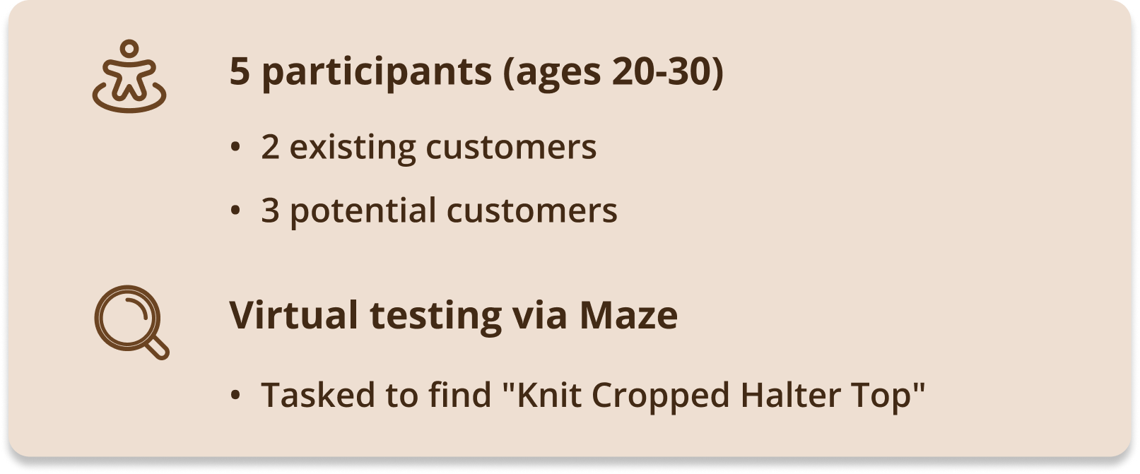
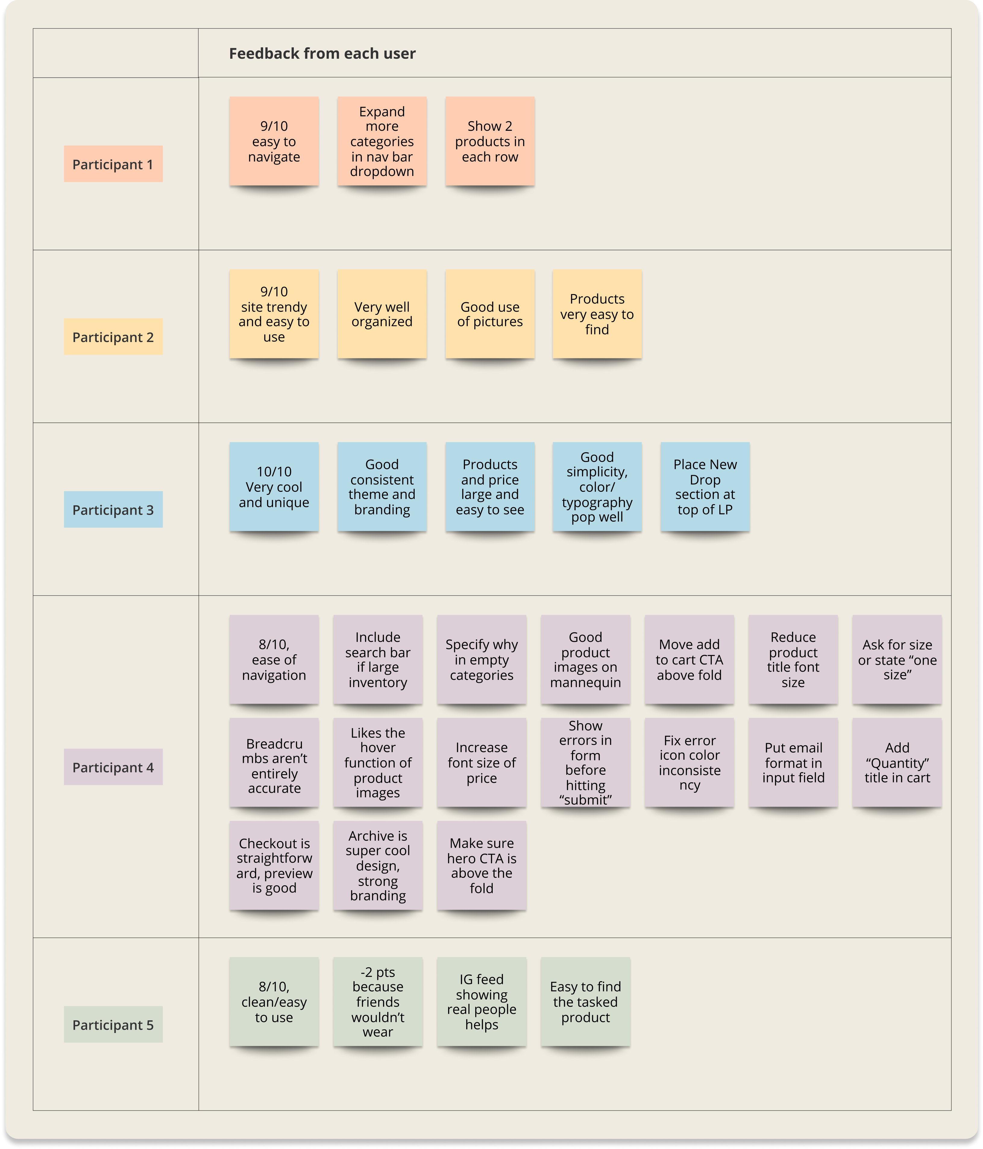
The majority of participant feedback was positive, with most rating the site higher than 8/10. Those who rated it 8/10 noted they personally wouldn't wear Eternal Return's clothing. Most suggested changes were minor.
Findings
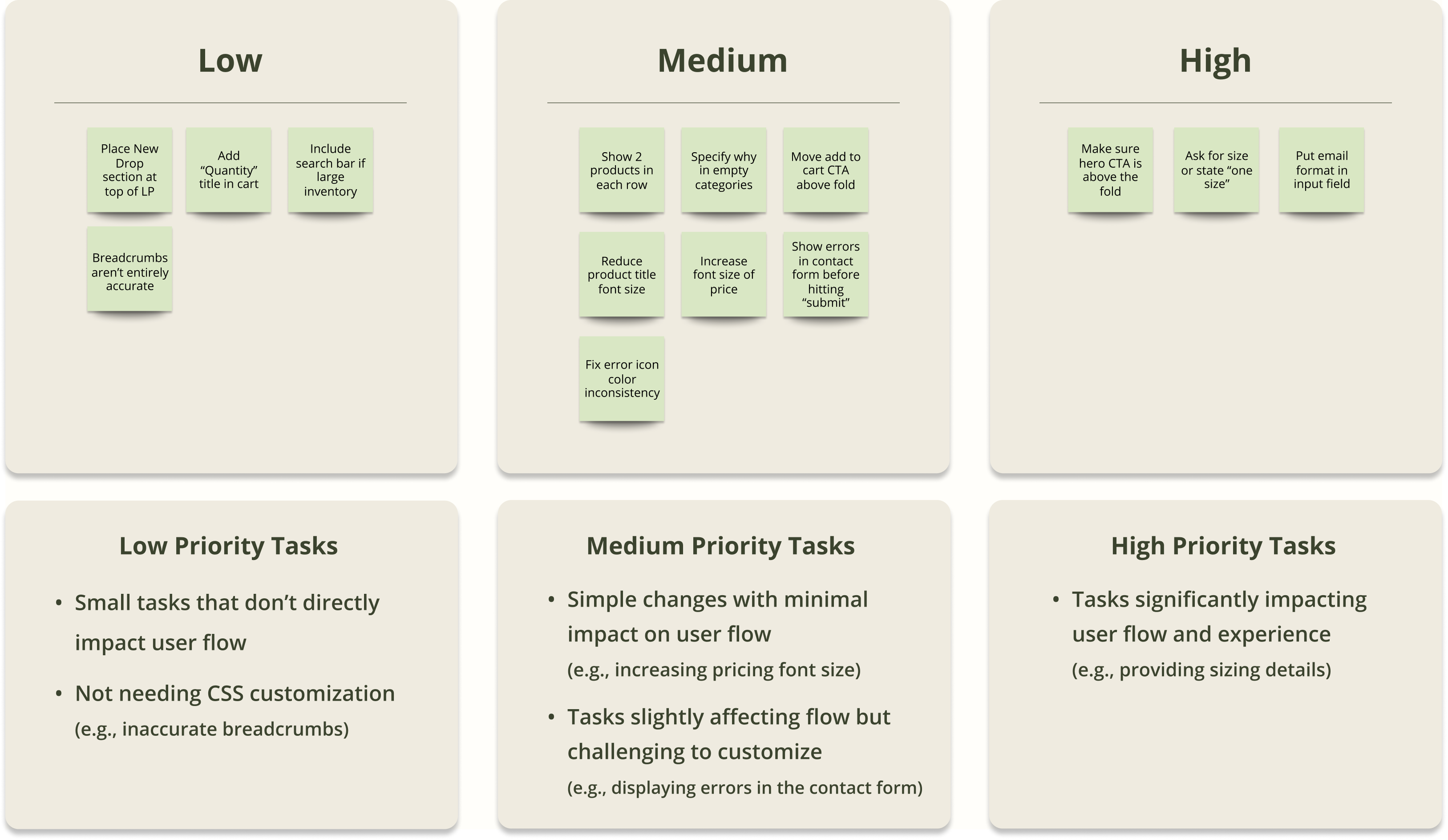
I organized the feedback into tasks and prioritized them accordingly.
Design Improvements
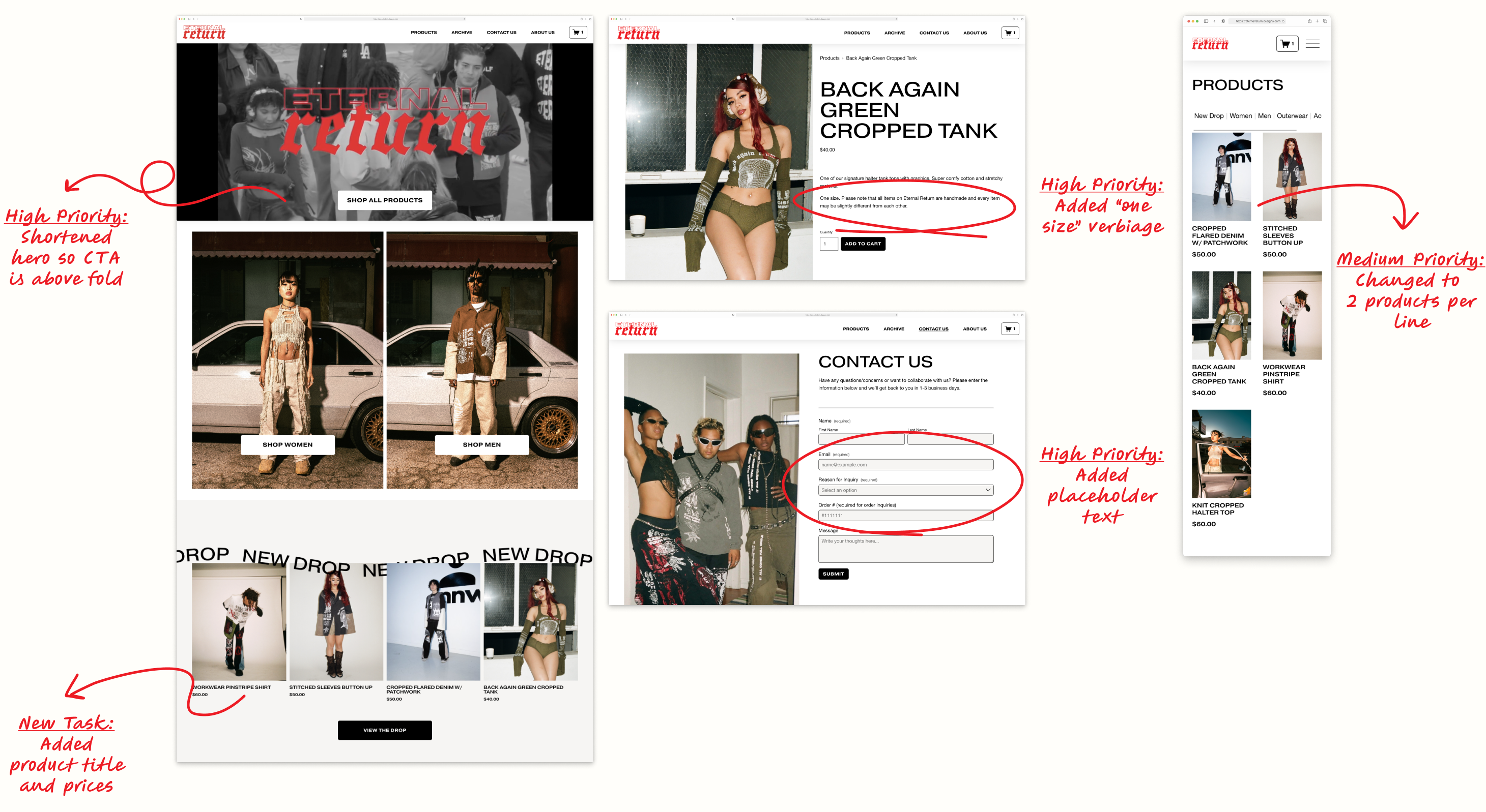
I successfully completed all high-priority tasks and added product titles/prices to the New Drop section as a new task. However, a Squarespace bug on individual product pages hindered progress on most medium-priority tasks. We are currently finding a work-around solution to proceed with these changes.
Statistical Results & Impact
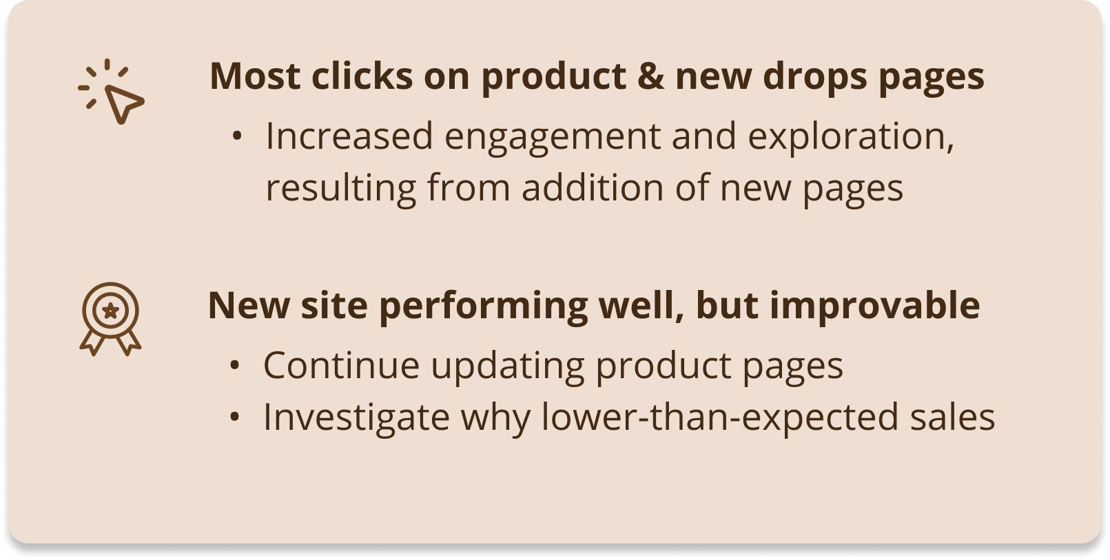
After tracking the new site performance for a month on Google Analytics, we saw a 94% increase in visitors and higher engagement, especially on the product pages—a clear improvement over the previous one-page site. Purchases increased from 0 to 3, though lower than expected. This could be due to limited visibility (the brand is small and only promoted via Instagram with no SEO or social media campaigns) or because users still prefer in-person shopping. To boost sales, we could focus on building trust with customer reviews, discounts, and return policies. Overall, we’re seeing positive results, and further testing and iterations could help lead to greater improvements in sales.
Reflection
What I Learned
Streamlining the Design Process for Efficiency 
Due to the client's 1.5-month timeframe and uncertainty about Squarespace's customization capabilities, I streamlined the process by omitting steps I deemed unnecessary. For example, I skipped lo-fi wireframing and dove into building the image-heavy archive page on Squarespace to assess feasibility and to avoid duplicative work. This efficient approach enabled me to complete the initial design-building process in just a week and a half.
Customizing with CSS 
Since the client lacked resources for a developer, I took on the entire site development. I was pleasantly surprised by Squarespace's improved intuitiveness, now featuring drag-and-drop grid features. For additional customizations, I referenced CSS codes from forums, implementing changes like adjusting the product title/price font and modifying the nav menu hover colors and spacing. I found the process of learning CSS enjoyable, and I am determined to dive deeper into its utilization for future projects.
Next Steps 
Our plan is to conduct additional usability tests to identify and address possible pain points and discover how we can further improve sales. We intend to conduct tests on the checkout process in the future as well. Moving forward, we aim to update the site bi-weekly with new item drops.
More Case Studies
Viasat Competitor SiteSatellite Internet Website
Spectrum Internet RedesignInternet Website
T-Mobile Deals RedesignWireless Phone Website
Thanks for stopping by. Let's work together!
I'm always open to getting to know you! If you're interested in working with me, just want to say what's up, or you're a fellow dog mom wanting to connect, please feel free to message me!

