Transforming a fragmented 300+ page platform into a scalable, engineering-aligned design system.

overview
Savings is a 16-year-old affiliate platform supporting 300+ brands across 27 templates and 300+ pages, driving approximately $3.5M in annual profitability. During a company-wide rebrand, our team needed to redesign the entire site. However, Savings did not have an existing design system or centralized source of truth.
I led the creation of a scalable, engineering-aligned design system to support the rebrand and future growth. Working closely with engineering, I implemented a token-based system and documented components to ensure consistency across paid and organic domains. By leveraging AI tools to accelerate token creation in Figma, I reduced tokens structure build time by ~50% and helped improve projected development time by ~20%.
+50%
+20%
project timeline
6 Months
team
Myself (Designer)
Khris K. (Developer)
Yanush C. (Developer)
my design skills in focus
Leveraging AI Tools
Design Systems Architecture
Cross-Functional Collaboration
Systems Thinking
the problem
A sixteen-year-old site built without a system
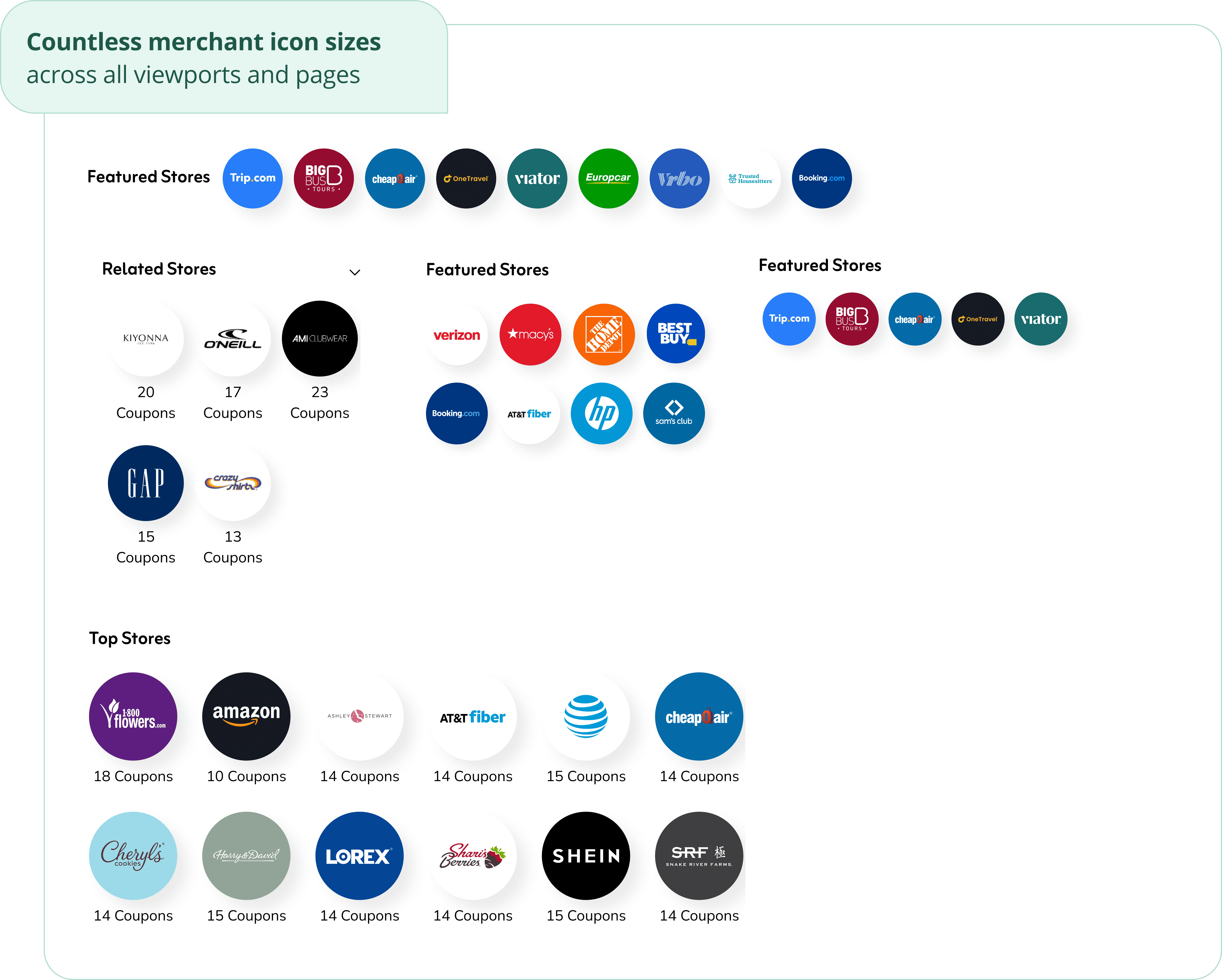
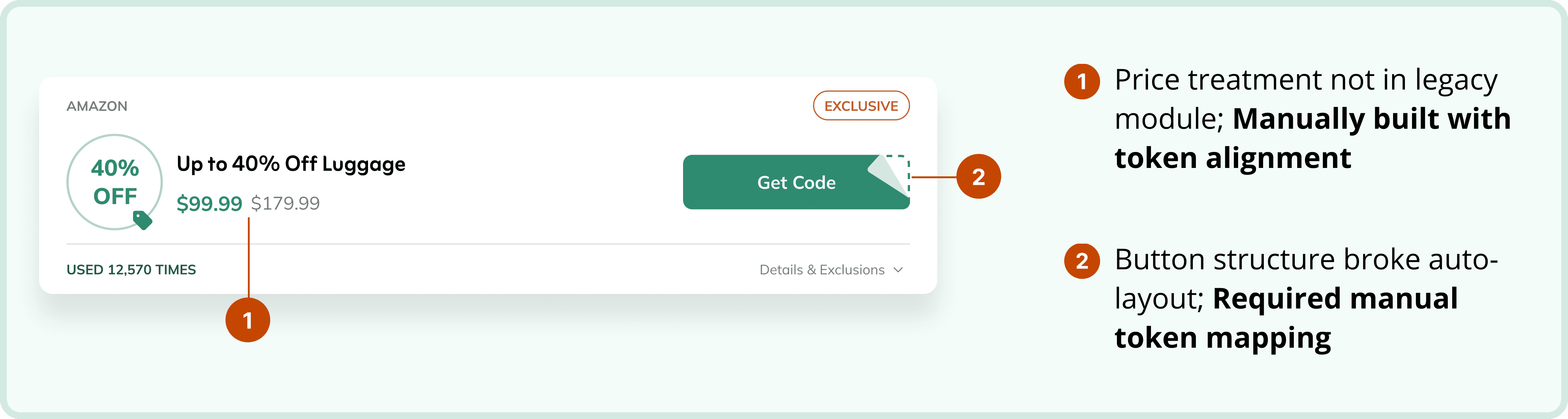
Through a site-wide audit, I found significant inconsistencies across key UI elements, particularly buttons and merchant icons. Some button styles were not brand-compliant, and similar components appeared differently across pages. These issues traced back to a core problem: Savings had no design system, no shared mocks, and no centralized source of truth, making it difficult to scale design consistently across a 300+ page platform.

system architecture
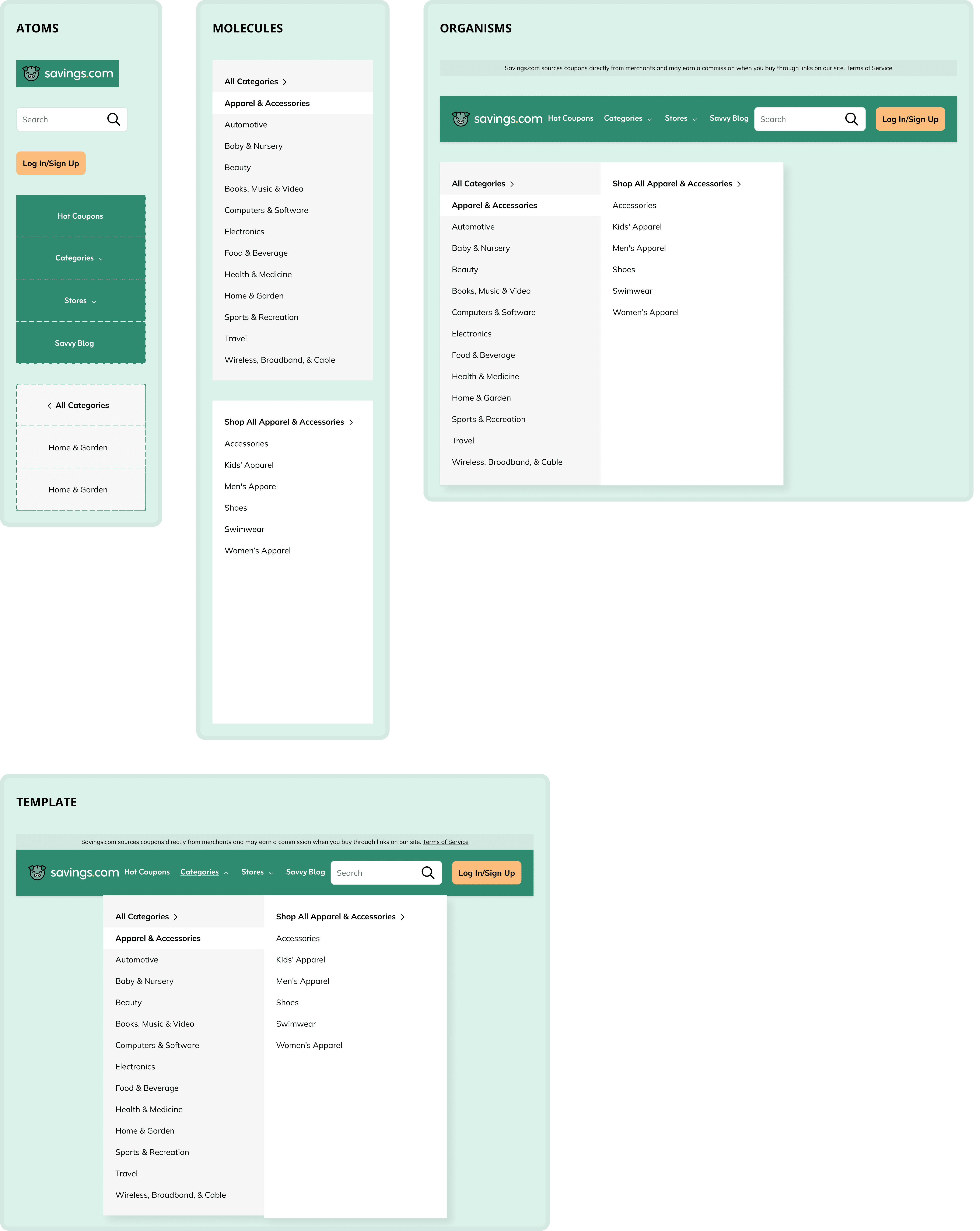
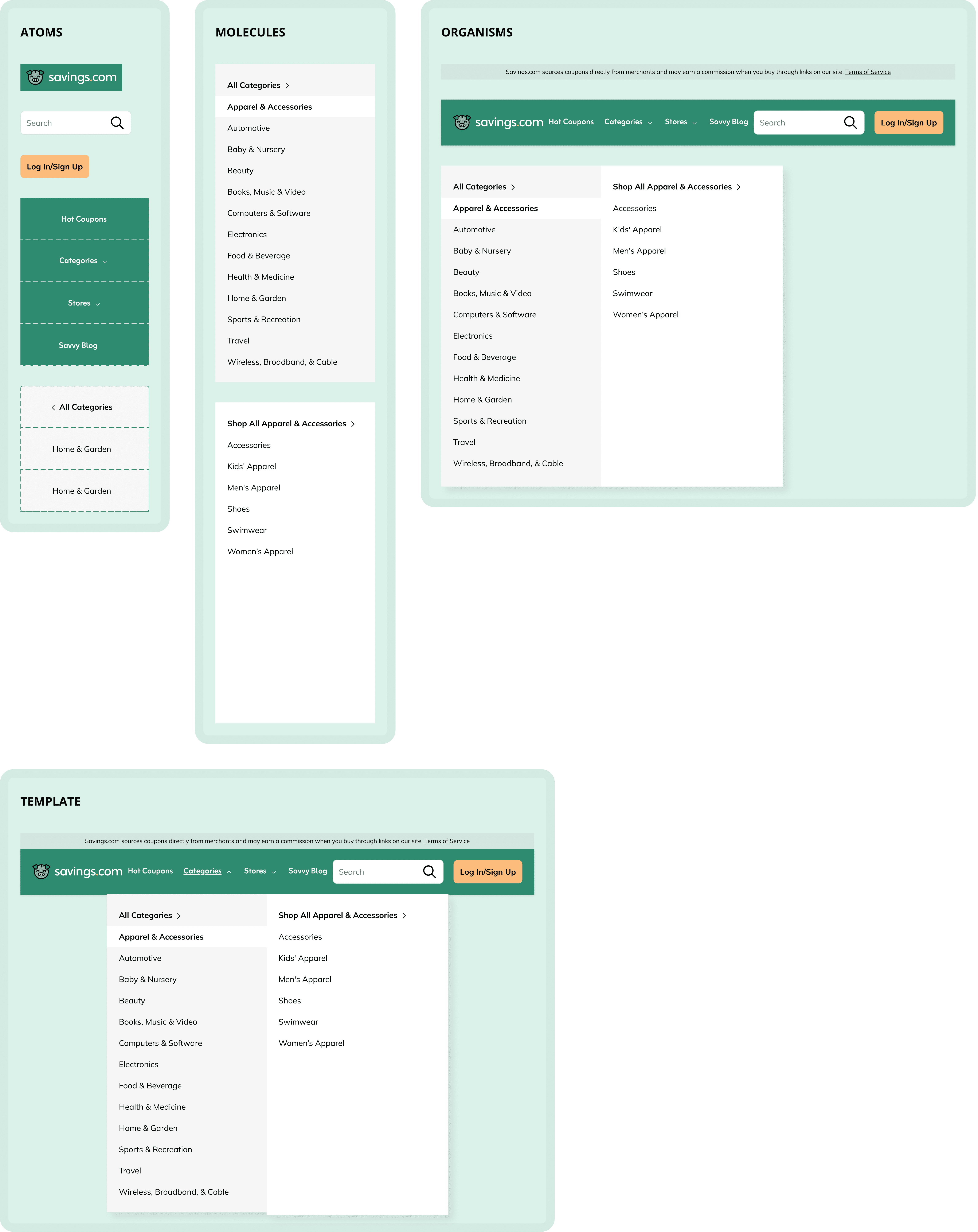
Building from the atomic level
To create clarity and scalability, I organized components using an atomic structure. I separated foundational elements from composed modules to ensure reusability and consistency across the system.
token structure
Developing a scalable token system with AI-assisted workflows
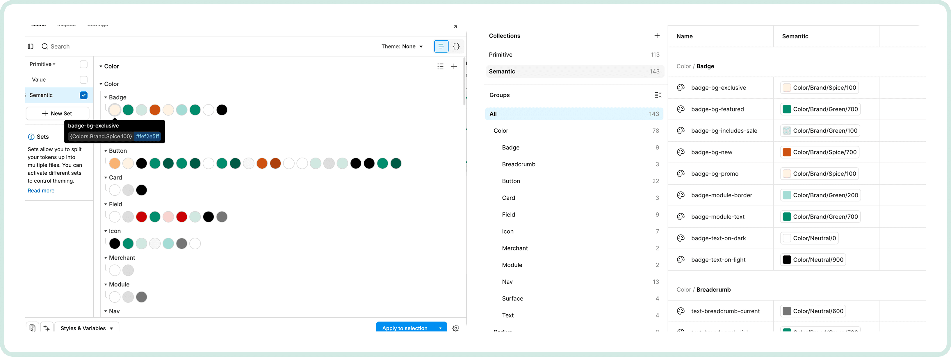
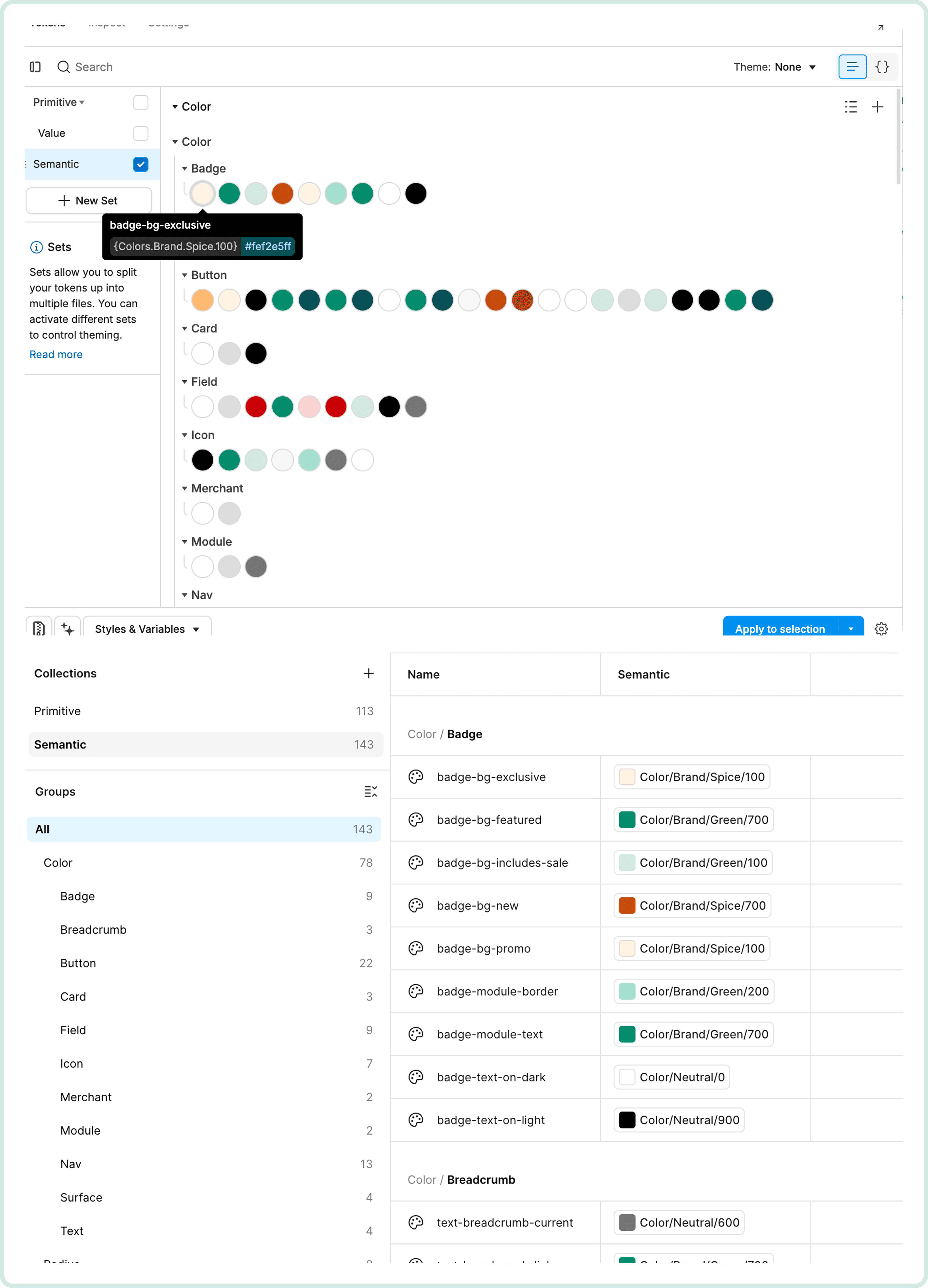
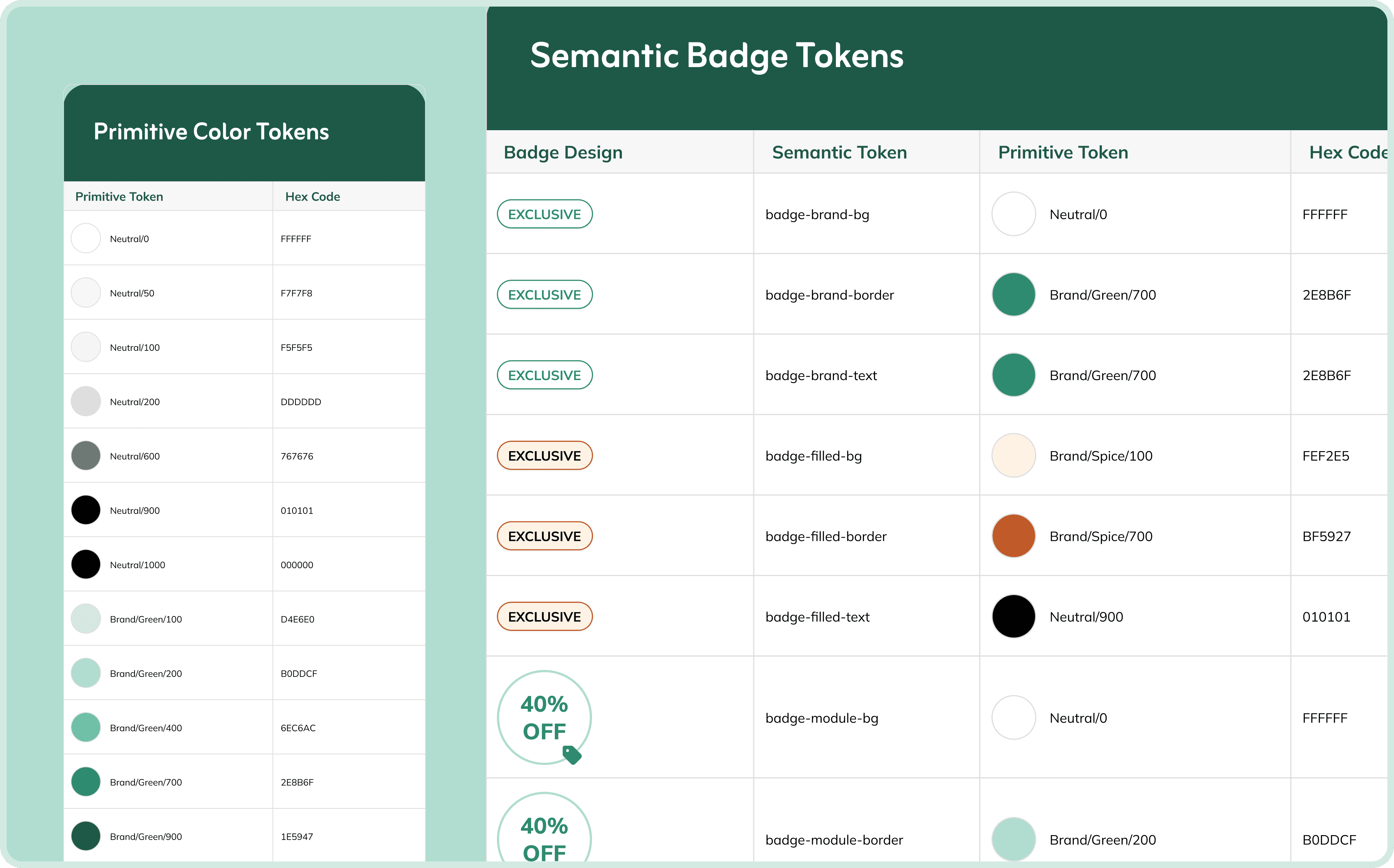
After defining core components, I rebuilt the design library using a structured token architecture, separating primitive tokens (raw values) from semantic tokens (contextual usage). To speed up setup without losing clarity, I leveraged AI tools to generate and validate token naming conventions, exporting structured JSON files that could be imported directly into Figma Variables. This approach reduced manual configuration time while ensuring a scalable, engineering-aligned foundation.
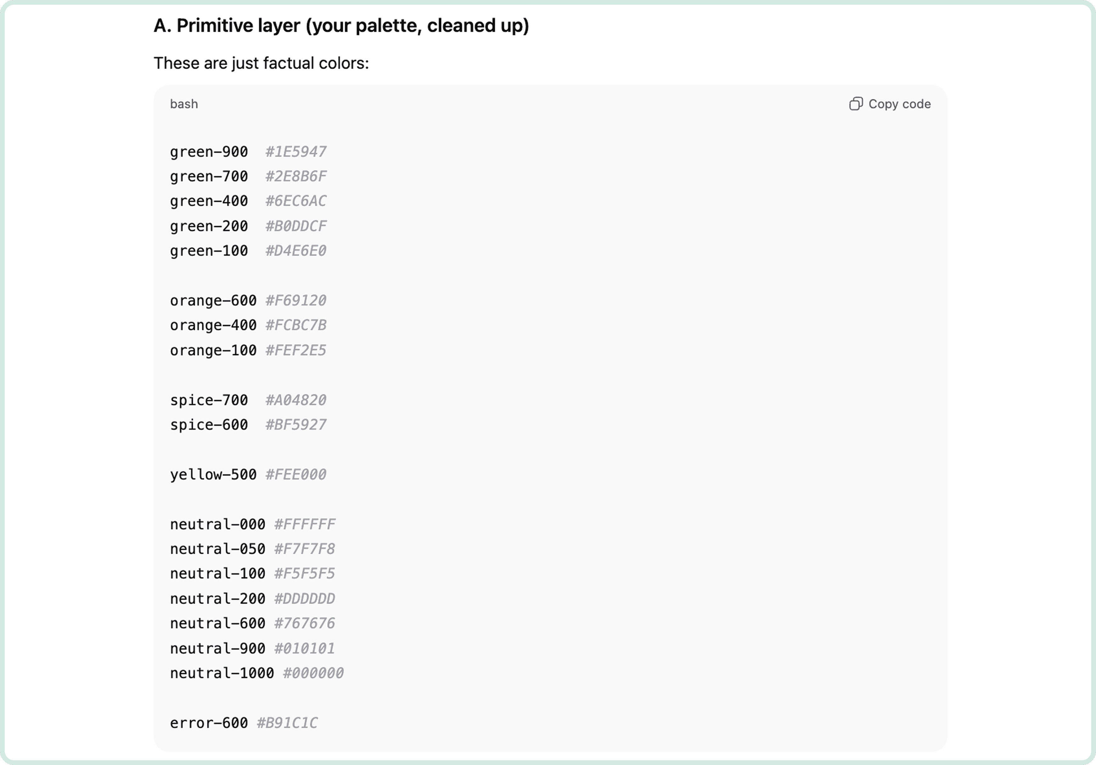
Building primitive tokens with ChatGPT
I started by setting up the primitive tokens, using my existing design system as a base to copy and adjust values like breakpoints and font weights. For color tokens, I turned to ChatGPT, providing my palette to quickly generate a structured set of primitive values.
Building semantic tokens with Cursor
Next, I exported the primitive tokens to Cursor and prompted it to generate semantic token names for each component using Figma MCP links. This connected raw values (primitive tokens) to their contextual usage (semantic tokens) across components.
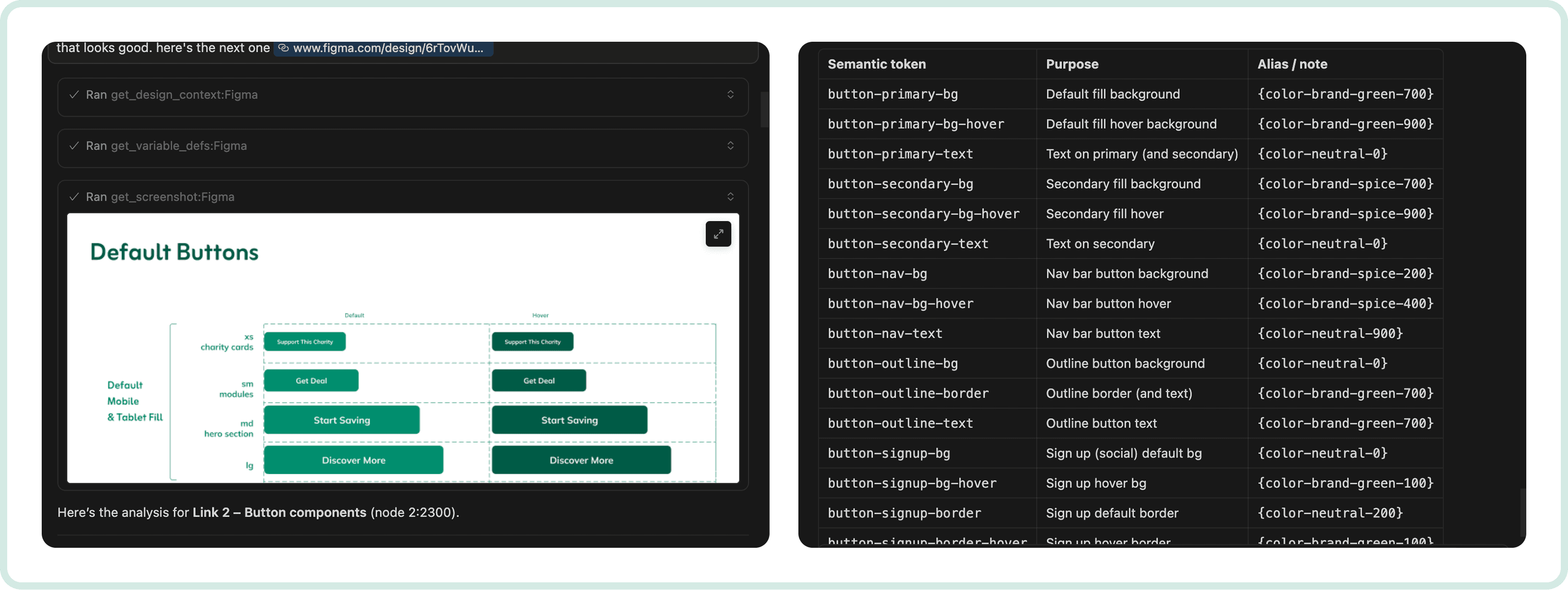
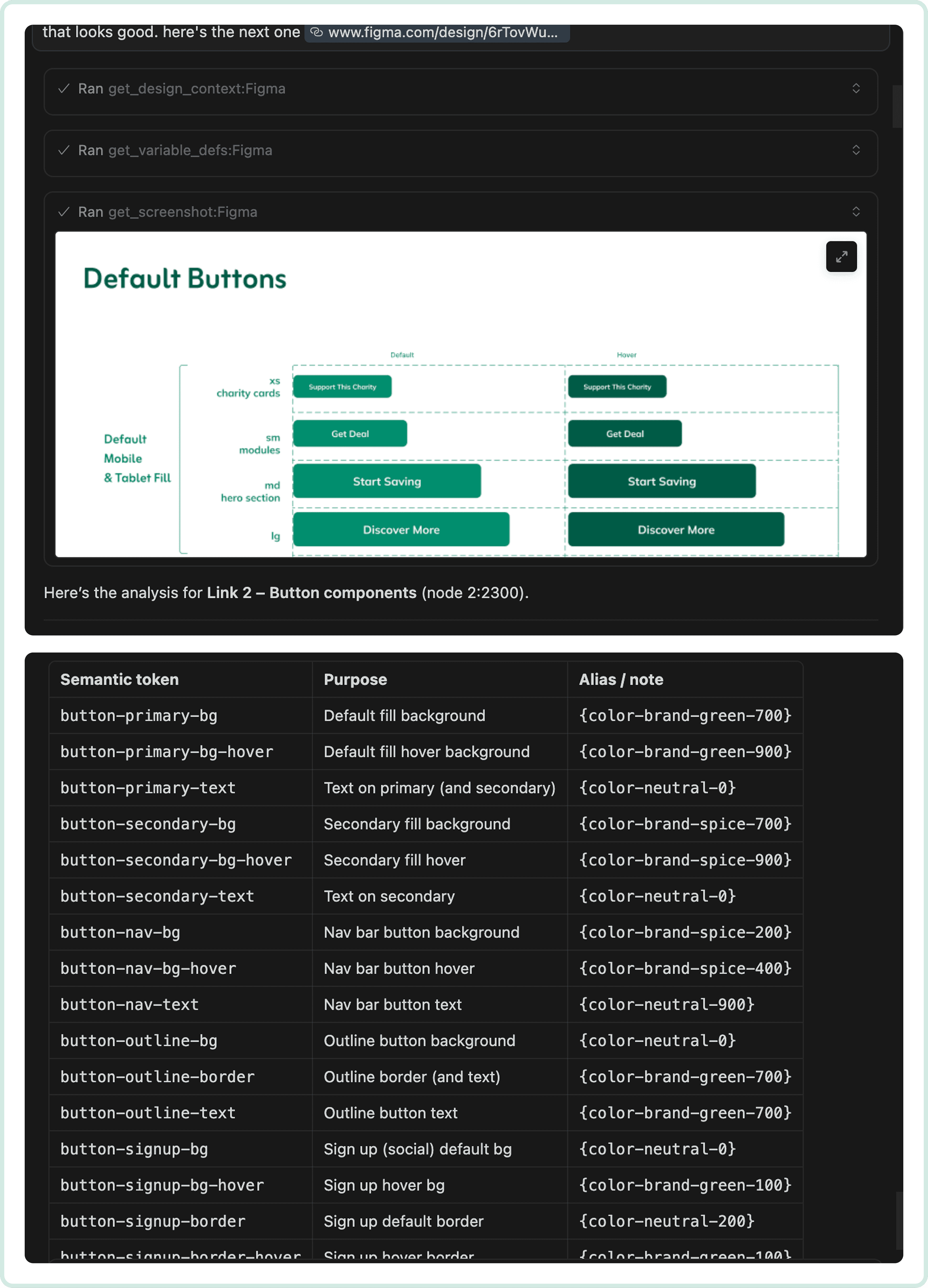
Importing tokens into Figma
After proofreading and adjusting names as needed, I had Cursor generate a JSON file of all semantic tokens, which I imported into Figma’s Tokens Studio plugin. This reduced token setup time by ~50%.
cross-functional alignment
Aligning on structure with engineers
To ensure the token system would work in practice, I held biweekly meetings with Yanush and Khris (engineering) to align on naming conventions and overall design system structure. This collaboration ensured my variables and components matched engineering workflows, minimizing friction during handoff and setting the system up for long-term scalability.
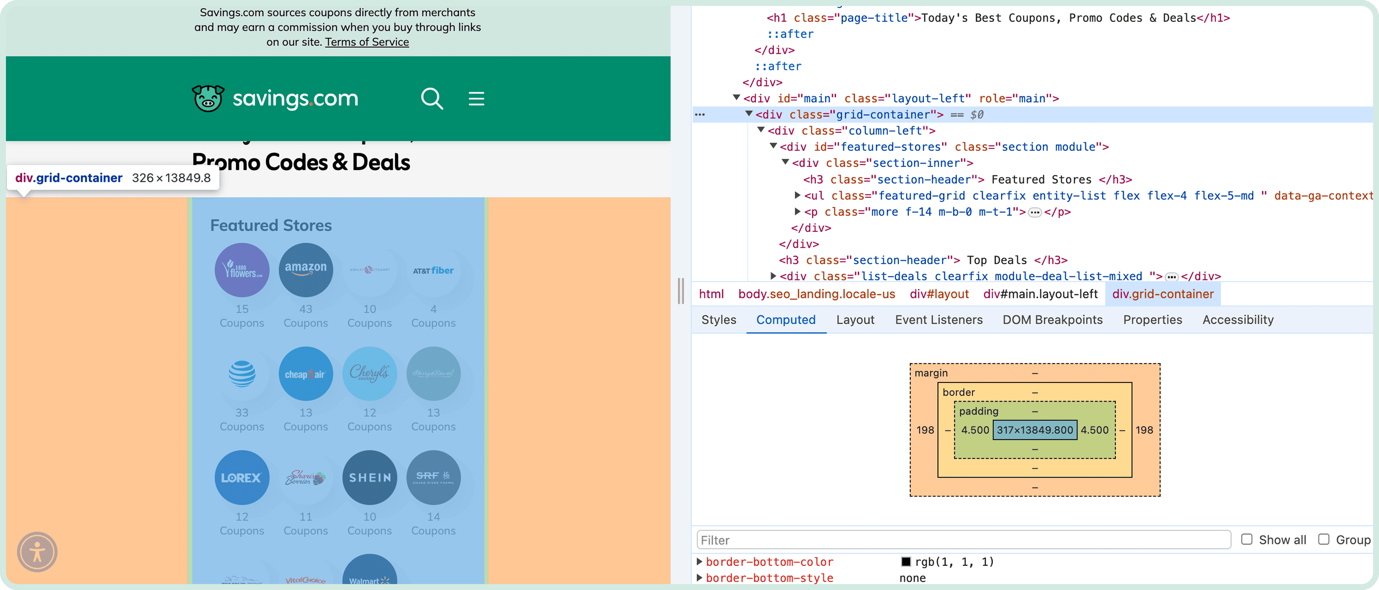
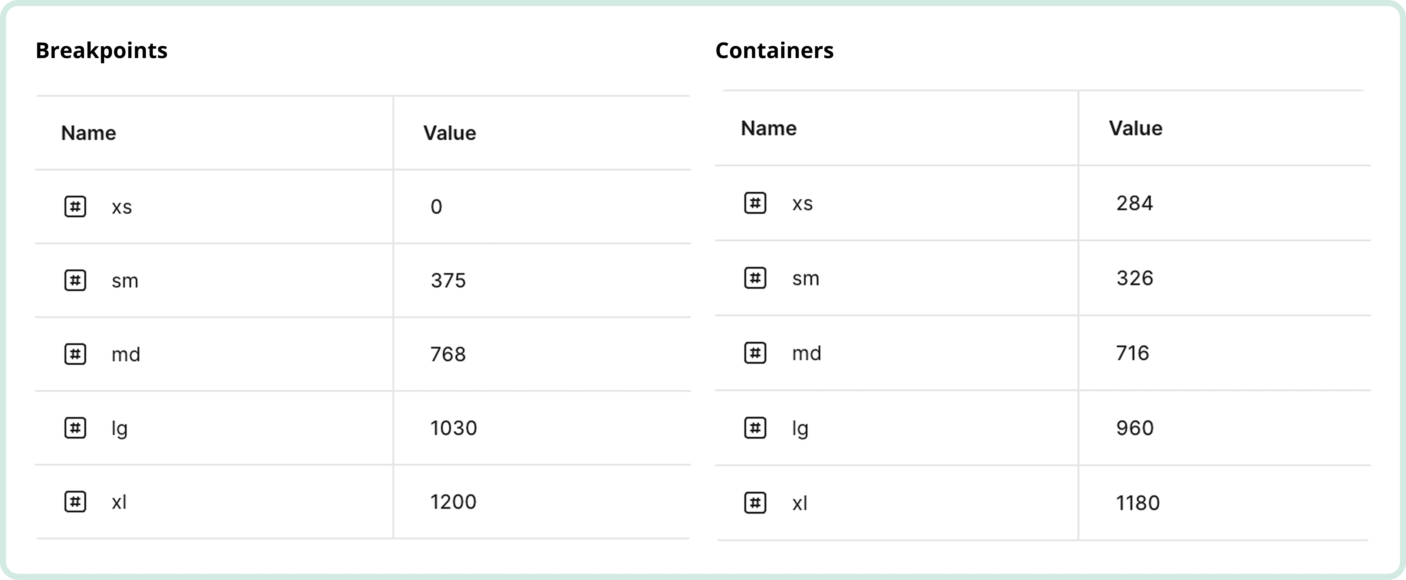
Breakpoints and containers
During token setup, I noticed my breakpoints didn’t match Yanush’s, which could have caused noticeable layout issues on the live site over time. I updated my variables to align with his. Containers also included built-in padding. For example, a mobile container measured 326px but had 4.5px padding on each side, effectively 317px. Removing these paddings was too risky, as it could affect other pages, so we agreed I could continue designing without them and handle any edge cases as they arose, since most content layouts wouldn’t be affected.
Legacy code constraints
The site’s legacy structure (built in Velocity) meant pages were highly interdependent and delicate. Changes made to one page could affect others. However, due to a tight timeline, the engineers wanted to reuse pre-existing elements where possible. Because pre-existing elements were coded inconsistently, some elements couldn't automatically implement the new tokens I had. I worked closely with the engineers as they manually refactored these components to carry the updated tokens to validate visual consistency and ensure alignment with the intended system structure. This collaboration gave me a deeper understanding of the engineering constraints and workflows, helping me design a scalable design system.
cross-team documentation
Documentation as the single source of truth
Tokens
I created a dedicated page listing each primitive and semantic token in charts, organized by type (color, space, typography, etc.). My goal was to eliminate gaps between design and engineering, making it easy for engineers to follow the system as a single source of truth while coding.
Components
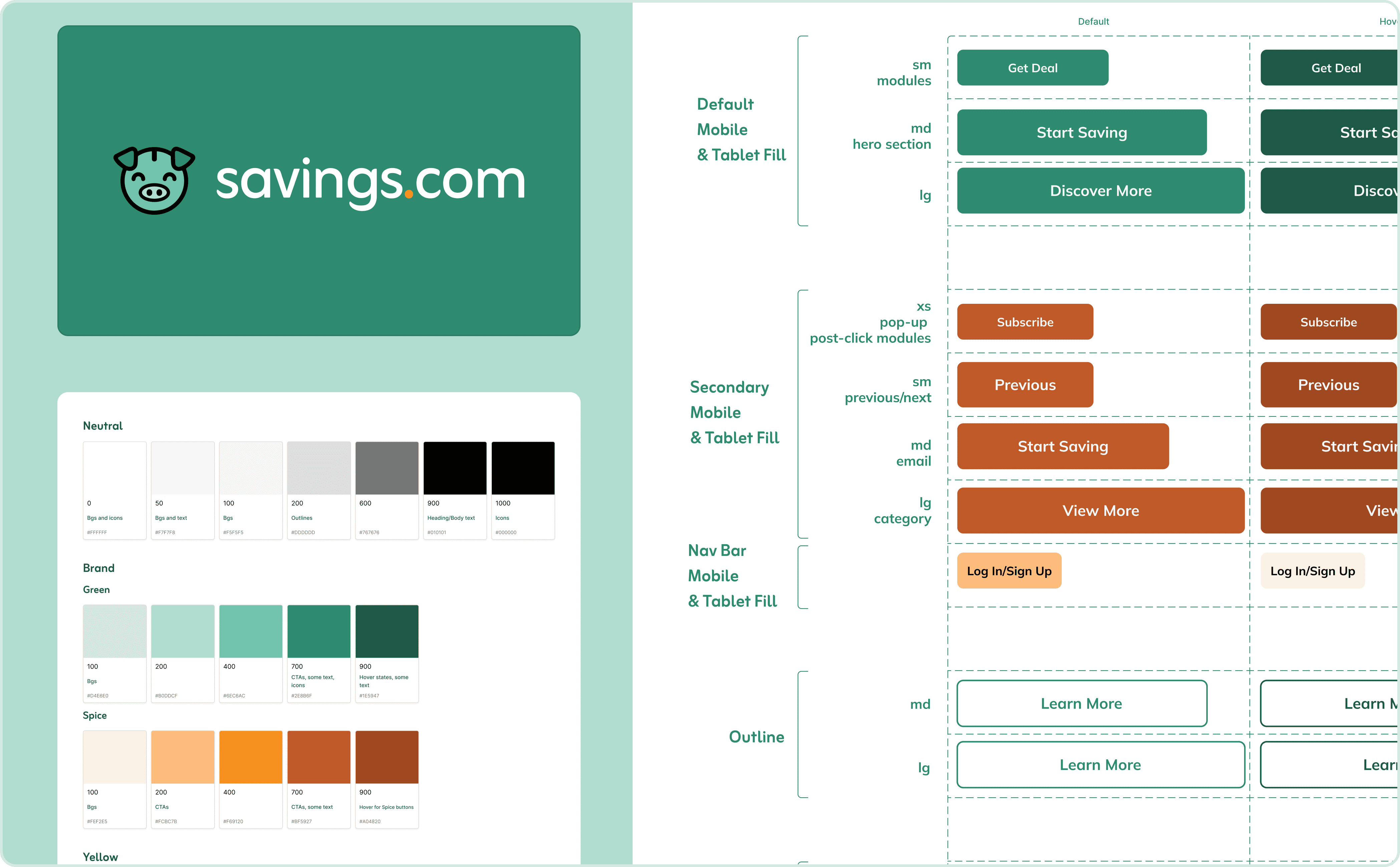
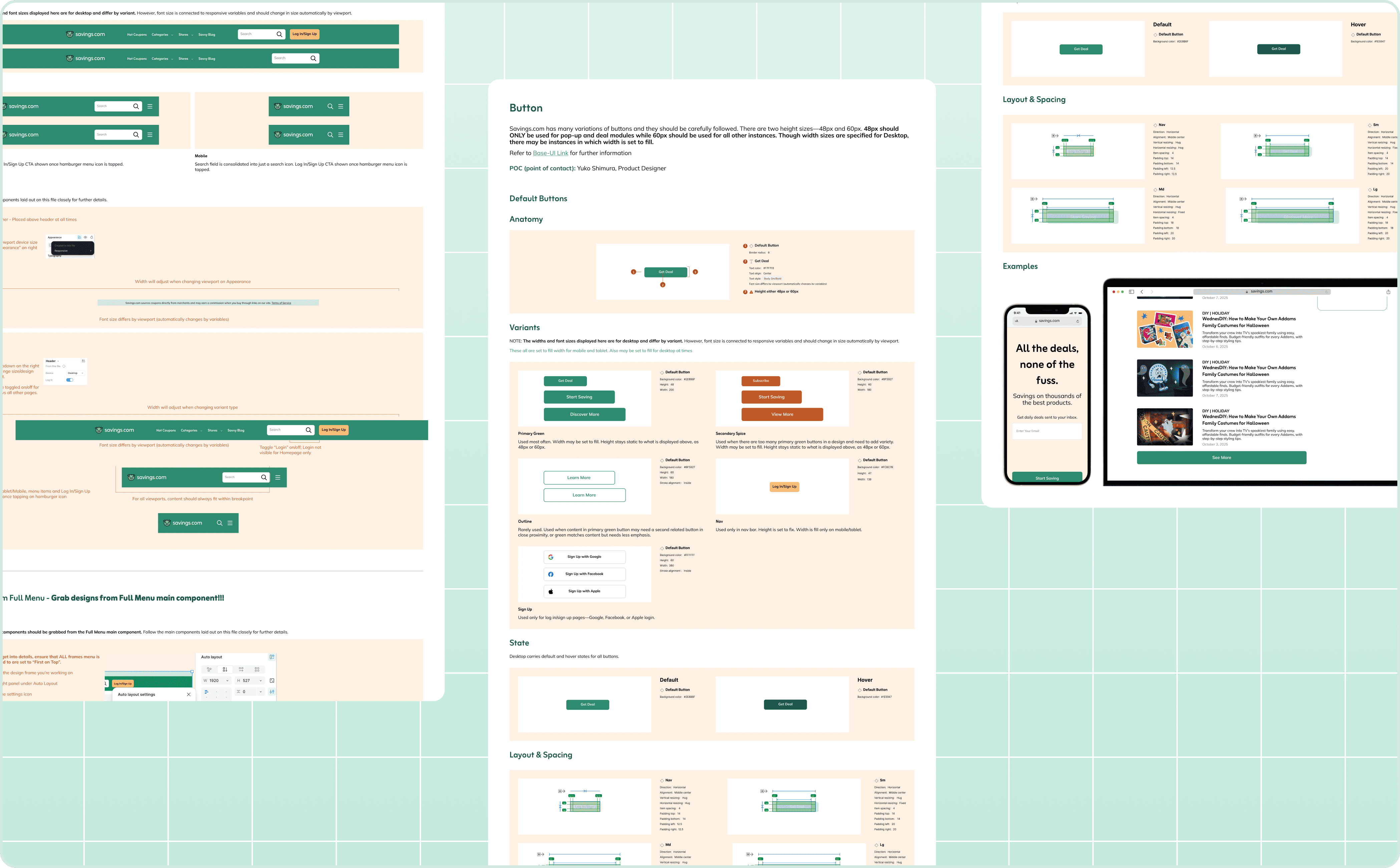
For components, I placed usage guidance directly alongside the design elements for designers to reference. Each component included detailed documentation covering anatomy, rules for toggling elements on and off, variants, and examples of real-world usage for designers, engineers, and product managers.
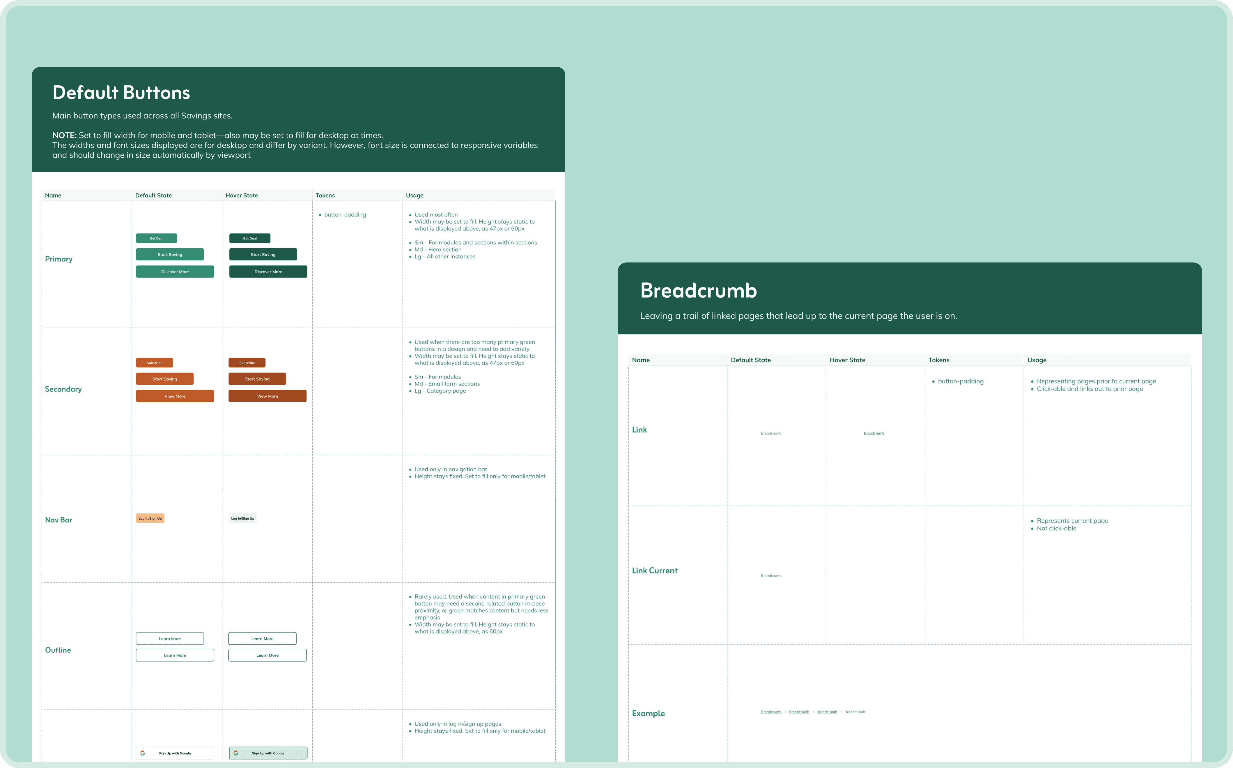
I documented precise rules like text line limits and clear guidance for adjusting component states via toggles and dropdowns. I also highlighted key details with icons for emphasis.
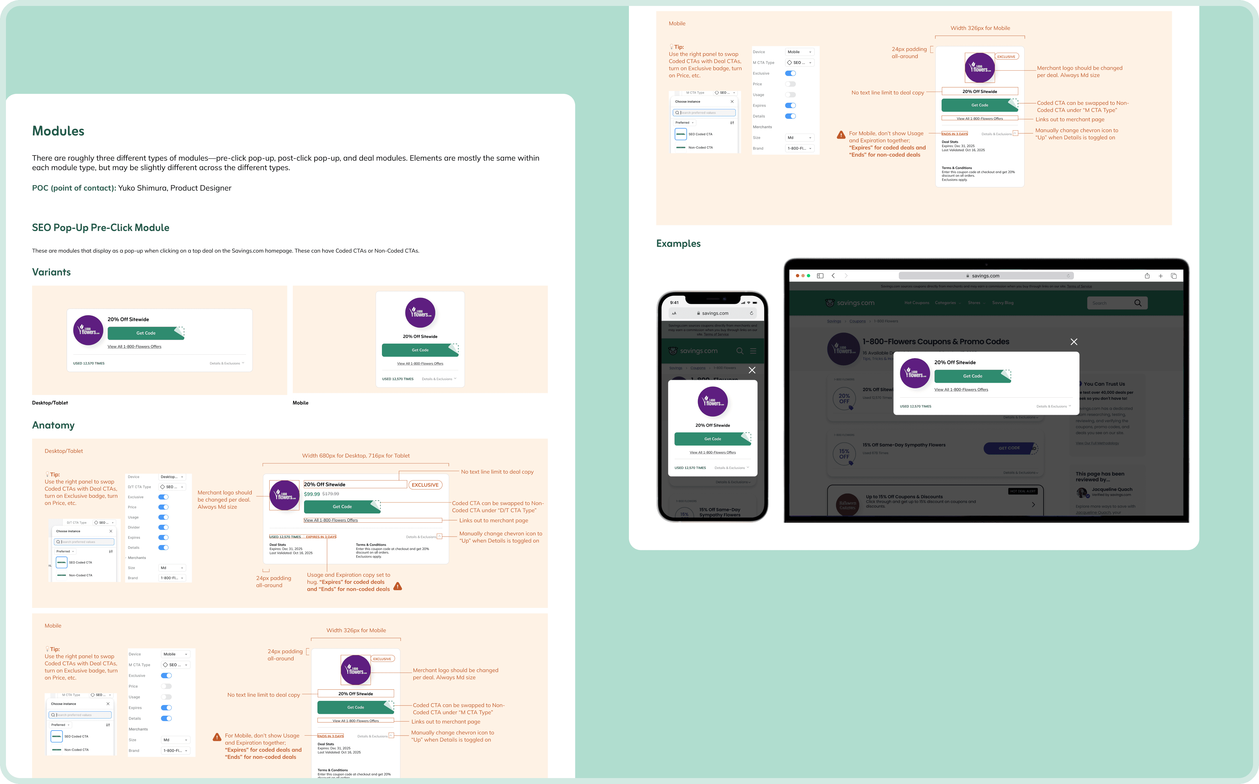
This is super informative and great, but it’s quite cramped and difficult to read all the notes.
Miriah (Designer)
I’d like to see the different hover states and edge cases of the designs.
Khris (Engineer)
Making adjustments
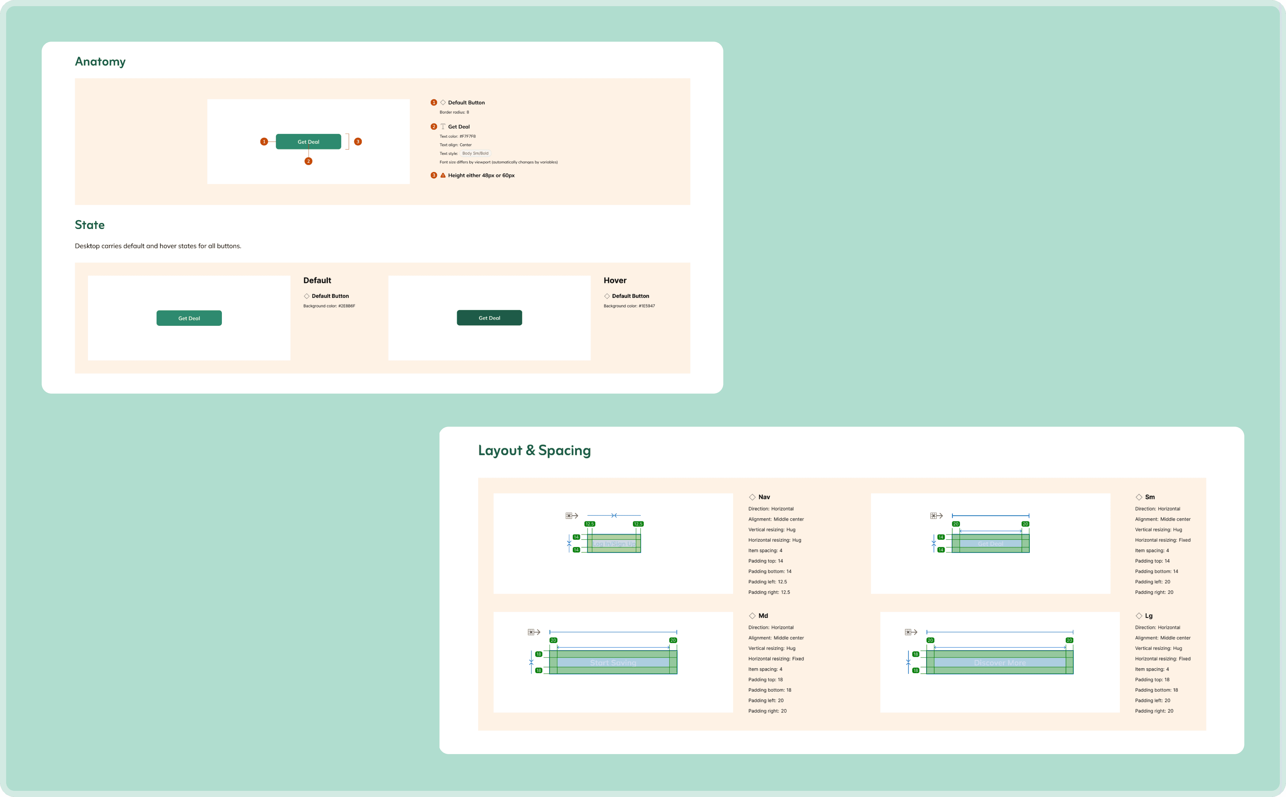
After gathering feedback, I realized my documentation needed more clarity and organization. I reorganized the documentation to make my notes more clear and digestible. Using the Specs plugin, I generated clean visual specs with padding and numerical pointers. Instead of having all annotations in one section, I separated "anatomy" and "layout/spacing" details into separate sections and included default and hover states where applicable, ensuring component behavior was easy to understand for engineers.
reflection & next steps
Reflections on impact and growth
Impact 🎯
This design system reduced development time by ~20% and established a clear standard for alignment between design and engineering
Using AI tools to build token structures sped up token creation on the design side by ~50%, significantly improving overall design system build time
Collaborating closely with engineers also deepened my understanding of how components and tokens are implemented in code, strengthening my cross-functional knowledge for future projects
Challenges 💪🏻
Building a design system from scratch for a site with no existing mocks required defining rules and structures from the ground up
Learning to integrate Cursor into the workflow had a learning curve and required multiple tutorials, but once I got the hang of it, setup became much faster
Leveraging AI tools helped accelerate both token creation and overall system build, making the project manageable despite its large scale
Next Steps 🐾
For now, all documentation is maintained within Figma to keep things simple for our small team. In the future, I’d like to explore a more comprehensive documentation hub to centralize components, tokens, and guidelines. I experimented with using Cursor to generate a local documentation site, but without a domain to host it, we paused development. This will be a further opportunity for my team to improve accessibility and cross-team collaboration.