Rapidly ideated with AI-assisted tools to simplify complex bundle options and improve information hierarchy.

overview
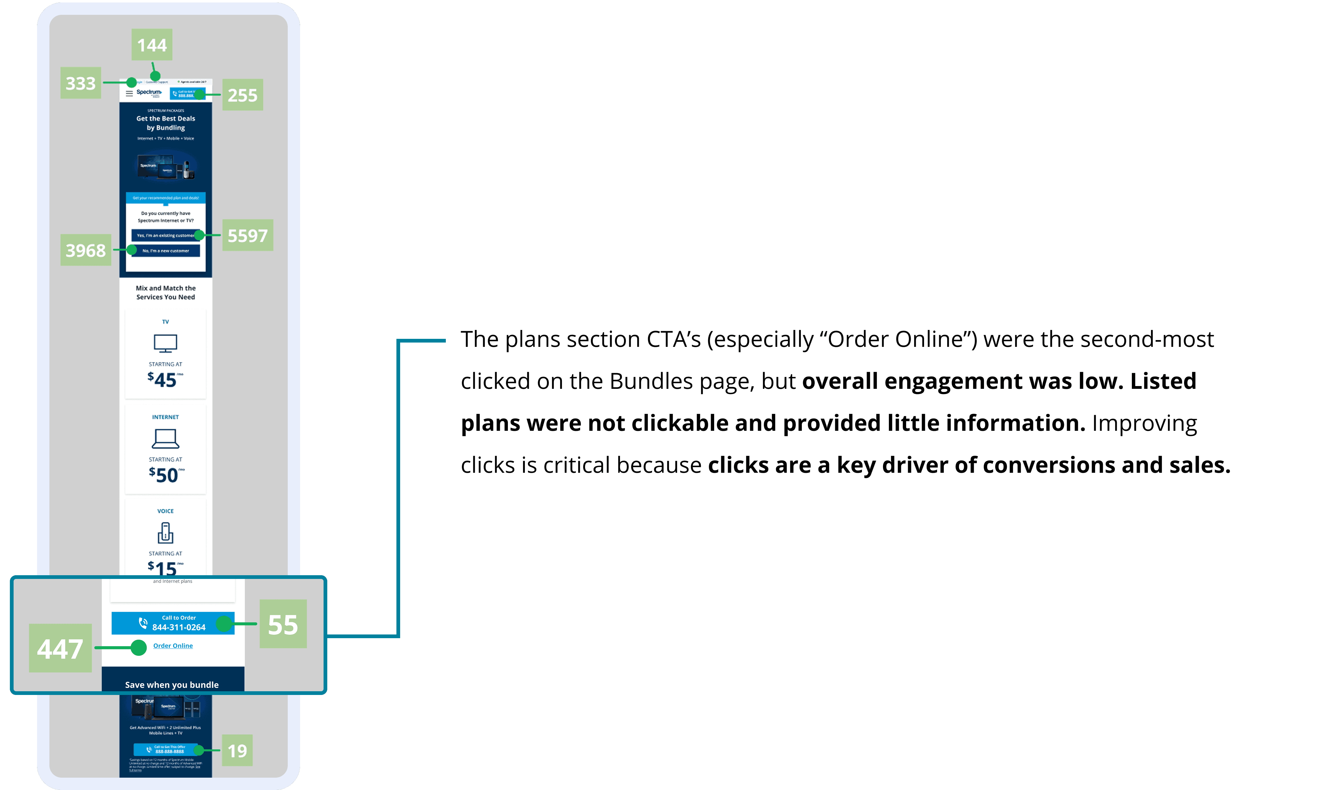
Spectrum is one of our clients providing internet, mobile, and TV services in the U.S. We operate an authorized reseller site for them, earning a commission on every sale. Recently, the client increased the commission for bundle sales by 200% through the end of the year, creating a strong business opportunity. Click analysis showed the Bundles page plans section had potential to improve performance, suggesting that users were engaging with bundle options but encountering friction when evaluating and comparing plans.
I led the design and development of a new interactive Bundles plan feature that guides customers to the right plan and drives conversions. The redesign achieved 100% satisfaction in user research and increased bundle sales by +8%.
+24%
+8%
+14%
project timeline
2.5 Months
team
Myself (Designer)
James K. (Product Manager)
Sunny K. (Developer)
my design skills in focus
Leveraging AI Tools
Logic-Driven UX
Usability Testing

the problem
The bundles plan section was a missed opportunity
For context, engagement in my team is defined through:
Call CTA Interactions – Users clicking call buttons throughout the site
Lead Form Submissions – Users completing the lead form step (our agents call them afterwards to close a sale)
Catching inconsistencies in the design
1.
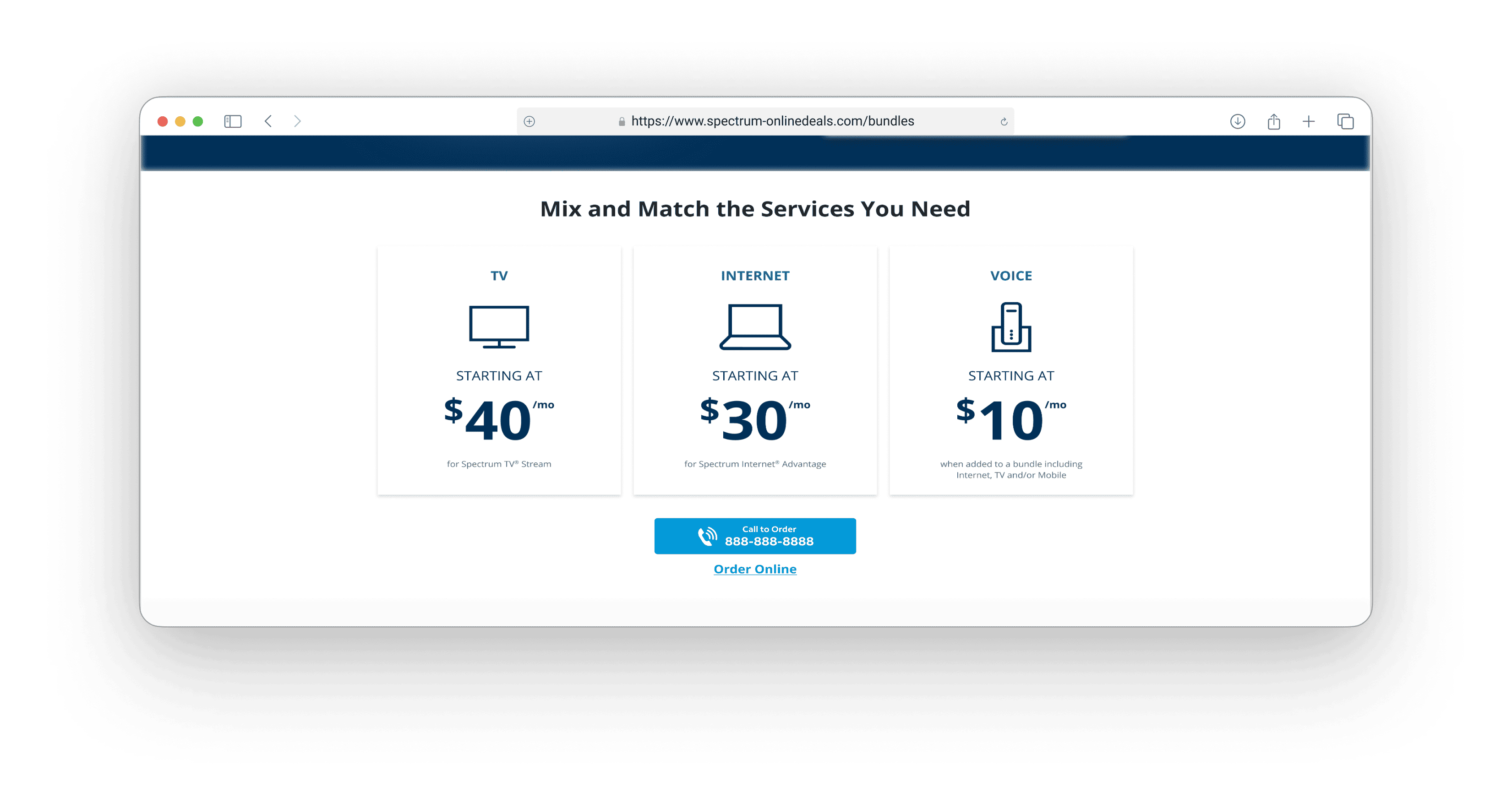
The Internet page plan cards show bundle options for 500 Mbps and 1 Gig, with more info
2.
The plans on the Bundles pages show outdated plan pricing for bundles and less info than that of the Internet page, most likely causing confusion for users
*Note, the results page is shown after the user goes through a product recommendation quiz from the landing page and displays plan info

the solution
Transforming the bundles section to be more informative and intuitive
Conversion Goals
Improve bundle sales and overall calls by at least 5% by EOY
Experience Goals
Provide informative plans that make the user want to click and engage
before diving into design ideation
Involving my product manager & dev early on
I worked closely with Feon (Product Manager) from the start, sharing with her my insights. Based on my click-analysis findings, we agreed to focus on re-inventing the plans section completely. We also discussed how the outdated pricing on the default Bundles pages could compromise the test results if tested with the new plan feature. We came up with a game plan to update the default design first with the correct information before testing any new designs to maintain consistency.
I then, connected with Sunny (Developer) to provide context, review the required changes, and discuss the level of effort—mostly low-effort copy updates—to ensure the update would be completed on time.

brainstorming with ai tools
Exploring layouts faster with ChatGPT and Figma Make
I used AI tools early in the process to quickly explore a range of possible layouts. This helped me spend more time validating design decisions and face constraints and tradeoffs upfront.
Prepping the Figma Make prompt with ChatGPT
From my experience working with Figma Make, I noticed the designs don’t come out in its optimal state without hyper-specific instructions in certain areas (i.e. colors). ChatGPT helps me make this process more efficient. I gave ChatGPT a general idea on what I wanted—an interactive plan feature that lets users mix and match what they want included in their bundles package with corresponding plan cards that match the branding of the cards in the Internet page. I made some edits here and there and it was ready for Figma Make!

Generating layout inspo with Figma Make
I like to use Figma Make as an inspiration tool for rapid layout exploration. The UI isn’t perfect, but it’s great for strategizing information hierarchy. After about 20 minutes of experimenting with different prompts and layouts, I selected two concepts (#1 and 2) that served as a foundation for my own designs—they offered the clearest, most intuitive information hierarchy in guiding users to their desired plan.
It’s also good to note that leveraging AI tools in this way saves me about an hour of brainstorming, give or take, and helps me save some brain power for other important parts of the design process.

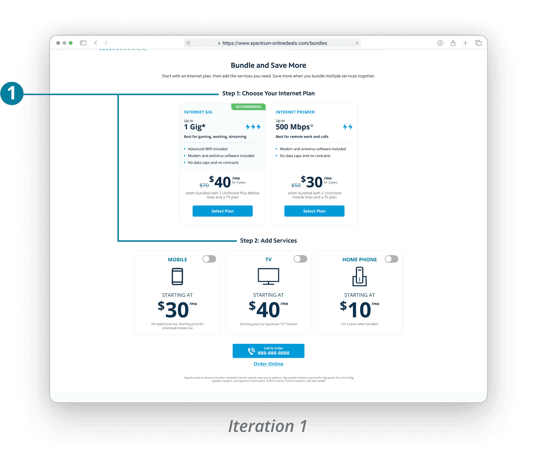
1.
Separating internet plans from additional services introduced the idea of a “bundle builder,” a strong potential to provide an engaging experience for the user while giving them a sense of control over what they include
2.
This concept inverted the layout of #1, allowing users to select services first and immediately see the bundle plan pricing update, reducing comparison effort and supporting easier plan evaluation for the user
3.
This option followed a similar hierarchy to #1 but placed plans within a carousel. Based on prior performance data from Spectrum sites, carousel layouts have historically underperformed, potentially adding friction by requiring users to swipe through plans
4.
Framing the experience like a cart checkout flow introduced extra steps, adding complexity when the goal was to make selecting bundles feel intuitive and lightweight
design iterations
A new mix-and-match bundles feature that makes choosing fun for users
The early stages
I sat down with Sunny to review my designs at an early stage to ensure that we were able to build a toggle-match system where the plan card info changes based off of what the user selects. The amount of variations to build out would be meticulous, but the concept I had was feasible for the timeframe—we were looking at about one day to build. I also shared my ideas with Feon to further strategize the most intuitive layout for the users. I progressed through a couple of iterations.

1.
I separated the “builder” into steps so the user will choose internet speed first and then add-ons. However, Feon and I discussed how the order felt confusing—the hierarchy made more sense to have the user choose the add-ons and then see the plan info change
2.
For the next iteration, I simplified the bundle toggles and placed them at the top so the user can see the plan info change as they select/deselect the services
Further changes—internet isn’t required for all bundles
After the iterations above, I learned from client that internet is actually not required for every bundle plan (i.e. TV can be standalone or bundled with home phone) 😱 This realization made the mix-and-match system more complex, as it added 16 more variations on top of the 20 existing—for a total of 36 bundle variations. Luckily this only added a couple of hours for me to design, and for Sunny as well, as we were duplicating similar card types and changing content.
Usability Testing & Iterations
Feedback revealed opportunities beyond the plan feature
Five participants
I ran unmoderated individual usability tests on my new prototyped design via Userlytics with five participants that fit the target demographic and have been shopping for bundled internet plans in the past 6 months. Although the new pricing section was the main focus, I had the participants look at other parts of the Bundles page to gather broader feedback on layout and content.

Austin

Tiffani

Edward

Uriel

Jessica
Topics I focused on each session:
How participants interacted with the plan card toggles—did they understand that the card info changes in correspondence to the toggles? Did they understand that some bundles require internet or TV?
How participants felt about the plan card info in general
Open-ended, general feedback on the landing page, lead flow, results page
The new plans section design had a 100% positive reaction.
The info on here is helpful because it shows the price prior to and after bundling. I like that I can play around with what internet or TV combo I want with the toggles.
Tiffani
I've shopped for bundles many, many times before, and it’s a hassle figuring out bund-able services—it's nice to be able to use a toggle.
Edward
Feedback & revisions
There wasn’t much constructive feedback regarding the plan feature (yay!), but I did receive a good amount of valuable feedback regarding the rest of the Bundles page experience (landing page, lead flow, results page).
Feedback on the bundles feature

Feedback
All 5 participants were satisfied with the new plans section. However, 2/5 felt there needed to be more explanation of services in the plan cards.
It’s not clear to me what Advanced WiFi is. Is it a router or something?
Uriel
Revisions
Added “router” and description to make it clearer what Advanced WiFi is
Additional feedback & planned tests
Feedback
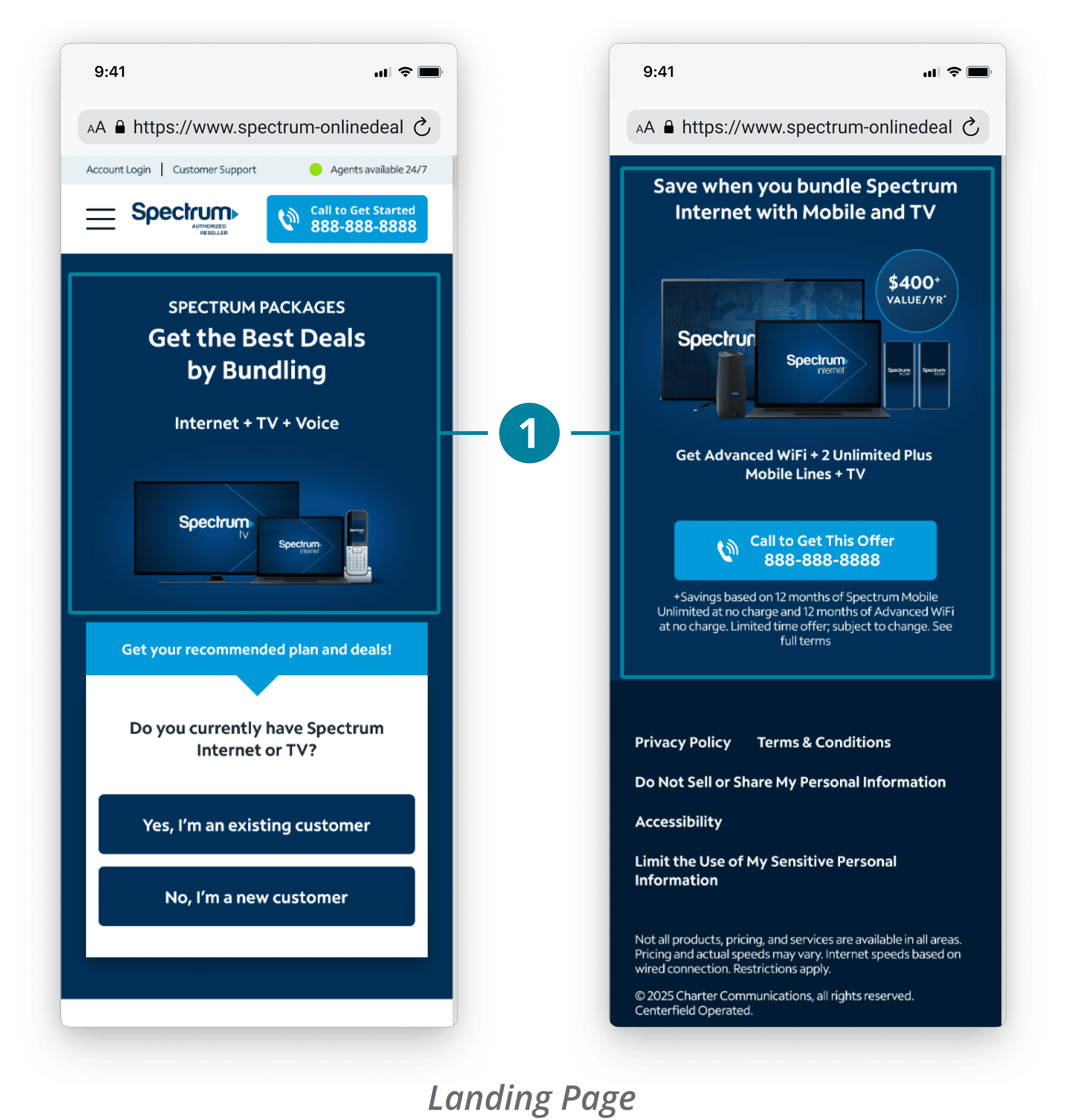
3 participants stated they liked how short the LP was, but they were also confused with the inconsistent bundle messaging—the hero shows Internet + TV + Voice, while the bottom banner promotes saving $400 with other services.
Next test ideas
Redesign the hero to highlight the value of bundling rather than listing specific products
Replace the bottom banner with individual service highlights/deals (i.e. Apple iPhone promo).
Feedback
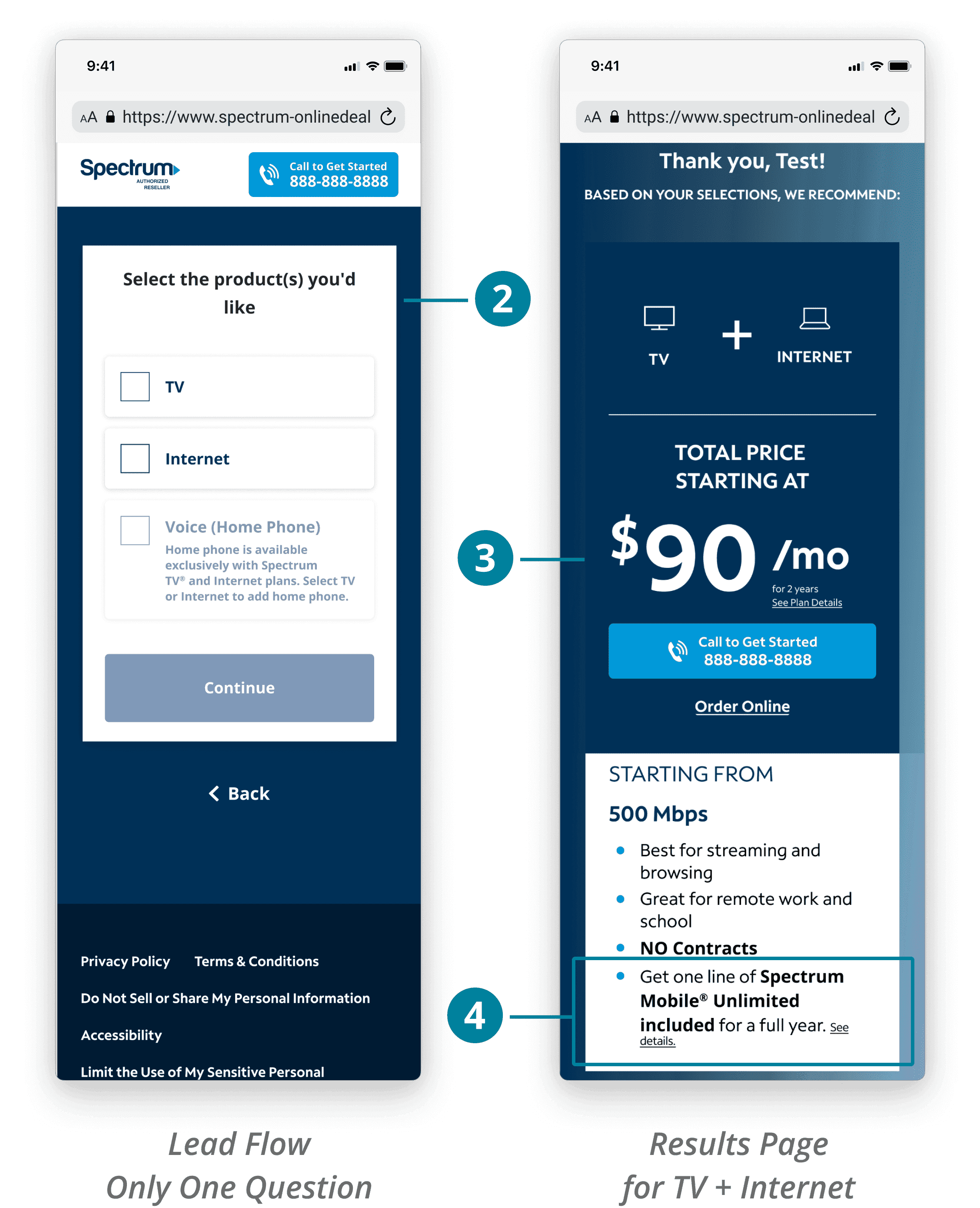
One participant stated having only one question before showing a recommended bundle plan was too brief, making the recommendation feel less genuine.
Two participants were confused why the results page didn’t include internet speed options like the plan cards on the landing page.
Two participants were wondering why they were being suggested mobile despite selecting TV + Internet.
Next test ideas
Add lifestyle questions to help personalize the results page more (i.e. “what do you use internet for?”)
Show 1 Gig and 5 Mbps plan options in results page
Match the plan card information to the new plan cards
game-plan with the product manager
Feon and I decided to hold off on broader Bundles changes until we measured the impact of the new feature in the A/B test.
prepping for dev handoff
Being mindful of edge cases
I discussed with Sunny to confirm the mix-and-match logic worked as intended and aligned on preferred handoff methods. I documented all 36 plan card variations across viewports, including toggle and error states, to help make development smooth.
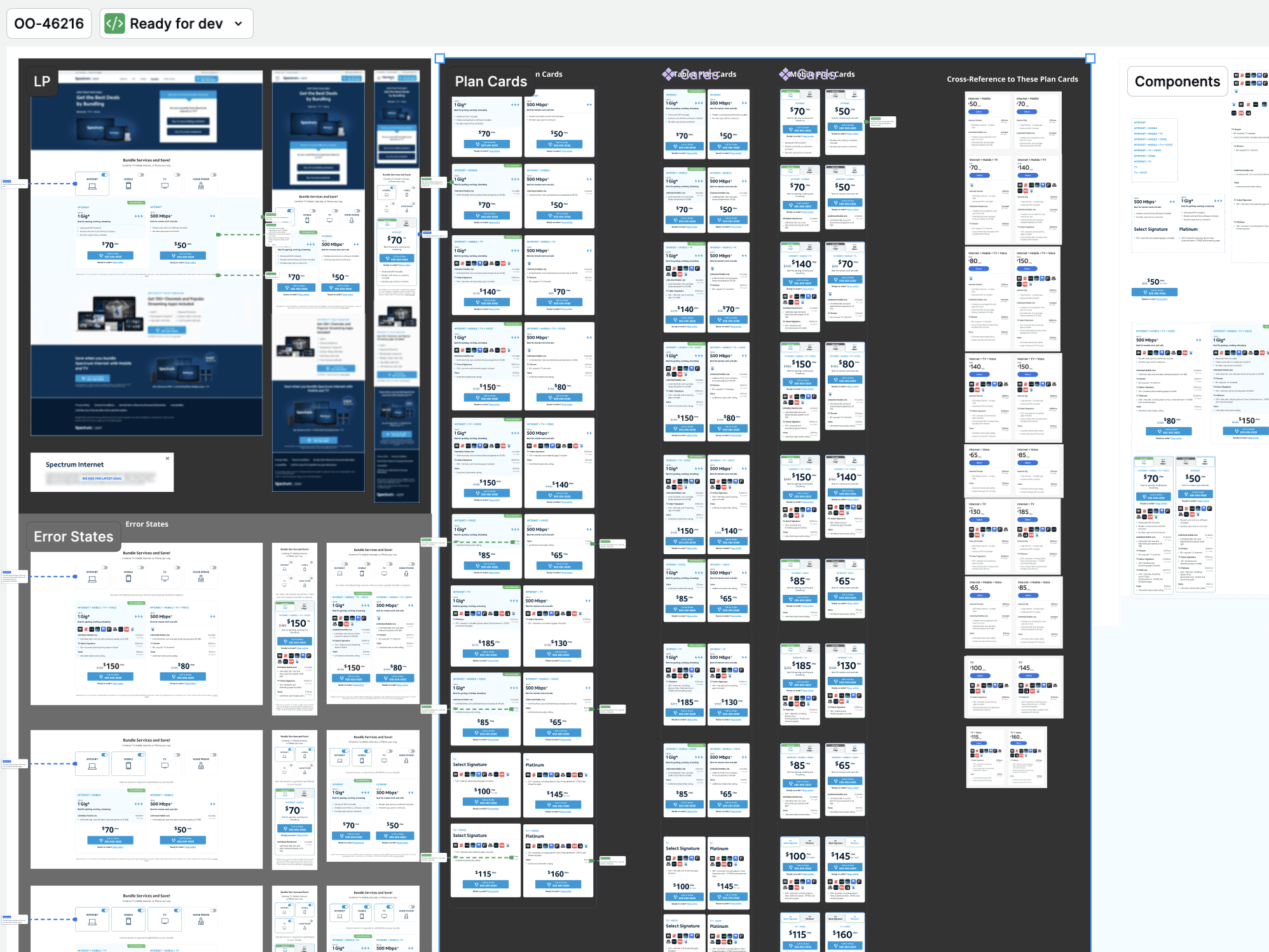
Designs Handed Off to Dev
During review, Sunny raised thoughtful edge cases which helped refine the final behavior and strengthen the overall design logic—for example:
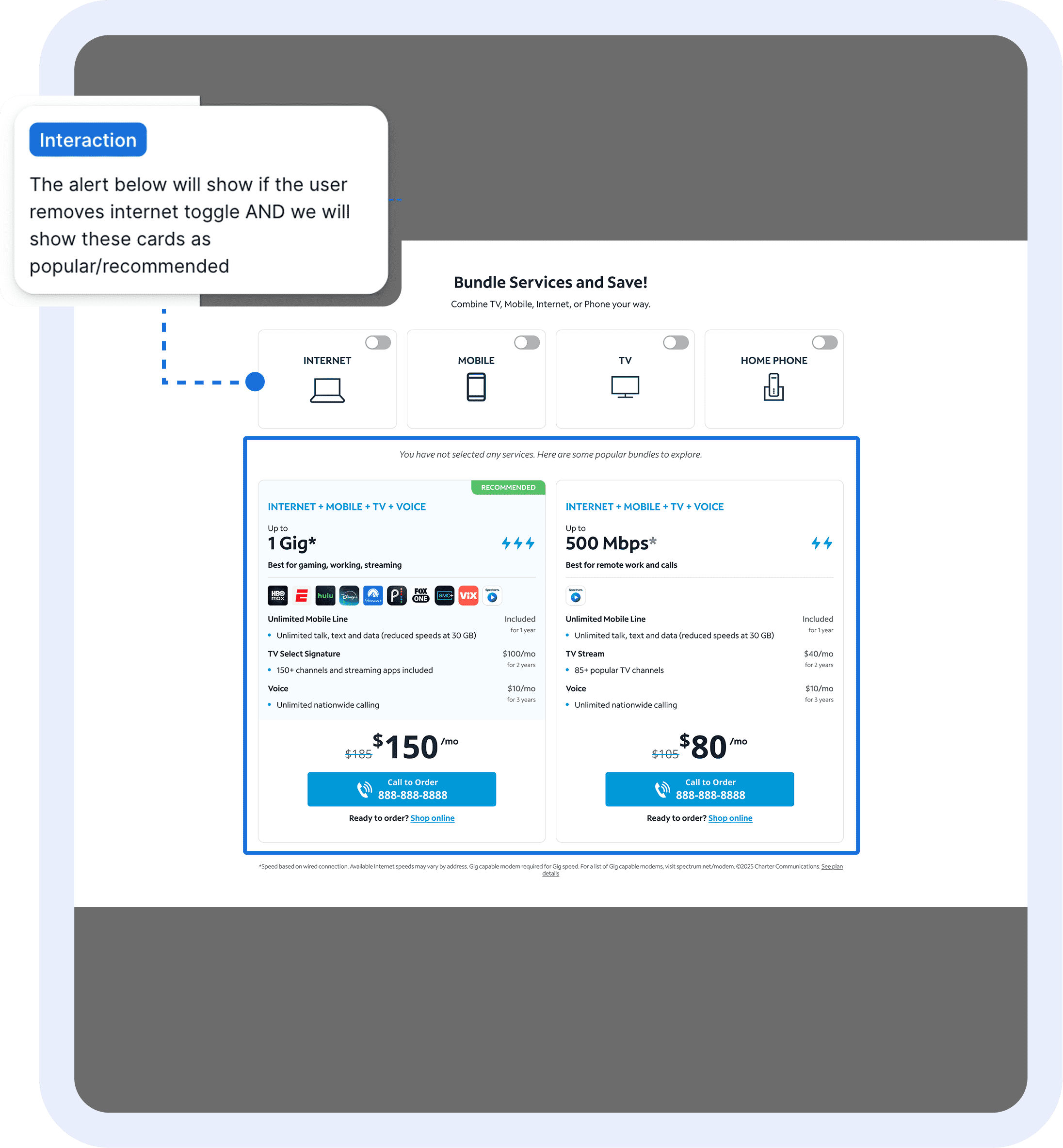
What happens when the user deselects the Internet option?
We decided to show the error message, 'You have not selected any services. Here are some popular bundles to explore.' The feature would then display the most popular bundle plans for 1 Gig and 500 Mbps speeds.What if the user deselects Internet and then selects Home Phone (which requires Internet and/or TV)?
We decided to show the error message, 'Internet or TV service is required to add Home Phone to your bundle. Here are some popular bundles to explore.' The feature would again, display the most popular bundle plans.

My Solutions for Edge Cases
final design
Balancing user insights with conversion goals
A/b test results
The numbers proved the new design was what we needed
Summarizing the data
+24 total SPV, +8% bundle sales
Exceeded conversion goal of +5% bundle sales and calls by EOY
+14% inbound calls
New design drove higher-quality bundle sales
Users value clear plan information and customizable bundle options
+2% engagement
-8% in lead form conversions, but can assume it was due to more calls
The A/B test ran for about 2 weeks and the results mirrored what I saw in usability testing. Bundle sales specifically increased +8%, suggesting that the new Bundles plan section aligned with what users were looking for. Although lead form conversions dipped, calls increased, which indicates that users were motivated to contact sales after viewing the clearer plan information. Overall, the new design was a success and it confirmed that users value transparency and customization when exploring bundle plans. The clear plan logic and transparency most likely helped users feel confident enough to call, rather than abandon or second-guess their choice. This was a huge win, directly supporting the company's initiative to maximize bundle sales after the 200% commission increase.
reflection & next steps
Lessons, wins, and a clearer path forward for Bundles
Prototyping Challenges 🕸️
Prototyping the plan card variations with toggles was straightforward but could have been cleaner. I attempted conditional prototyping with If/Then logic and variables, but the complexity was beyond what Figma’s currently supports. Given the time constraint, I ended up manually prototyping (for now). Although the test is complete, I’m now exploring on Figma Make to see if it can generate clean prototypes so I can work with this tool in the future.
Organizing Timeline 🕰️
I had to pause on this project for 2–3 weeks due to two high-priority initiatives that came up right before usability testing. Coordinating timelines and making weekly adjustments with my product manager and developer was a challenge. This experience taught me how to multi-task effectively, stay organized, and adapt quickly to shifting priorities.
Next Steps 🐾
With this test proving to increase bundle sales, I plan to continue improving the Bundles page experience by working on the following tests:
Landing Page - Hero section and banner redesign
Lead Flow - Adding more lifestyle questions to personalize bundle recommendations
Results Page - Match the plan card designs to those on the landing page